


Forget those cabin in the woods vibes for a second. If you’re tired of every van looking like a cedar closet on wheels, it’s time to embrace the power of monochrome. Black and white isn’t just for old movies; it’s the ultimate hack for making a small space feel high-end and intentional. Trust me, your van deserves this glow-up! Let’s get into it.
The High-Contrast Hero Look
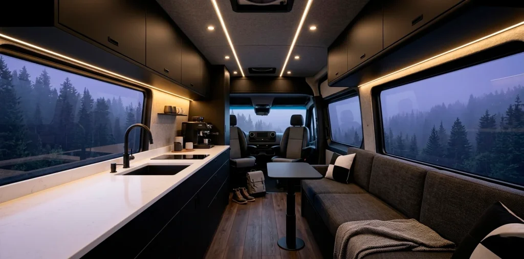
Why play it safe with beige when you can go for a look that actually makes a statement? A black and white palette creates instant depth, turning a standard cargo van into a rolling art gallery. I’ve seen people worry that black makes a space feel smaller, but when you pair dark lowers with bright white uppers, the ceiling practically disappears. It’s like a visual magic trick for your living room on wheels. Plus, it hides the inevitable dirt from your trail runs way better than you’d think. Ready to ditch the vanlife cliches?
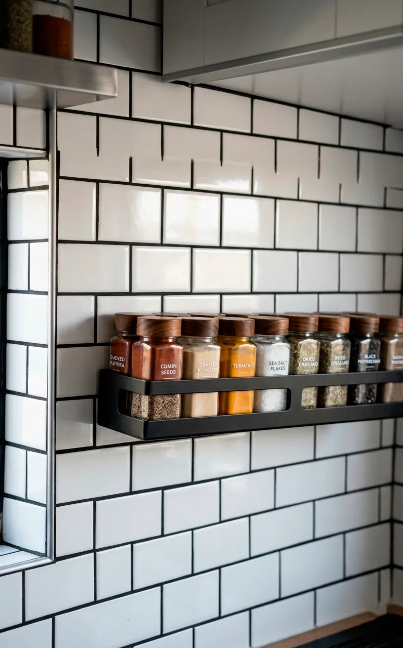
Textures That Stop the Hospital Vibe
Nobody wants to live in a glorified refrigerator. To keep your monochrome van from feeling cold and clinical, you need to lean hard into textures.
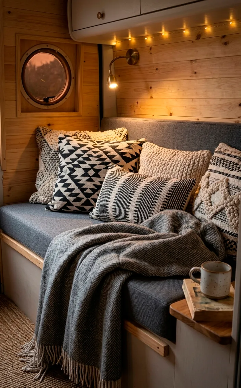
Think matte black hardware against a glossy white subway tile backsplash, or a chunky grey knit throw on a charcoal bench. These layers add warmth without breaking your color code. Ever touched a soft-touch matte cabinet? It’s a total game-changer.
Key textures to include:
- Matte powder-coated metals
- High-gloss ceramic tiles
- Chunky wool knits
- Natural slate or stone flooring
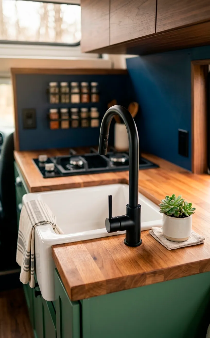
IMO, mixing these elements prevents the space from looking flat. Mix your metals too! A brushed gold faucet can actually pop beautifully against a black sink if you want just a tiny hint of spice.
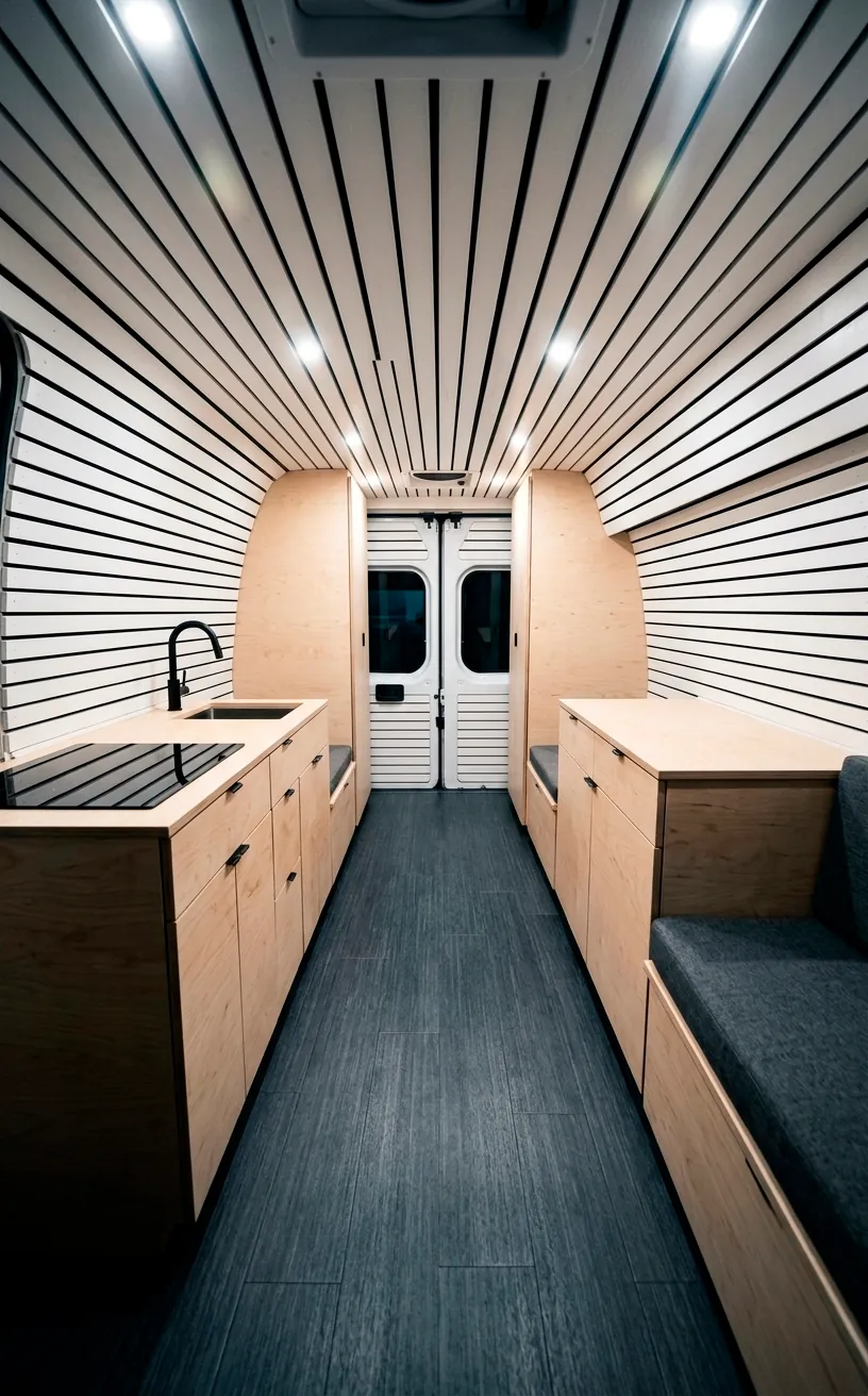
Floor It: Dark Bases and Bright Horizons
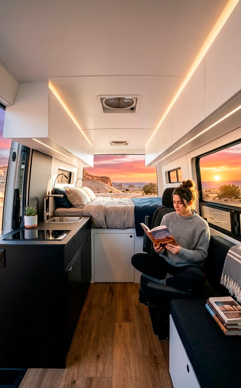
Start from the bottom. Darker flooring acts as an anchor for the whole design. I usually recommend a slate-look vinyl or a deep ebony wood grain because, let’s be honest, you’re going to track in mud.
Contrast that heavy base with a crisp, slatted white ceiling. It draws the eye upward and makes the van feel twice as tall. Have you ever noticed how a dark floor makes everything above it seem to float? It creates an airy, sophisticated vibe that’s hard to beat in a small footprint.
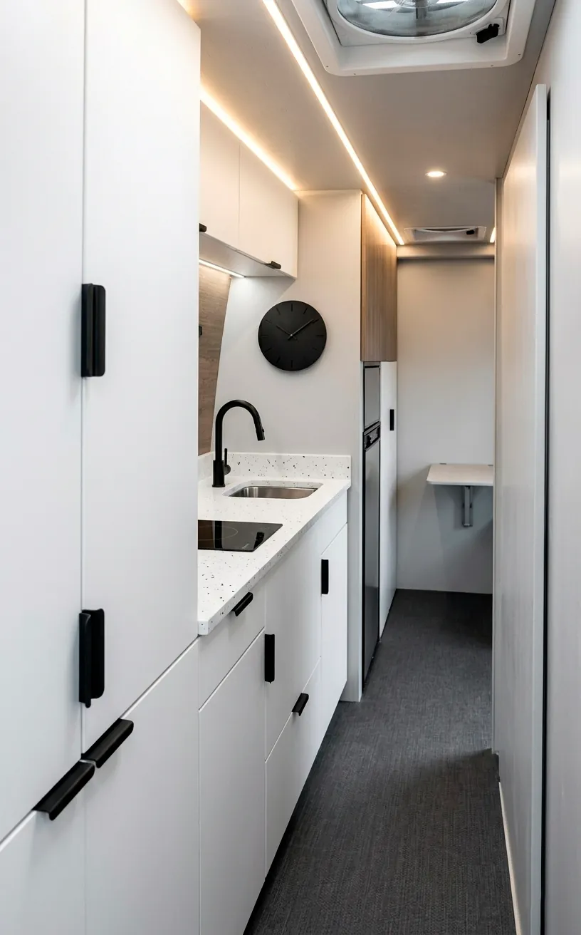
Hardware and Accents: The Devil in the Details
Don’t underestimate the power of a handle. Swap those generic silver pulls for sleek, matte black edge tabs. It’s the easiest DIY you’ll ever do.
I think the faucet is the centerpiece of the kitchen. A high-neck black faucet against a white apron sink looks incredibly sharp and high-end.
Essential hardware upgrades:
- Matte black finger pulls
- Industrial T-bar handles
- Recessed circular latches
- High-arch magnetic faucets
Throw in some black-and-white photography or a minimalist clock to tie the room together. Small touches turn a basic build into a home.

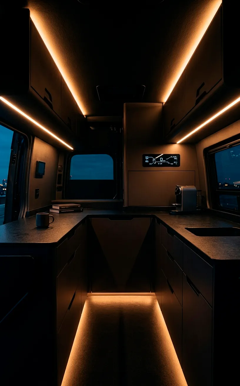
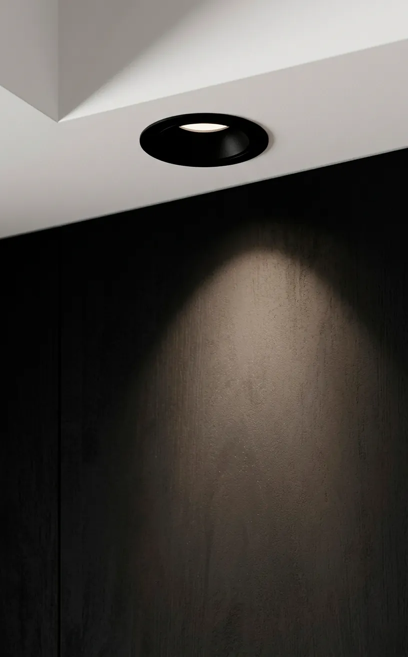
Lighting the Void
Lighting is your best friend in a high-contrast interior. Without it, your black cabinets might just look like a giant black hole at night. Warm-dim LEDs are essential here. Use puck lights to highlight specific zones and strip lighting to create a halo effect around the bed frame. It adds a futuristic glow that makes the monochrome pop. Who doesn’t want their van to look like a spaceship? 🚐
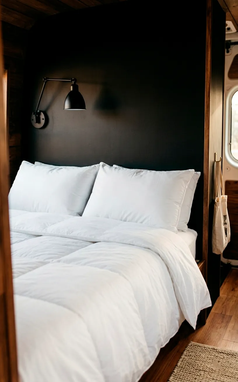
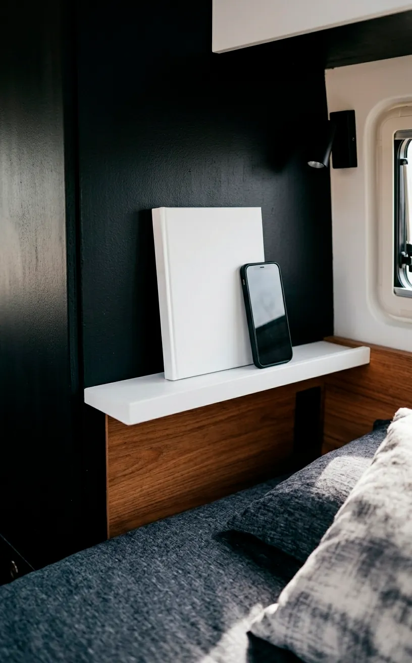
The Art of the Black Accent Wall
You don’t have to paint everything. A single matte black accent wall behind the bed can create a cozy, cave-like feel that’s perfect for sleeping. It provides a stunning backdrop for white linens.
Ever worried about messy wiring? This setup makes any wall-mounted tech or reading lights blend in seamlessly. Why let a messy wire ruin your aesthetic when you can hide it in plain sight? It’s the ultimate lazy-person’s hack for a clean finish.
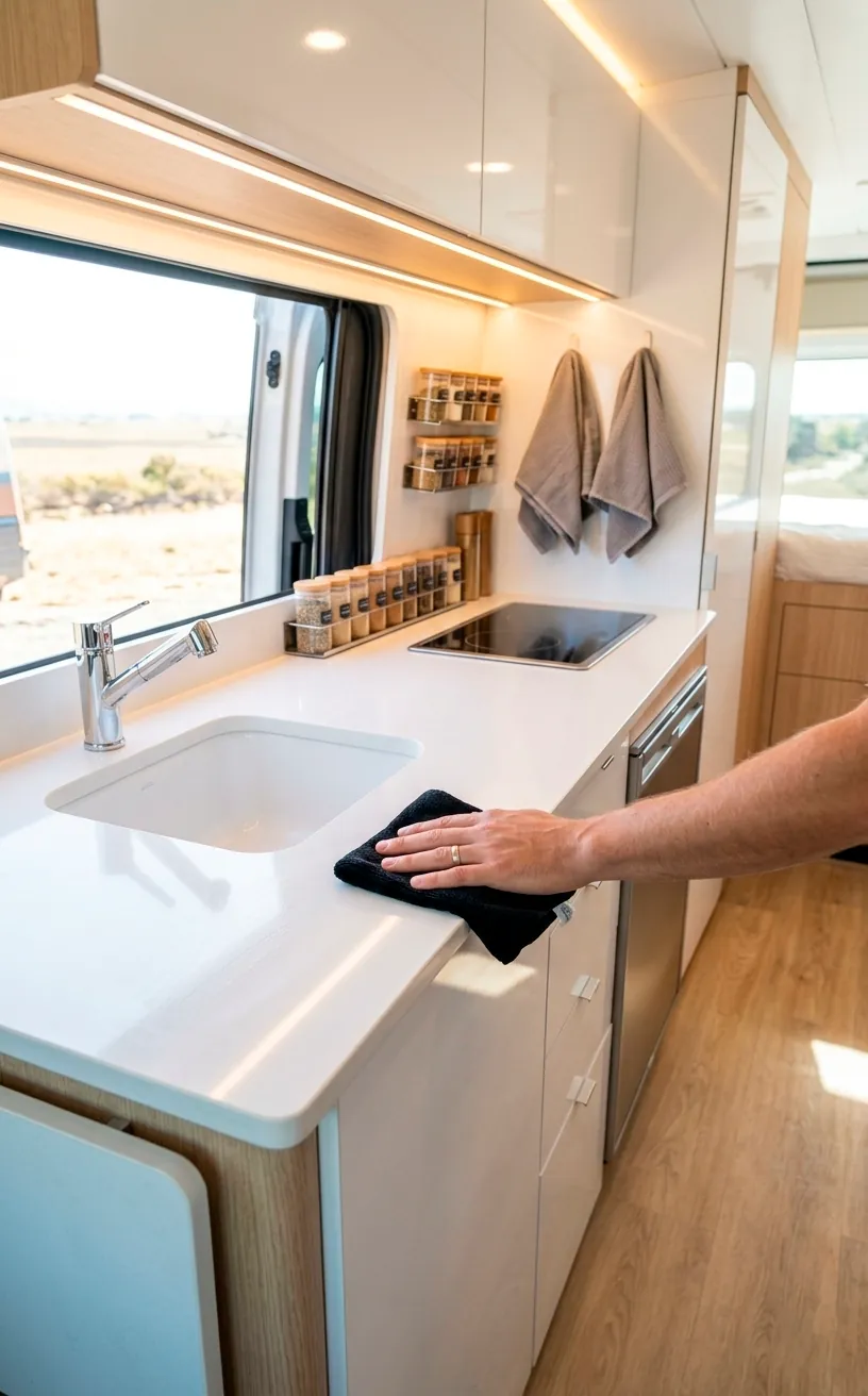
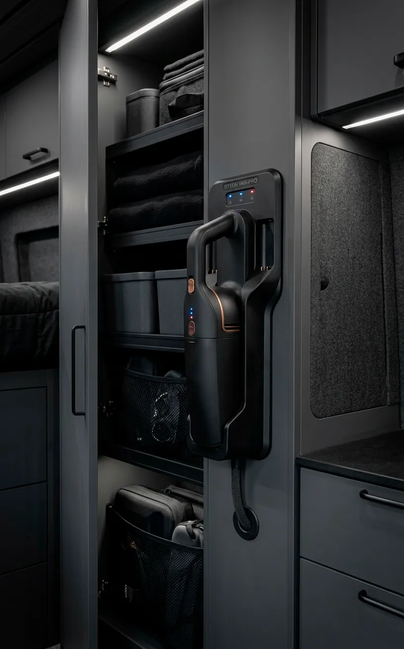
Maintenance: Keeping the White in Black and White
Let’s talk about the elephant in the room: cleaning. White surfaces show every spilled coffee, while black surfaces love to highlight dust. You’ll want a good handheld vacuum and some microfiber cloths handy.
IMO, the extra five minutes of wiping down counters is a small price to pay for a van that looks like a boutique hotel. It keeps you disciplined, right? You’ll appreciate the clean look every time you slide that door open.
Conclusion
Whether you’re a minimalist at heart or just want a van that stands out at the trailhead, monochrome is the move. It’s bold, it’s clean, and it’s surprisingly easy to pull off with the right textures. So, are you going to embrace the dark side or stick with the tired lumberjack aesthetic? Let me know which idea you’re grabbing first in the comments! 😎
Related posts
See AllEarthy Terracotta Sunroom Ideas for a Mediterranean Vibe
Transform your space into a sunny European retreat. Discover simple, earthy terracotta sunroom ideas that bring authentic Mediterranean vibes straight …
Read more15 Playful Memphis Style Attic Loft Ideas with Graphic Shapes
Transform your attic loft with playful Memphis style decor! Discover 15 bold ideas using graphic shapes, vibrant colors, and quirky …
Read more15 Custom Built-In Bed Ideas for a Luxury Kids Room
Ready to transform that chaotic playroom into a high-end sanctuary? Discover 15 jaw-dropping built-in bed ideas that blend luxury, smart …
Read moreA Step-by-Step Guide to Total Laundry Room Organization
Transform your chaotic laundry space into an organized, functional oasis with this step-by-step guide. We share smart storage hacks, sorting …
Read more