


Forget the ‘all-white’ minimalist aesthetic that has dominated our social feeds for way too long. Why settle for a house that looks like a sterile hospital wing when you can embrace the regal, moody, and downright delicious world of jewel tones? This year, I am obsessed with deep emeralds, piercing sapphires, and royal rubies. These colors don’t just sit there; they command the room and make every holiday gathering feel like a high-end gala. Trust me, your living room deserves this glow-up. Ready to see how we can turn your space into a literal treasure chest? Let’s get into the good stuff. 🥂
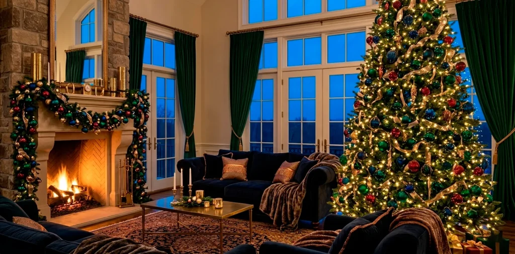
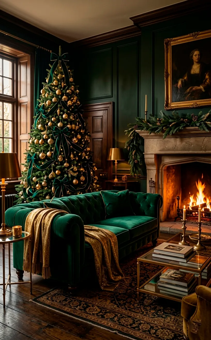
Emerald Green Velvet Accents
I always start with emerald green because it feels like the sophisticated older sibling of traditional forest green. It carries a weight and depth that instantly elevates a room from ‘standard Christmas’ to ’boutique hotel lobby.’ Have you ever noticed how a simple velvet texture makes a color look ten times more expensive? I certainly have.
I recommend swapping your standard cotton pillows for heavy emerald velvet ones. This simple switch adds a tactile richness that invites people to actually sit down and get cozy. If you want to take the luxe vibe even further, check out this emerald and gold luxury holiday guide.
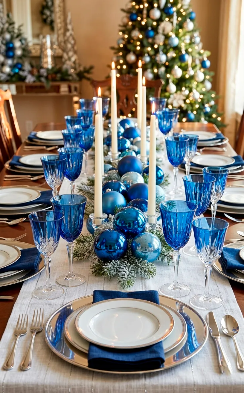
Sapphire Blue Glassware
Sapphire blue brings a cool, mysterious edge to the holiday table that red just can’t touch. TBH, I think sapphire is the most underrated holiday color in existence. It pairs beautifully with silver for a ‘winter wonderland’ look, or with gold if you want to lean into the royalty vibe. I love using chunky, cobalt-colored wine glasses or a massive sapphire glass pitcher as a centerpiece. The way the holiday lights catch the blue glass creates this ethereal glow that makes everything look like a dream. Plus, it hides red wine stains much better than clear glass does. Talk about a win-win! 🍷
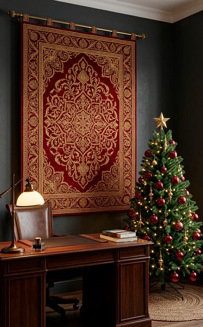
Ruby Red Wall Tapestries
Don’t confuse ruby with basic fire-engine red; we are going for that deep, wine-soaked crimson that feels grounded and historic. I find that a large ruby-toned tapestry or a heavy rug can anchor a room that otherwise feels a bit flighty.
You can hang these fabrics behind your tree to create a dramatic backdrop that makes the greenery pop. It provides a focal point that screams ‘I have my life together’ even if you just finished wrapping presents at 3 AM.
I personally love the way ruby interacts with warm-toned lighting. Ever wondered why old theaters use red velvet? It’s because it absorbs light in the most flattering way possible. It turns your living room into a stage for your holiday memories. ❤️
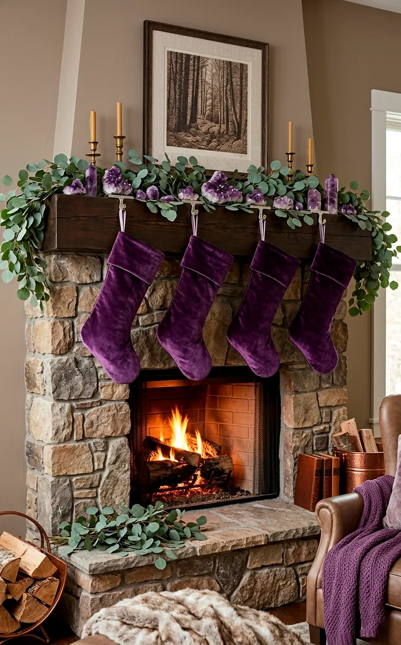
Amethyst Purple Stockings
Purple usually gets ignored during December, but amethyst is a game-changer for anyone wanting a unique look. I suggest ditching the itchy white fur stockings for something in a deep plum or amethyst shade. It adds a layer of mystery to the mantel that feels fresh and unexpected. IMO, nothing looks better against a stone fireplace than a row of dark purple stockings with gold embroidered names. It’s regal without being stuffy. If you’re feeling extra, mix them with some dried lavender sprigs for a scent that matches the aesthetic. 💅
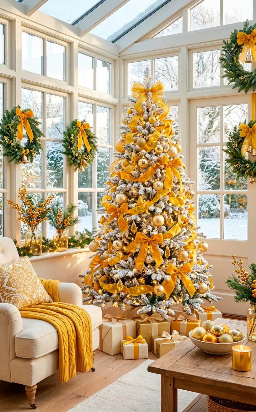
Citrine Yellow and Gold Mixes
Citrine is that bright, punchy yellow-gold that brings the sunshine into a dark winter room. I love mixing this with traditional gold to create depth. Using just one shade of gold can look flat and, frankly, a bit cheap.
Try adding citrine-colored silk ribbons to your wreaths. The yellow undertone makes the metallic gold around it look much more vibrant.
Does your room feel a bit too dark with all those moody blues and greens? This is your secret weapon to brighten things up without relying on boring white.
I find that citrine also works wonders in the kitchen. A bowl of lemons or some yellow-gold napkins can bridge the gap between your holiday decor and your everyday life seamlessly. ✨
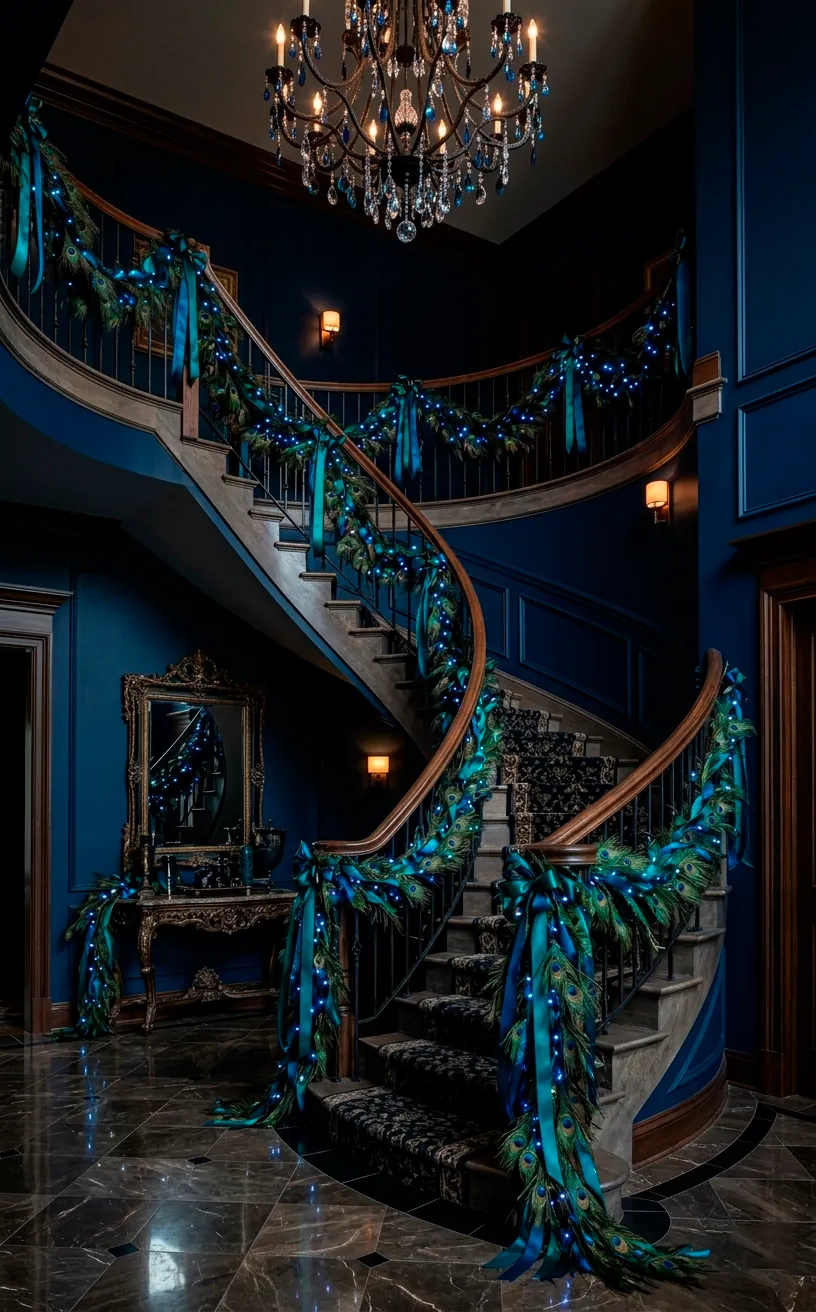
Peacock Feather Garlands
If you want to lean into the maximalist vibe, peacock-colored garlands are the way to go. These combine teal, sapphire, and emerald into one stunning piece. I usually drape these over a mirror or along a staircase railing for maximum impact.
It feels a bit ‘Great Gatsby,’ doesn’t it? That’s exactly the point. We want drama, we want texture, and we definitely want our guests to ask, ‘Where did you get that?’
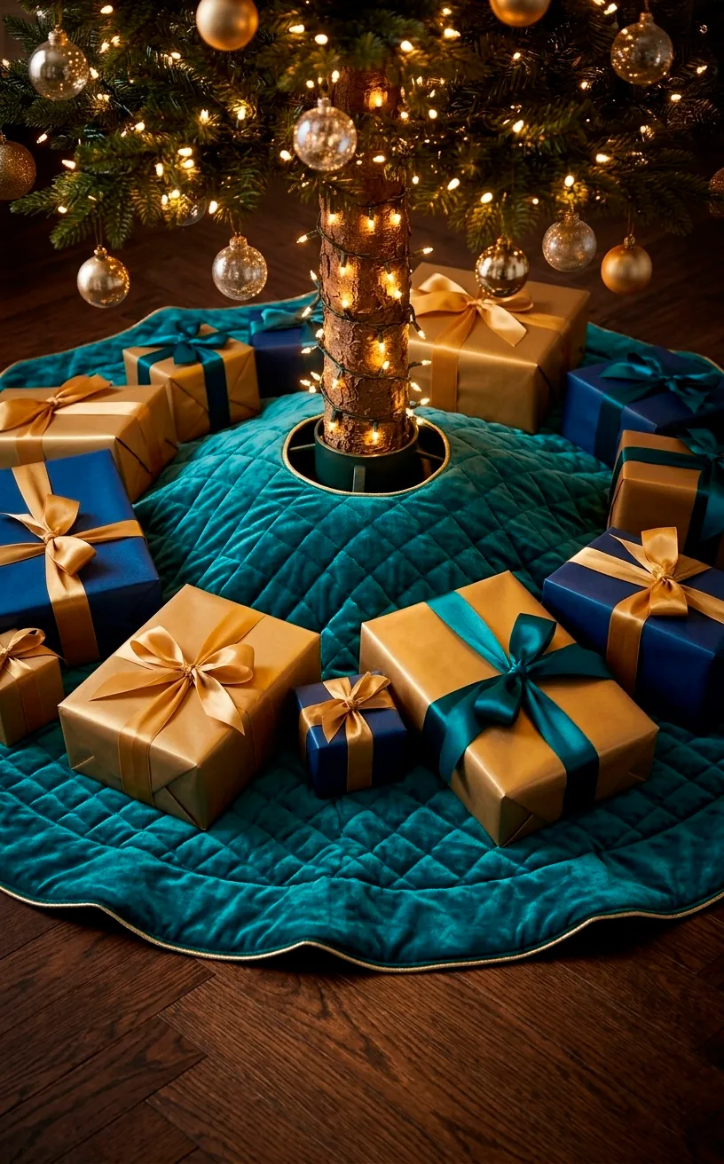
Teal Velvet Tree Skirts
The tree skirt is usually an afterthought, but I think it’s the foundation of your entire tree design. A teal velvet skirt creates a moody, deep base that makes your floor look like a shimmering pool.
I hate those flimsy felt skirts that collect every single cat hair in a five-mile radius. Go for a heavy, quilted teal velvet instead.
It provides a beautiful contrast if you have light wood or white tile floors. It’s like adding a tailored suit to the bottom of your tree. 🎄
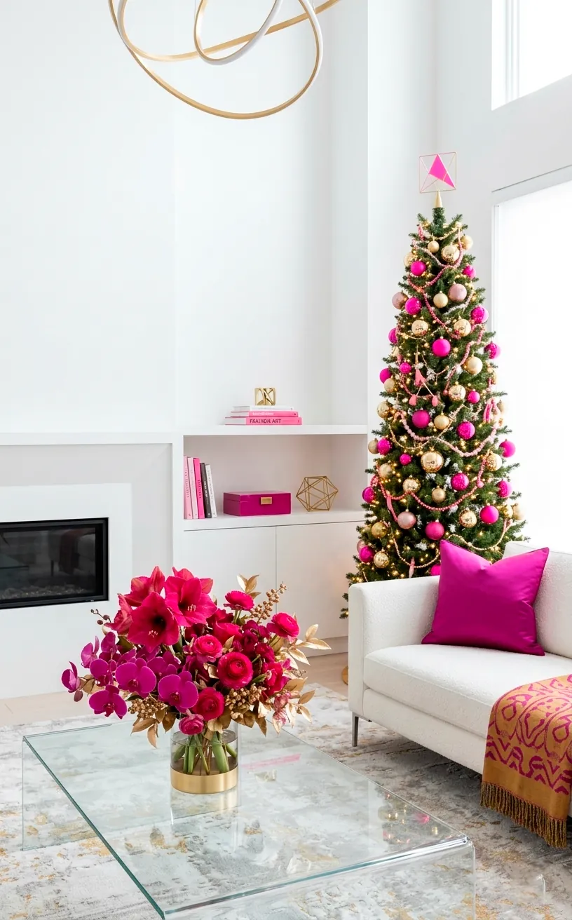
Magenta and Fuchsia Pops
For the truly brave, adding magenta or fuchsia can break up the seriousness of a jewel-toned room. I like to call this the ‘electric jewel’ look. Think of it as the neon sign of the holiday season. Use it sparingly, like in a few select ornaments or a bold floral arrangement. It adds a modern, playful energy that prevents the room from feeling like a dusty museum. IMO, it’s the ultimate way to show your personality. For more inspo on what’s hot, peek at these vibrant 2026 Christmas color trends. 🤩
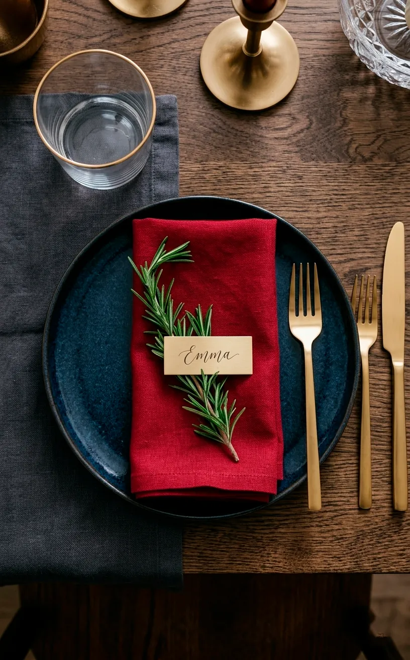
Gold and Brass Flatware
Your dinnerware should join the party too! I swapped my silver forks for gold-toned brass years ago and never looked back.
Gold flatware acts as the ‘jewelry’ for your table. When you place it next to sapphire plates or ruby napkins, the whole setting just glows.
Why use boring stainless steel when you can eat like royalty for a few weeks?
Just make sure you hand-wash them; nobody wants to see their beautiful gold finish peeling off because of a harsh dishwasher cycle. It’s a small price to pay for such a stunning look. 🙌
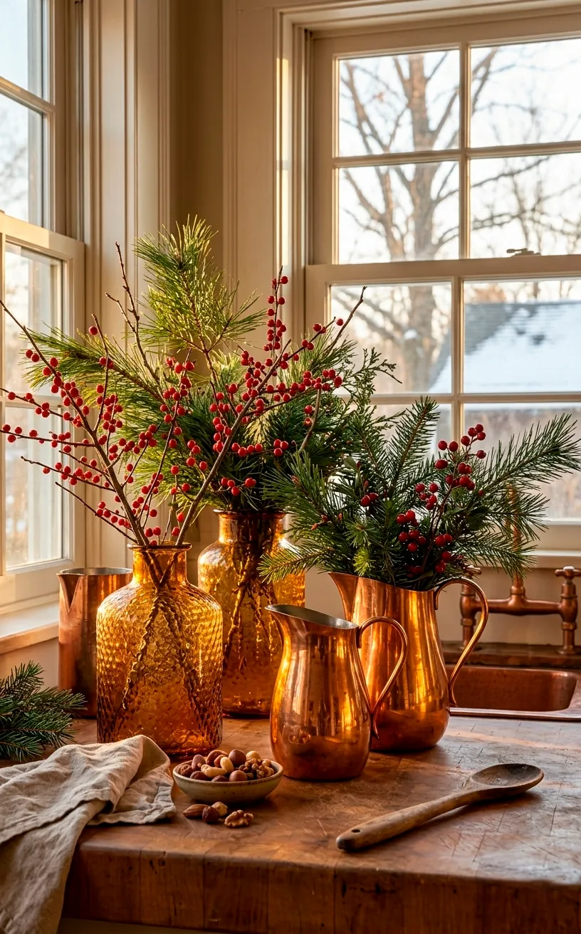
Copper and Amber Vases
Copper is the earthy cousin of the jewel-tone family. It brings a warmth that feels very ‘homey’ but still upscale. I love using amber-colored glass vases filled with eucalyptus and gold-sprayed berries.
The orange-gold hue of copper perfectly complements the deep blues and greens of the other jewel tones. It’s the glue that holds the palette together, honestly.
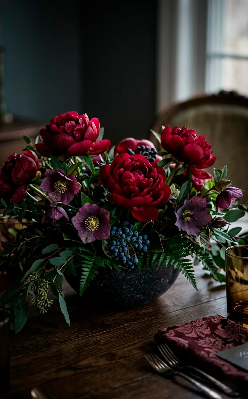
Deep Floral Centerpieces
Ditch the grocery store carnations and go for something moody. I am talking dark burgundy dahlias, deep purple anemones, and maybe some navy berries. A jewel-toned floral arrangement acts as a living piece of art. I find that placing these in a low, wide bowl allows for easy conversation across the table while still looking incredibly lush. It’s a literal breath of fresh air in a room full of tinsel. 🌿
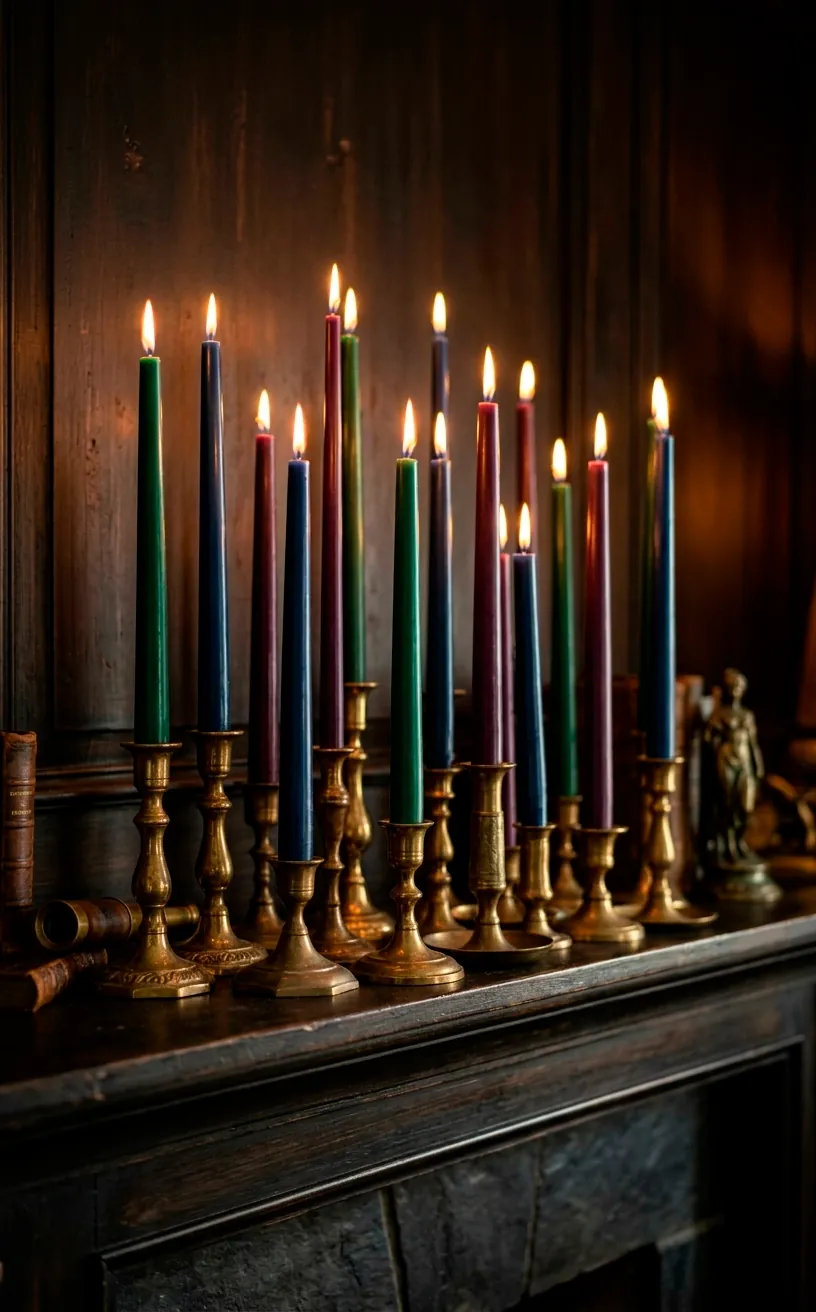
Moody Jeweled Candles
Lighting is everything. If you use harsh, white lights, your jewel tones will look flat and dull. I recommend using colored taper candles in shades of emerald, plum, and navy.
When they melt, the colored wax dripping down looks like actual melting jewels. It’s a bit dramatic, sure, but isn’t that what we’re here for?
I always group them in mismatched vintage brass holders to create a layered, ‘collected over time’ look. It’s an easy way to add height and interest to any surface. 🕯️
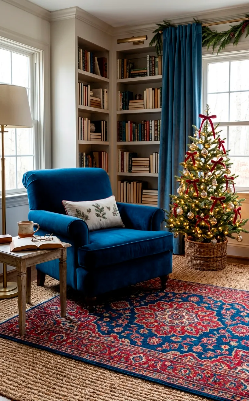
Layered Jewel-Toned Rugs
If you really want to commit to the bit, layer your rugs. I love placing a smaller, vibrant jewel-toned Persian rug over a larger, neutral jute one. This adds color and warmth to the floor without overwhelming the entire space.
It feels intentional and curated. Plus, it’s a great way to hide any holiday cookie crumbs that inevitably fall during the festivities. Practicality meets style, folks! 🛋️
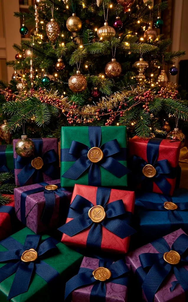
Midnight Navy Ribbons
Midnight navy is the new black for the holiday season. I use it for everything from gift wrapping to tree garlands. It provides a depth that black lacks, making the surrounding colors feel more vibrant.
I love a wide, grosgrain navy ribbon tied in big, floppy bows on the tips of tree branches. It’s such a simple DIY that looks incredibly expensive.
Seriously, go buy a huge spool of navy ribbon. You will thank me later when your tree looks like it was decorated by a professional.
It’s also great for tying around napkins or even hanging ornaments from the ceiling. The possibilities are endless, TBH. 🎀
The Maximalist Jewel Mantel
Finally, bring it all together on the mantel. This is where you can go wild. Mix the emerald garlands, the amethyst stockings, and the citrine candles. Add some gold-sprayed pomegranates for a touch of natural jewel tones. I find that a crowded mantel actually looks better than a sparse one when you’re working with these rich colors. It creates a sense of abundance and joy that perfectly captures the holiday spirit. Don’t be afraid to overdo it! LOL 💎

Conclusion
Switching to a jewel-toned palette is the easiest way to make your holidays feel intentional, luxurious, and a whole lot of fun. Whether you’re just adding a few emerald pillows or going full ‘peacock’ with your garlands, these colors bring a life and energy that beige just can’t compete with. So, which of these bold ideas are you grabbing first? I’m personally starting with the navy ribbons! Let me know in the comments how you’re styling your space this year. Happy decorating, and stay bold! 🏠
Related posts
See AllEarthy Terracotta Sunroom Ideas for a Mediterranean Vibe
Transform your space into a sunny European retreat. Discover simple, earthy terracotta sunroom ideas that bring authentic Mediterranean vibes straight …
Read more15 Playful Memphis Style Attic Loft Ideas with Graphic Shapes
Transform your attic loft with playful Memphis style decor! Discover 15 bold ideas using graphic shapes, vibrant colors, and quirky …
Read more15 Custom Built-In Bed Ideas for a Luxury Kids Room
Ready to transform that chaotic playroom into a high-end sanctuary? Discover 15 jaw-dropping built-in bed ideas that blend luxury, smart …
Read moreA Step-by-Step Guide to Total Laundry Room Organization
Transform your chaotic laundry space into an organized, functional oasis with this step-by-step guide. We share smart storage hacks, sorting …
Read more