


You look at that giant empty space above your mantel every day and feel the urge to do something great. I’ve been there, staring at a blank wall while drinking lukewarm coffee, wondering why my living room feels so lopsided. Symmetry offers the easiest shortcut to a house that looks like a professional designer lived there. Let’s fix that wall once and for all.
The Visual Power of Order
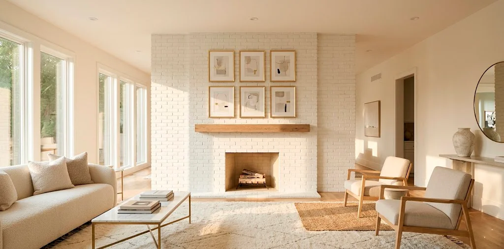
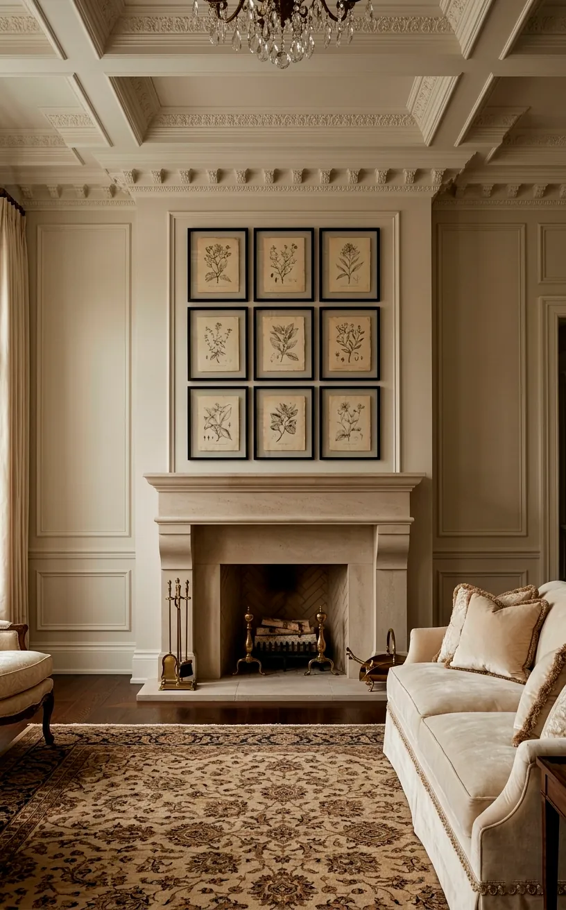
Symmetry works because our brains crave order. When you walk into a room and see a perfectly balanced grid, your stress levels actually drop. I call this the ‘Zen Effect’ of interior design. Why settle for chaos when you can have a focal point that commands attention? A symmetrical layout above your fireplace creates a sense of stability and height. It draws the eye upward, making your ceilings feel taller than they actually are. Honestly, it’s the oldest trick in the book for a reason. You just need a few matching frames and a vision to pull this off properly.
Finding Your True Center
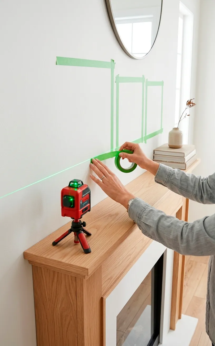
Everything starts with the center line of your fireplace. If you miss this by even an inch, the whole thing looks like a glitch in the Matrix. I usually grab some painter’s tape and mark the exact midpoint of the mantel before I even touch a hammer.
Ever noticed how a slightly off-center frame ruins your mood? It’s basically the interior design version of an itch you can’t scratch. Spend the extra five minutes finding the ‘dead center’ point on your wall. This acts as the anchor for your entire grid.
Once you find it, use a pencil to lightly mark where the middle of your central frames will sit. This tiny step saves you from turning your wall into Swiss cheese with unnecessary nail holes later. You can learn more about creating a balanced focal point in my guide to achieving a perfect mantel.
Frame Selection for a Cohesive Look
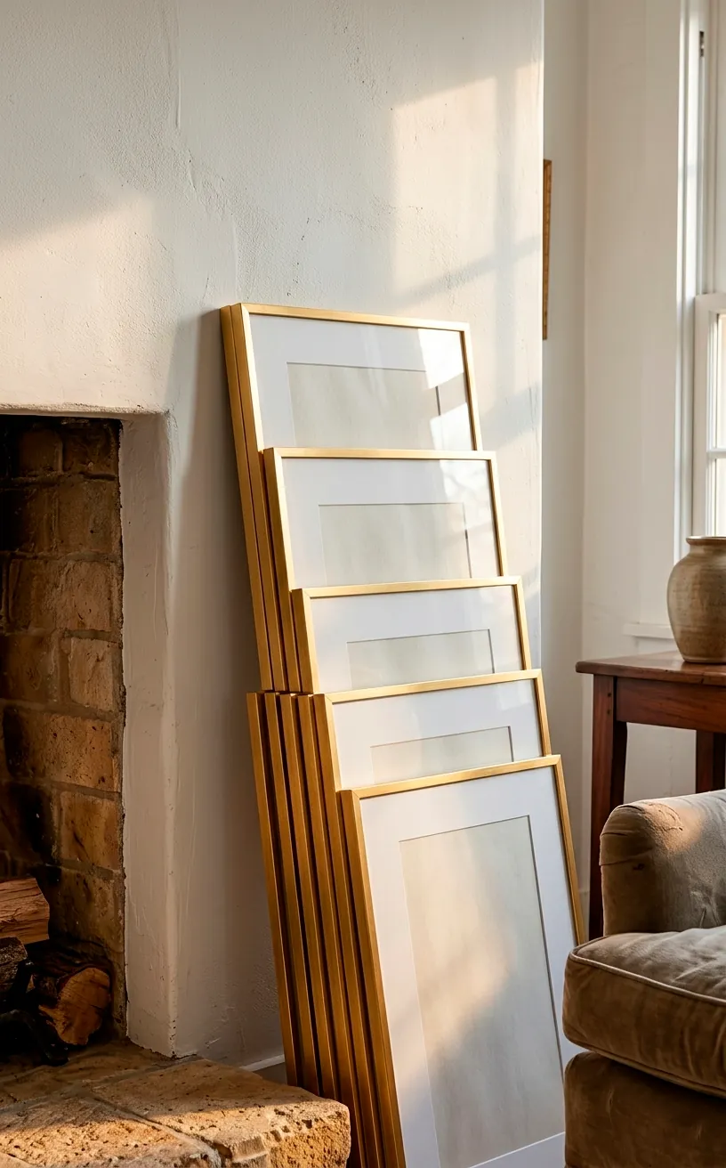
Consistency is king here, IMO. For a symmetrical wall, you need identical frames. Don’t try to mix ‘shabby chic’ with ‘industrial’ unless you want a headache. I personally love thin metal frames for a modern vibe, but thick wood works great for a cozy farmhouse feel.
Matching frames provide the ‘grid’ structure that makes the symmetry pop. If the frames vary even slightly in size, the whole illusion of perfect balance disappears faster than my motivation on a Monday morning. Pick one style, one color, and one size, then stick to it for the entire display.
Measuring Twice and Crying Zero Times
Math is the enemy of fun, but it’s the best friend of a gallery wall.
I always calculate the spacing between frames before I start. Two or three inches is usually the sweet spot. Anything wider looks like the frames are trying to escape each other.
Layout your frames on the floor first. This lets you see the ‘real world’ spacing without committing to the wall. I’ve spent hours sliding frames around on my rug just to get the gap perfect. FYI, it’s way easier to move a frame on the floor than to patch a hole in the drywall.
Do you have a level? Use it. Do you have a steady hand? Don’t trust it. Gravity always wins, so verify every single line with a tool. This prevents the dreaded ‘slanted grid’ that makes your guests tilt their heads in confusion.

The Art of Choosing Your Subject
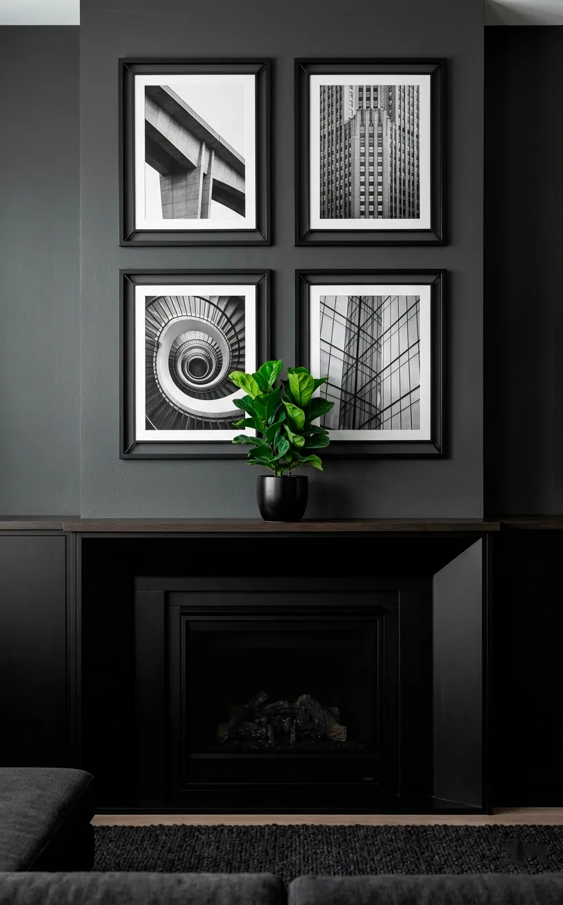
What goes inside the frames matters just as much as the layout. Since the fireplace is the heart of the room, choose art that reflects your personality. I’m a fan of black and white photography for a timeless look. It keeps the symmetry looking clean and intentional.
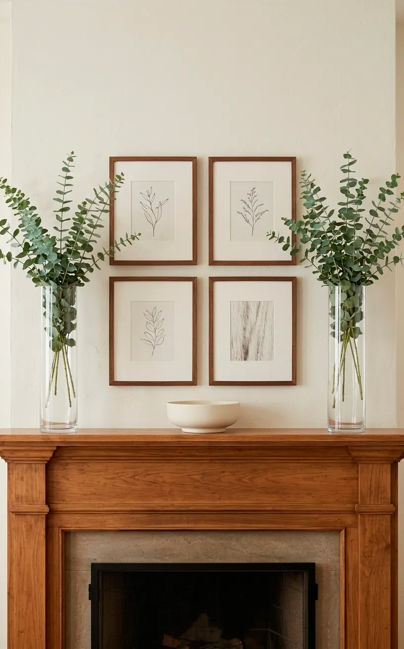
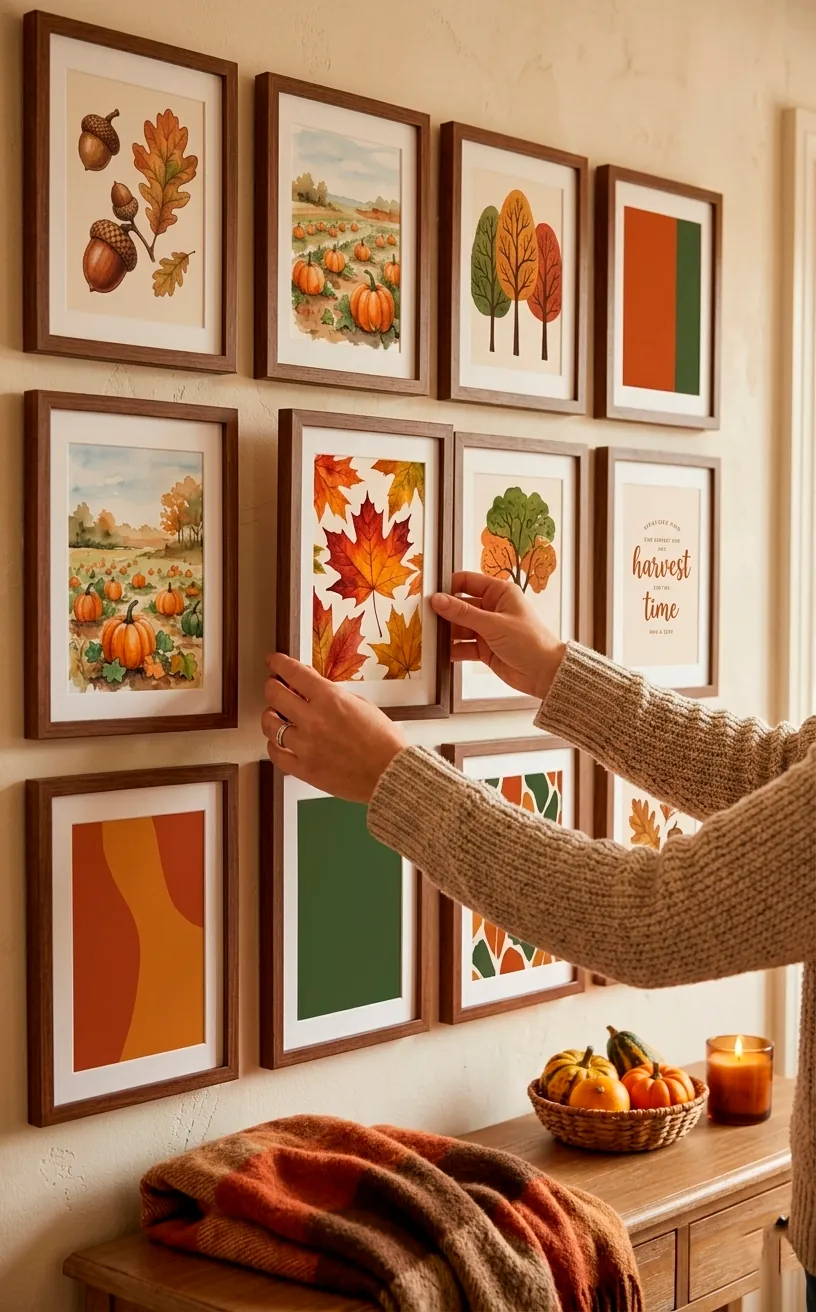
You could also go for a series of sketches or even pressed leaves if you like a nature-inspired aesthetic. Just ensure the color palette stays consistent across all pieces. If one frame is neon pink and the rest are beige, your symmetry is going to feel broken. Consistency in the art content reinforces the overall balance of the grid.
The Grid Layout Explained
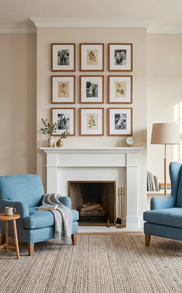
A standard grid—like a 2×2 or a 3×2—is the safest bet for fireplace decor. It fits the rectangular shape of the mantel perfectly. I usually recommend keeping the bottom row about 6 to 10 inches above the mantel surface. This leaves room for a few decorative objects without crowding the art. If you go too high, the art looks like it’s floating away to the ceiling. If you go too low, it feels like it’s resting on the mantel’s shoulders. Find that middle ground where the art and the fireplace feel like one cohesive unit.
Lighting Your Masterpiece
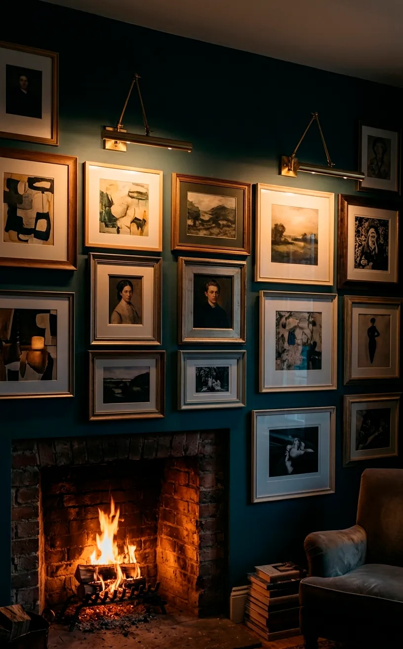
Bad lighting can kill a great gallery wall. If your fireplace is in a dark corner, your art will just look like a series of black rectangles. I love using battery-operated picture lights that you can stick right above the frames. They add a museum-quality glow without the need for an electrician.
Natural light is great, but watch out for glare. If your frames have glass, a bright window can turn your art into a mirror. I sometimes swap standard glass for non-reflective acrylic to keep the focus on the images. Proper lighting turns a simple wall into a ‘moment’ in your home. For more ways to set the mood, check out these intimate lighting ideas for your living room.
Imagine sitting by the fire with the gallery wall softly illuminated. It creates an atmosphere that feels both cozy and expensive. Don’t skip the lighting; it’s the finishing touch that brings the whole project to life.
Bridging the Mantel Gap
The space on the mantel itself shouldn’t compete with the gallery wall. Since your wall is symmetrical, your mantel decor should follow suit. I usually place matching candlesticks or vases on either end of the mantel to ‘bookend’ the art. This creates a full frame-within-a-frame look.
Avoid placing tall, distracting items in the center of the mantel. You don’t want a giant vase blocking the bottom half of your favorite photo. Keep the center clear or use low-profile items like a small bowl or a stack of books. This keeps the visual path to your gallery wall wide open and unobstructed.
Avoiding the ‘Museum of Boredom’
Symmetry doesn’t have to mean boring. Some people worry a grid looks too stiff or formal. To fix this, I inject some life into the art itself. Mix a few personal family photos with abstract patterns or travel shots. It keeps the grid organized but the content feels human.
Whatever you do, don’t hang your frames too far apart. It’s the most common mistake I see. When frames are 12 inches apart, they stop looking like a collection and start looking like lost children. Keep them tight and tidy.
Also, check your heights. I once hung a whole grid only to realize it was 2 inches lower on the left side. My eye twitched for a week until I fixed it. Use a level. Seriously. Use it.
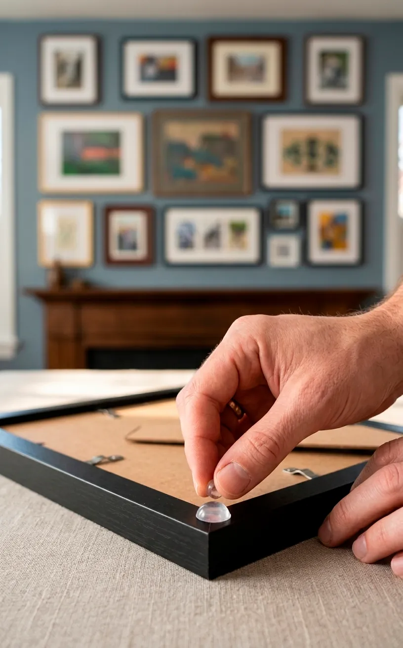
Finally, make sure your frames are actually level. I know I said it already, but it’s that important. Even a half-degree tilt will drive you crazy once you notice it. Use small adhesive dots on the back corners of the frames to keep them from shifting when someone slams a door.
Rotating Art for the Seasons
One of the best things about a grid is how easy it is to update. You don’t have to move the nails; just swap the art inside the frames. I put up botanical prints in the spring and switch to moodier landscapes or family holiday photos in December. It keeps the room feeling fresh without a full renovation.
It’s like giving your fireplace a new outfit every few months. Since the frames stay in their perfect symmetrical spots, the process takes ten minutes. It’s the ultimate low-effort, high-impact decor hack. Plus, it gives you an excuse to print all those photos sitting on your phone.
Conclusion
Designing a symmetrical gallery wall above your fireplace is the ultimate way to bring balance and style to your home. By choosing matching frames and measuring with precision, you create a timeless look that never goes out of fashion. Now that you have the blueprint, which frame color are you going to choose first? Let me know in the comments, and go grab that level—your wall is waiting for its glow-up!
Related posts
See AllEarthy Terracotta Sunroom Ideas for a Mediterranean Vibe
Transform your space into a sunny European retreat. Discover simple, earthy terracotta sunroom ideas that bring authentic Mediterranean vibes straight …
Read more15 Playful Memphis Style Attic Loft Ideas with Graphic Shapes
Transform your attic loft with playful Memphis style decor! Discover 15 bold ideas using graphic shapes, vibrant colors, and quirky …
Read more15 Custom Built-In Bed Ideas for a Luxury Kids Room
Ready to transform that chaotic playroom into a high-end sanctuary? Discover 15 jaw-dropping built-in bed ideas that blend luxury, smart …
Read moreA Step-by-Step Guide to Total Laundry Room Organization
Transform your chaotic laundry space into an organized, functional oasis with this step-by-step guide. We share smart storage hacks, sorting …
Read more