


Let’s face it, doing laundry usually ranks somewhere between getting a root canal and watching paint dry. But what if we magically transformed that dreaded chore zone into a dreamy, soothing retreat? I recently overhauled my own dingy wash space, and honestly, color changes absolutely everything. Let’s explore some incredibly pretty pastel palettes!
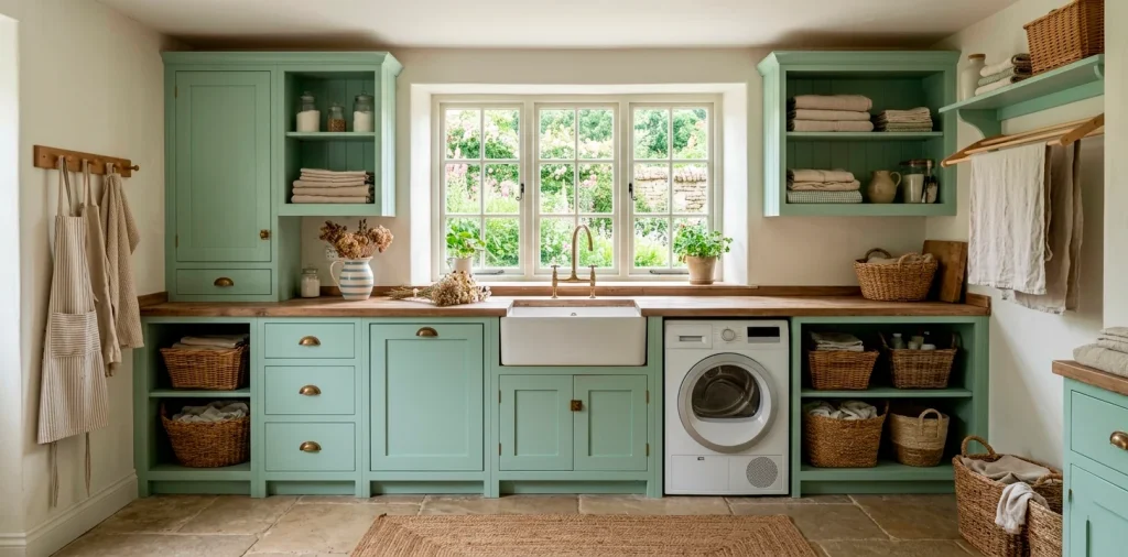
Mint Green and Soft Butter Yellow
Imagine stepping into a room that permanently feels like a fresh, sunny spring morning. I painted my own lower cabinets a crisp mint green last year, and suddenly, folding socks didn’t feel entirely tragic. Combining mint cabinetry with soft butter-yellow beadboard walls creates an uplifting, cheerful atmosphere. The yellow bounces natural light around the room beautifully, while the green grounds the space in nature. Ever wondered why vintage cottage kitchens feel so welcoming? This exact color combination is usually the secret ingredient.

Lavender Haze and Creamy White
Lavender is having a massive moment in interior design right now, IMO. People often shy away from purple tones, but a muted, dusty lavender acts beautifully as a soft neutral.
Pairing this delicate shade with creamy, off-white trim creates a sophisticated yet incredibly cozy atmosphere. The creamy white softens the cooler tones of the lavender, preventing the room from feeling chilly during winter months.
You can easily elevate this entire look by swapping out basic handles for vintage glass knobs. Want to upgrade those doors? Check out these creative hardware styles for your laundry room cabinets.

Blush Pink and Warm Taupe
Blush pink definitely isn’t just for nurseries anymore. Grounding a soft, delicate pink with a warm taupe base cabinet prevents the room from looking like a giant marshmallow. Because let’s be real, absolutely nobody wants to scrub grass stains out of jeans inside a piece of candy.
The warm taupe provides a beautifully mature, earthy foundation that makes the pink feel intentional and chic. I highly recommend bringing in woven wicker baskets and natural wood shelving to bridge these two colors together. It creates a stunningly warm, inviting aesthetic that makes laundry day infinitely more bearable.

Powder Blue and Sandy Beige
Coastal grandma vibes, anyone? This palette instantly transports you straight to a breezy seaside cottage.
Powder blue walls genuinely lower your blood pressure the second you walk in. I swear, looking at soft blue hues actually makes dealing with stubborn stains less stressful.
Ground this airy color with sandy beige floor tiles.
This sandy tone hides lint and loose pet hair surprisingly well, which is a massive win in my book. You get the beauty of a light floor without the constant need to sweep every five minutes.

Peach Fuzz and Sage Green
Combining warm peach tones with earthy sage green produces a stunningly beautiful, organic feel. I actually spotted this exact combination in an old historic farmhouse last summer, and it looked absolutely spectacular. The warmth of the peach perfectly balances the cooler, herbal undertones of the sage green. It feels delightfully retro without stepping into outdated territory.
To pull this off seamlessly, consider incorporating natural textures. Design elements to include:
- Woven rattan light fixtures
- Unlacquered brass cabinet hardware
- Terracotta floor tiles
Discover more sage green accents for a rustic country vibe.

Pistachio and Crisp Linen
Pistachio is that quirky, fun cousin of mint green that brings a tiny bit more warmth and personality to a space. When you pair a pistachio-painted wooden folding station with crisp linen-white walls, you get an unbelievably fresh cottage aesthetic. I promise you, folding endless mountains of white towels feels significantly less tedious when your surroundings look this cute. The slight yellow undertone in pistachio warms up rooms that lack natural sunlight. Add a simple jute rug, and you immediately achieve a beautifully balanced, incredibly charming utility room.

Seafoam and Pale Terracotta
Want something a little bit more grounded and earthy? Seafoam brings that crisp, salty ocean breeze directly indoors, while pale terracotta introduces a lovely, rustic Mediterranean charm.
I love using terracotta hues on the floor. Think beautifully faded, chalky brick-style tiles rather than anything too bright or orange.
This combination gives your laundry space a gorgeous, sun-baked cottage feel. You can tie the whole look together simply by placing a few small clay pots filled with fresh eucalyptus on your open floating shelves.

Lilac and Silver Gray
Lilac brings a surprisingly cool, floral note that pairs brilliantly with silver-gray tones. Have you ever wondered why ultra-modern appliances look so violently out of place in cozy cottage rooms? Gray paint effortlessly bridges that awkward aesthetic gap.
By painting your utility cabinets a soft silver-gray, you tie those shiny modern washers directly into the room’s design. Add soft lilac wallpaper above the wainscoting, and the whole space immediately softens. It transforms a highly functional, metallic space into a gentle, romantic cottage haven.

Lemon Chiffon and Robin’s Egg Blue
This palette delivers pure, unadulterated vintage nostalgia. It instantly brings back memories of fresh lemonade and crisp spring mornings.
Try painting your upper cabinets a soft lemon chiffon. The pale yellow keeps the upper half of the room feeling light, airy, and open.
Then, install robin’s egg blue beadboard wainscoting on the lower half of the walls.
This dynamic combination absolutely screams 1950s cottage charm. Just add a vintage-inspired runner rug and some cute glass jars for your detergent pods to complete this incredibly joyful, vibrant aesthetic.

Icy Pink and Charcoal Slate
Okay, I fully realize that charcoal isn’t exactly a pastel, but hear me out! Pairing an icy, barely-there pink with a deep charcoal slate floor creates the ultimate high-contrast cottage look. The dark slate floors brilliantly hide muddy paw prints and grass clippings—an absolute lifesaver, honestly. Meanwhile, the icy pink walls bounce all that glorious natural light around the room, keeping the space bright and cheerful. It strikes a perfect balance between soft cottage charm and practical, hard-working utility. You get a pretty space that actually handles real life.

Conclusion
Color holds the magical power to transform our most dreaded household chores into moments of peaceful retreat. Whether you lean toward the crispness of pistachio or the vintage nostalgia of lemon chiffon, there is a pastel palette perfect for your home. Which beautiful hue are you grabbing a paintbrush for first? Let me know in the comments! 😉
Related posts
See AllThe Ultimate Guide to Styling a Minimalist Summer Guest House
Get ready to turn that dusty backyard shed or spare room into a stunning, clutter-free summer retreat. Discover the easiest …
Read more15 Space-Saving Furniture Finds for a Compact Camper Van
Maximize every inch of your camper van with these 15 clever, space-saving furniture finds. From foldable tables to hidden beds, …
Read moreDIY Modern Dried Floral Hoop: An Easy Autumn Tutorial
Learn how to craft a stunning DIY modern dried floral hoop for autumn. This easy tutorial walks you through supplies, …
Read more10 Statement Pieces That Every Dream Home Needs
Upgrade your space from basic to breathtaking. Discover the ten ultimate statement pieces that instantly inject personality, luxury, and jaw-dropping …
Read more