












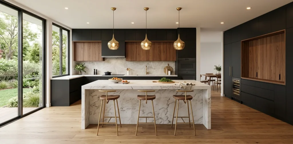

Tired of staring at a monochrome kitchen that puts you to sleep before you even brew your morning coffee? I completely feel your pain. Two-tone cabinets offer the ultimate escape from boring designs, instantly breathing life into your space. Let me walk you through my absolute favorite pairings that guarantee a massive style upgrade without needing a full demolition crew.
Navy Blue and Crisp White
You simply cannot go wrong with the classic tuxedo look, but with a nautical twist. Painting your lower cabinets a deep, grounding navy blue while keeping the uppers bright white creates an illusion of higher ceilings. I actually did this in my last apartment, and the transformation blew my mind. The dark bottom hides scuffs and spills (because I drop things constantly), while the white tops reflect light beautifully. Want to nail this aesthetic perfectly? Upgrade your doors with brushed brass cabinet pulls or pair the scheme with a glossy white subway tile backsplash to really make that blue pop. FYI, if you want a deeper look at this vibe, check out this guide on classic navy blue dark cabinets brass hardware.

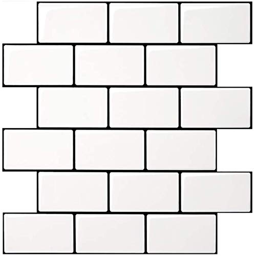
Art3d 10-Pack Subway Tiles Peel and Stick Backsplash, White, 12 x 12 Inch
View on AmazonCERTAIN CONTENT THAT APPEARS ON THIS SITE COMES FROM AMAZON. THIS CONTENT IS PROVIDED “AS IS” AND IS SUBJECT TO CHANGE OR REMOVAL AT ANY TIME.
Sage Green and Natural Oak
Ever feel like your kitchen needs to take a deep breath and chill out? Sage green mixed with natural oak wood brings the serenity of nature right indoors.
I highly recommend keeping the wood tones on your island or lower units to anchor the room, paired with minimalist natural oak counter stools. Then, splash that soft, earthy sage across the rest of the cabinetry.
This combination feels incredibly organic and grounded. It gives off major cozy cottage energy without feeling dated or heavy. Plus, trailing greenery in ceramic indoor plant pots looks absolutely amazing against this backdrop, making your morning routine feel like a walk through a botanical garden.


EYYTHUNG Counter Height Stools Set of 2, Farmhouse 25” Bar Stools with Solid Wood Legs & Back, Mid Century Modern Barstools Chairs for Kitchen Island, Dining Room, Cafe, Pub, Natural Oak
View on Amazon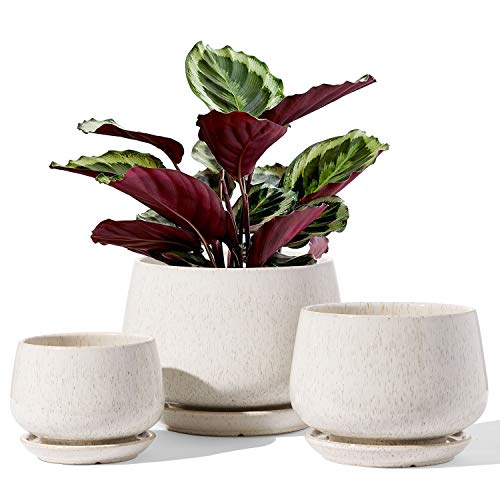
LE TAUCI Plant Pots, 4.1+5.1+6.5 inch, Set of 3, Reactive Glaze Beige
View on AmazonCERTAIN CONTENT THAT APPEARS ON THIS SITE COMES FROM AMAZON. THIS CONTENT IS PROVIDED “AS IS” AND IS SUBJECT TO CHANGE OR REMOVAL AT ANY TIME.
Matte Black and Warm Walnut
If you crave drama and modern sophistication, you need this combo in your life immediately. Matte black upper cabinets make a massive, bold statement, while warm walnut lowers keep the space from feeling like a sterile laboratory.
The rich grain of the walnut, beautifully enhanced with a food-safe wood conditioner, perfectly balances the stark, light-absorbing qualities of matte black. I love incorporating sleek, handle-less doors or low-profile matte black finger pulls here to maintain that ultra-modern, seamless aesthetic. This pairing screams luxury and tells your guests you know exactly what you are doing with your interior design.

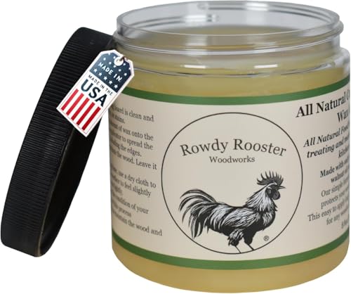
Cutting Board Wax- Refined Walnut Oil for Wood and Beeswax, 8 fl.oz
View on Amazon
Satanga Edge Black Finger Pull for cabinets Kitchen Concealed Drawer pulls Aluminum Flat Hidden Back Mount Door Handle for Home 5Pack Modern 4.72" Overall Length Easy Installation
View on AmazonCERTAIN CONTENT THAT APPEARS ON THIS SITE COMES FROM AMAZON. THIS CONTENT IS PROVIDED “AS IS” AND IS SUBJECT TO CHANGE OR REMOVAL AT ANY TIME.
Charcoal Gray and Soft Cream
Let us talk about the ultimate transitional pairing.
Charcoal gray delivers almost as much contrast as black, but it feels significantly softer and more approachable.
Pair those moody gray lower cabinets, easily achieved using a high-quality charcoal gray cabinet paint, with warm, creamy off-white uppers. The cream undertones prevent the room from feeling icy or unwelcoming.
You get a highly sophisticated look that works just as beautifully in a rustic farmhouse as it does in a downtown loft. Throw in some sleek brushed nickel cabinet handles, and you have a total masterpiece. Honestly, this might be the most foolproof color scheme on the planet.


Nuvo Cabinet Paint, Earl Grey (Quart)
View on Amazon
Ravinte Cabinet Handles, Brushed Nickel,5" Length,3" Hole Center,30 Pack
View on AmazonCERTAIN CONTENT THAT APPEARS ON THIS SITE COMES FROM AMAZON. THIS CONTENT IS PROVIDED “AS IS” AND IS SUBJECT TO CHANGE OR REMOVAL AT ANY TIME.
Terracotta and Warm Off-White
Ready for something a little spicy? Terracotta brings incredible warmth and a Mediterranean flair—incorporating a terracotta kitchen canister can really lean into that vibe—that instantly makes your kitchen feel like a sunny vacation spot.
Combine earthy terracotta base cabinets with warm off-white uppers and brushed brass handles to keep the space airy and bright. I adore how this combo shifts in tone throughout the day as natural light hits it, particularly when anchored by a boho kitchen runner. It feels rich, inviting, and wonderfully unexpected compared to the usual neutrals people default to. You literally cannot feel sad cooking in a kitchen this vibrant.


Henry Watson - Airtight Coffee Canister - Terracotta - Made in England - 6.5 inches x 4.4 inches - The Original Suffolk Collection
View on AmazonCERTAIN CONTENT THAT APPEARS ON THIS SITE COMES FROM AMAZON. THIS CONTENT IS PROVIDED “AS IS” AND IS SUBJECT TO CHANGE OR REMOVAL AT ANY TIME.
Midnight Blue and Light Ash Wood
This combination delivers serious Scandinavian vibes mixed with moody elegance, accented beautifully by minimalist wooden cutting boards. A deep midnight blue on your island—perhaps paired with sleek Scandinavian bar stools—contrasts spectacularly with light ash wood perimeter cabinets. The cool tones of the blue harmonize perfectly with the pale, subtle grain of the ash, creating a balanced, zen-like atmosphere. I once helped a friend paint her island this exact shade and accessorized with navy blue kitchen towels, and it completely revolutionized her open-concept living space. If you want a setup that looks effortlessly expensive and incredibly trendy, you definitely need to consider this pairing.


Non-Toxic Acacia Cutting Board Set of 3, Mineral Oil Free, Plastic Free
View on Amazon
Nathan James Kirsten Scandinavian Backless Wooden Bar Stool, Boucle Bar Stool with Tapered Solid Wood Legs, Boucle/Light Brown
View on AmazonCERTAIN CONTENT THAT APPEARS ON THIS SITE COMES FROM AMAZON. THIS CONTENT IS PROVIDED “AS IS” AND IS SUBJECT TO CHANGE OR REMOVAL AT ANY TIME.
Emerald Green and Warm Beige
Jewel tones always bring the drama, and emerald green sits right at the top of the luxury hierarchy.
When you pair a bold, saturated emerald with a soft, warm beige, you create a sophisticated contrast that avoids looking too intense. The beige grounds the loud green, offering a soothing visual break for your eyes.
I suggest using the green on a central focal point, like a massive island, while keeping the surrounding cabinetry beige. This keeps the room bright but ensures that gorgeous green remains the undeniable star of the show.

Muted Mustard and Slate Gray
Do not run away from yellow! A muted, earthy mustard yellow brings incredible joy to a room without blinding anyone.
Grounding that sunny mustard with a cool, stoic slate gray creates a retro-modern look that feels incredibly fresh. The gray neutralizes the yellow’s intensity, making it surprisingly livable and chic. It reminds me of mid-century modern design at its absolute finest. IMO, this takes a lot of guts to pull off, but the payoff is absolutely massive. Cool accents to add:
- Matte black hardware
- Geometric backsplash tiles
- Vintage-inspired pendant lights

Dusty Pink and Cool Gray
Yes, pink belongs in the kitchen, and no, it does not look like a dollhouse.
A sophisticated dusty rose or blush pink paired with a crisp, cool gray feels incredibly chic and slightly Parisian.
The gray acts as a serious, grown-up counterbalance to the playful pink tones.
Use the gray on your lower units to handle the heavy lifting of daily wear and tear, and let the pink float above on the upper cabinets. It brings a soft, flattering glow to the entire room that you will instantly fall in love with. Every time the morning sun hits those pink uppers, you will know you made the right choice.

Greige and Warm White
Sometimes you want the two-tone effect without slapping a bold color across your walls. Enter greige. 🎨 Blending a soft gray-beige with a pure, warm white creates the most subtle, elegant two-tone look imaginable. This combination whispers rather than shouts. It adds just enough depth to prevent the room from looking flat while maintaining a highly pristine, airy feel. This serves as the ultimate backdrop for gorgeous marble countertops or statement lighting. It basically guarantees your home will never go out of style.

Mint Green and Bright White
Want your space to feel as refreshing as an ice-cold mojito on a summer day? Mint green and bright white deliver precisely that energy.
This combo works absolute miracles in smaller or darker spaces because it bounces light around so effectively. The crisp white keeps the mint from looking overly sweet or dated.
I highly suggest adding some natural wood accents, like floating shelves or a butcher block counter, to warm things up. It creates a cheerful, energetic environment that makes you actually want to cook dinner.

Deep Plum and Cream
Let us explore something exceptionally moody and romantic. Deep plum offers an unexpected alternative to navy or black, bringing a rich, velvety texture to your cabinetry.
Pairing a heavy, dramatic plum with a soft, buttery cream creates a stunning visual balance. The cream lifts the space and prevents the dark purple tones from feeling cavernous. If you love hosting elegant dinner parties and drinking expensive wine, this color scheme perfectly matches your vibe. It feels incredibly bespoke and high-end.

Slate Blue and Maple Wood
Slate blue carries this wonderful gray undertone that makes it practically a neutral.
When you introduce the warm, golden hues of maple wood, magic happens.
The slight orange tones in the maple wood sit directly opposite the blue on the color wheel, creating perfect harmony.
I love seeing solid slate blue cabinets lining the walls while a massive, gorgeous maple island commands the center of the room. It strikes the perfect balance between colorful expression and timeless, enduring design. You get the absolute best of both worlds with this setup.

Olive Green and Charcoal
Are you obsessed with moody, dark academia aesthetics? Combining a murky, rich olive green with dark charcoal gray creates a den-like, cozy atmosphere that feels incredibly sophisticated. Because both colors share dark, muted undertones, they blend together beautifully rather than fighting for attention. You absolutely must use ample warm under-cabinet lighting to make this work, otherwise it might look like a cave. But when lit correctly? It transforms your cooking area into a chic, intimate speakeasy. Throw in some unlacquered brass hardware, and you have perfection.

Classic Black and Crisp White
We cannot finish this list without acknowledging the undisputed king of contrast: black and white. It provides the ultimate blank canvas for your personal style.
Keeping the upper cabinets white and the lowers black creates a grounded, graphic look that commands attention. You can easily change out your decor, rugs, or small appliances whenever you want because this tuxedo combination matches literally everything. It guarantees a sharp, tailored look that impresses every single guest who walks through your door. For more ways to make practical spaces look amazing, read this family friendly scandinavian kitchen guide.

Conclusion
Choosing a two-tone layout completely revolutionizes how your space feels, turning an ordinary room into a curated masterpiece. Whether you crave the moody drama of black and walnut or the airy breeze of mint and white, mixing hues gives you total design freedom. Do not fear taking a bold leap with your colors! Which of these striking combinations are you grabbing first? Let me know in the comments! 🔥
Related posts
See All15 Vintage Circus Inspired Details for Playful Kids Bedroom Decor
Bring the magic of the big top home! Discover 15 playful, vintage circus-inspired decor details that will transform your kid's …
Read moreThe Complete Guide to Styling a Dining Room Credenza for Everyday Elegance
Give your dining room credenza the ultimate glow-up. Discover easy, elegant styling tips that balance everyday function with show-stopping design.
Read more15 Dried Citrus and Cinnamon Garlands for a Naturally Cozy Kitchen
Forget mass-produced decorations. Transform your kitchen into a naturally cozy, aromatic sanctuary with these 15 beautiful dried citrus and cinnamon …
Read moreThe Dog-Friendly Camper: Designing a Van Interior for Your Pets
Transform your camper van into the ultimate dog-friendly adventure mobile! Discover clever interior design hacks, durable materials, and cozy setups …
Read more