


Forget living in a museum of wood-paneled sadness. I love the sleek lines of the 1950s, but I simply cannot handle a house that looks like a permanent sepia-toned filter. You deserve a space that feels alive and reflects your actual pulse! My own living room used to feel like a dusty thrift store until I threw in a teal velvet sofa that practically screams at guests. Ready to mix that iconic vintage vibe with some high-octane energy? I’ll show you how to break the rules without breaking your aesthetic. 🙂
Ditching the Safety Beige Mentality
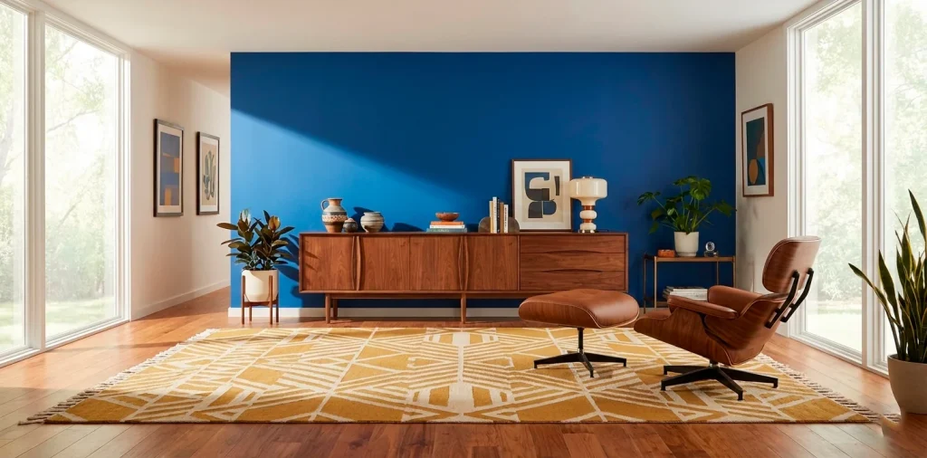
Most people think Mid-Century Modern means sticking exclusively to walnut wood and oatmeal fabric. IMO, that is the fastest way to make your home look like a boring corporate lobby from 1962. Why settle for a room that lacks a soul? I challenge you to pick one color that scares you just a little bit. It transforms a stiff, predictable layout into a personality-packed sanctuary in seconds. I find that a single daring choice acts as a catalyst for the entire room’s energy. Have you ever noticed how a splash of orange makes wood grain look ten times more expensive?
- Start with a bold focal point like a primary-colored sofa.
- Use white walls to let your high-contrast furniture breathe.
- Mix wood tones to avoid a showroom look.
Finding Your Signature Power Color
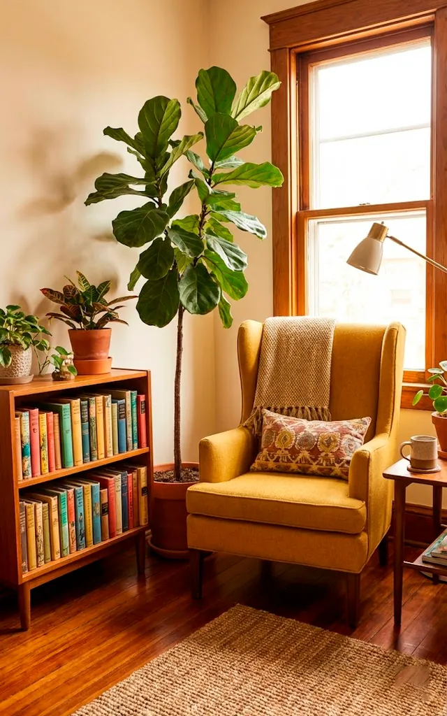
Don’t just grab a neon lampshade because it caught your eye in a clearance aisle. Think about how you want to feel when you are drinking your coffee at 7 AM. Do you want the sunny optimism of a sunflower yellow or the moody, intellectual depth of an emerald green? I suggest looking at your favorite piece of art or even a vintage rug for inspiration. Once you find that anchor hue, every other design choice falls into place perfectly. Does your current palette make you feel inspired or just tired? Trust your gut here; it usually knows more than the latest trend report.
Curves, Tapered Legs, and Neon Dreams
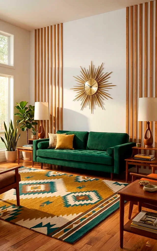
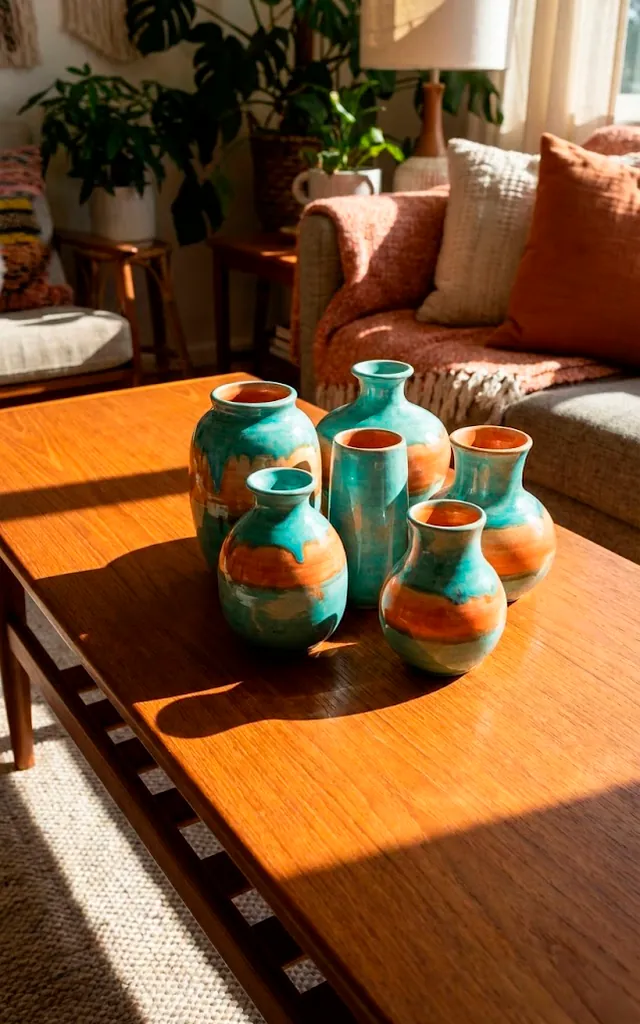
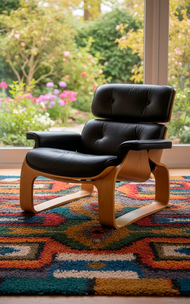
Mid-Century design thrives on geometry, but those sharp angles desperately need some softness to keep things cozy. I love pairing a classic Eames-style chair with a rug that looks like a technicolor dreamcoat. The contrast between the rigid wood and the chaotic color keeps the eye moving throughout the space. Do you really want your guests to fall asleep because your decor is too coordinated? FYI, the ‘mismatch’ is actually where the magic happens. I always look for pieces that share a similar silhouette but offer a total surprise in terms of fabric or finish.
- Pair pointed furniture legs with plush, colorful textiles.
- Look for organic, kidney-shaped tables in unexpected hues.
- Use matte black accents to ground bright neon colors.

The Art of the Strategic Splash
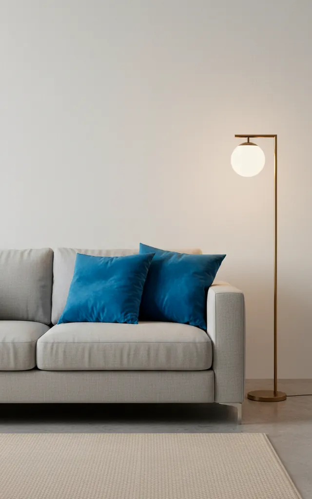
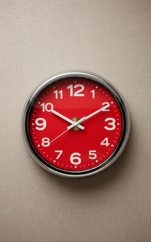
You don’t need to paint every single wall like a box of highlighters to make a statement. Start small if you feel nervous about the commitment. A set of cobalt blue pillows or a ruby red wall clock does wonders for a neutral room. These small pops actually draw more attention than a full-room makeover sometimes because they create a specific destination for the eye. It is all about balance and restraint, not overwhelming the senses. Ever tried swapping out boring cabinet hardware for something colorful? It’s a game-changer for any kitchen or credenza!
Textural Tension is Your Best Friend
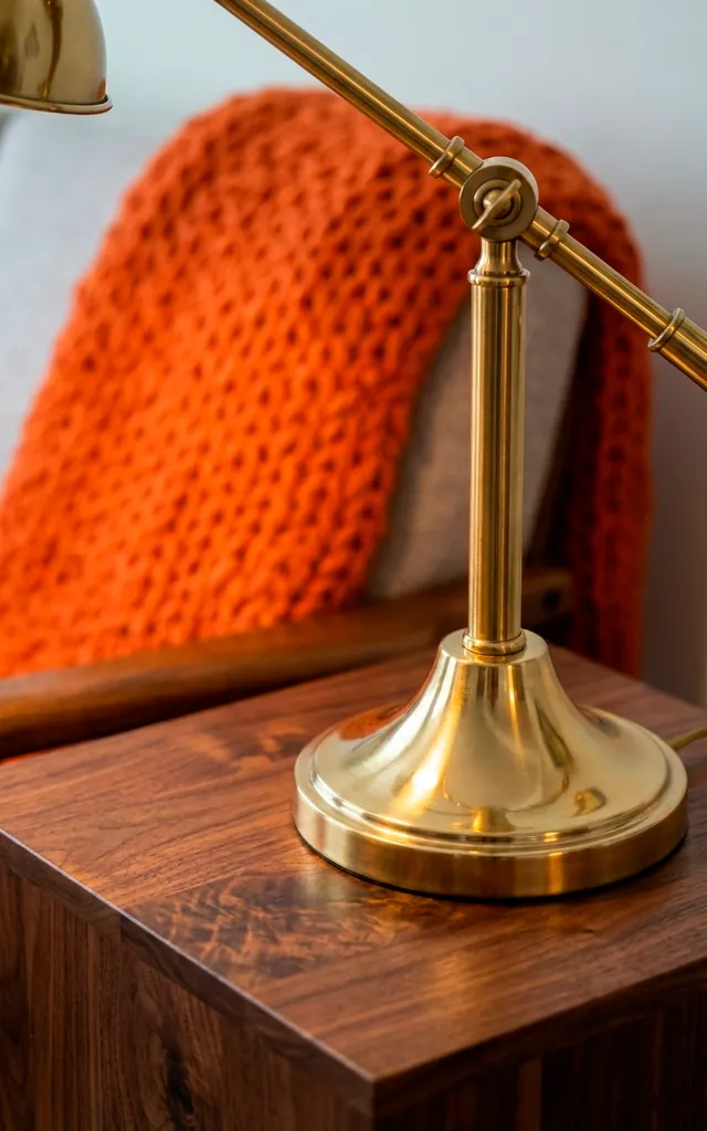
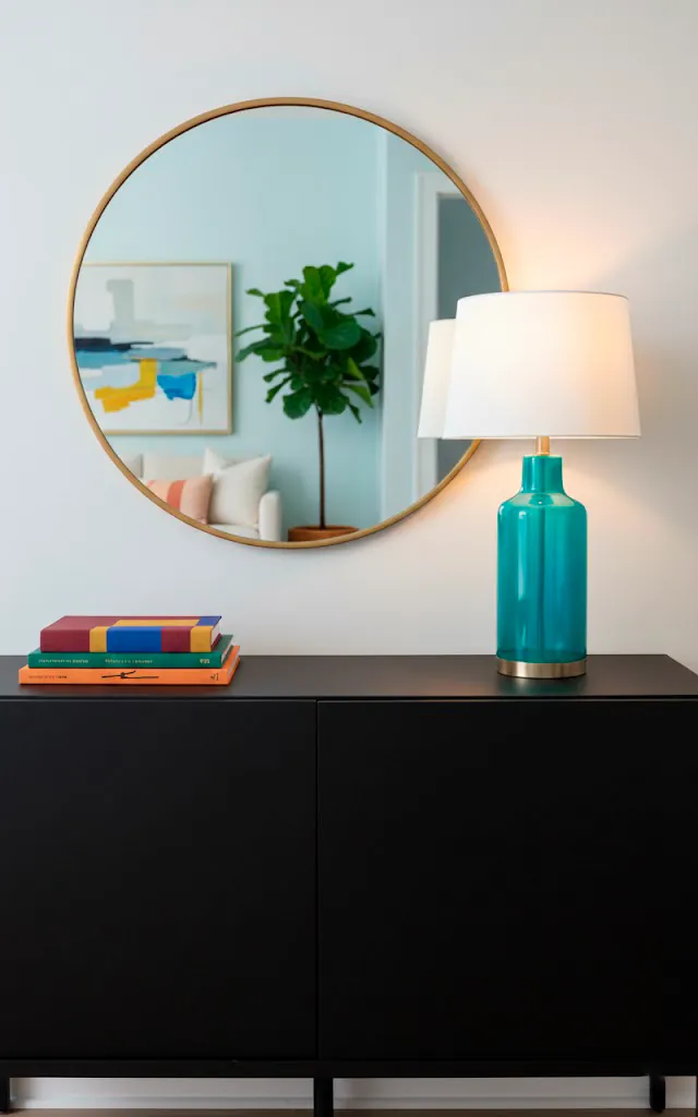
Mix your materials like a total pro to add that necessary layer of sophistication. Think heavy velvet, ribbed corduroy, and even some high-gloss plastics. I once paired a matte black credenza with a high-shine turquoise lamp and it honestly changed my entire perspective on lighting. Texture adds a physical depth that color alone simply cannot provide. Why stick to flat, boring surfaces when you can have a tactile playground in your living room? I find that the more you mix ‘hard’ and ‘soft’ elements, the more expensive the room feels.
- Combine metal lighting with fabric shades.
- Place glass decor on top of heavy wood surfaces.
- Layer sheepskin rugs over flat-weave patterns.

Let There Be Colorful Light
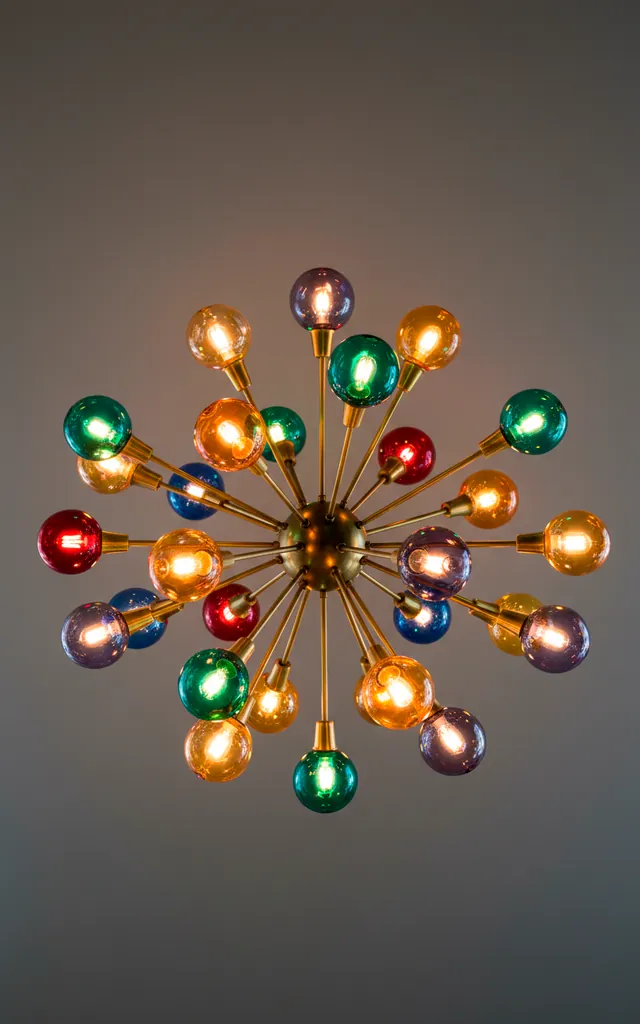
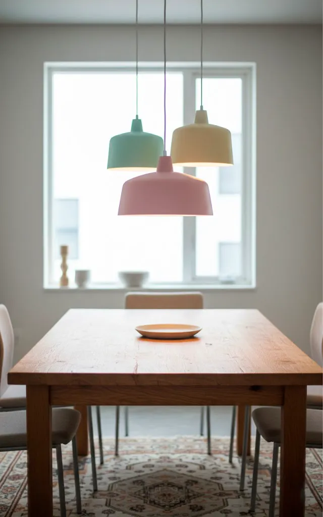
Lighting serves as the jewelry of your home, so don’t settle for those basic builder-grade fixtures. I always look for sputnik chandeliers with colored glass globes or pendants in matte pastels. These pieces act as functional sculptures that tie your bold theme together from the top down. Does your ceiling reflect your unique style or just your landlord’s lack of imagination? Lighting sets the mood for everything from dinner parties to late-night reading sessions. Investing in one ‘wow’ light fixture usually solves about 50% of your decor problems instantly. 😉
The Masterpiece is Yours
You now have the secret sauce to turn a vintage vibe into a modern masterpiece. Don’t let the fear of ‘too much’ stop you from creating a home that you actually enjoy living in every day. Grab that paintbrush, find that funky chair, and start your own color revolution today. If I can do it without losing my security deposit, you definitely can too! Which room are you going to tackle first? I bet it’s going to look incredible. 🙂
Related posts
See AllEarthy Terracotta Sunroom Ideas for a Mediterranean Vibe
Transform your space into a sunny European retreat. Discover simple, earthy terracotta sunroom ideas that bring authentic Mediterranean vibes straight …
Read more15 Playful Memphis Style Attic Loft Ideas with Graphic Shapes
Transform your attic loft with playful Memphis style decor! Discover 15 bold ideas using graphic shapes, vibrant colors, and quirky …
Read more15 Custom Built-In Bed Ideas for a Luxury Kids Room
Ready to transform that chaotic playroom into a high-end sanctuary? Discover 15 jaw-dropping built-in bed ideas that blend luxury, smart …
Read moreA Step-by-Step Guide to Total Laundry Room Organization
Transform your chaotic laundry space into an organized, functional oasis with this step-by-step guide. We share smart storage hacks, sorting …
Read more