


Tired of the same old ‘Frozen’ vibes for your winter wedding? You don’t need a flurry of fake snowflakes and generic icy blue tinsel to make a lasting impact. I’ve seen enough ‘winter wonderland’ setups to last a lifetime, so let’s talk about palettes that actually feel fresh. Ready to ditch the clichés for something your guests will actually remember? 😉
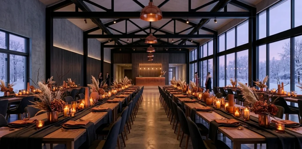
Terracotta and Charcoal
Who says orange only belongs to October? I love how terracotta brings an earthy warmth to a cold winter night, especially when you pair it with a moody charcoal grey. It feels grounded, modern, and just a little bit rebellious against the standard white-and-silver tradition. Ever noticed how a dark grey linen makes every other color pop? By using charcoal as your base, the terracotta accents look like flickering embers in a fireplace.
You can pull this off with heavy stoneware plates, velvet napkins, and dark, matte-finished cutlery. Skip the fresh roses and opt for dried palms or rust-colored pampas grass to keep the vibe architectural. This duo works perfectly in industrial loft spaces or renovated barns where the wood tones already lean warm. If you want to see how these tones translate to other seasonal decor, check out this terracotta Christmas inspiration.
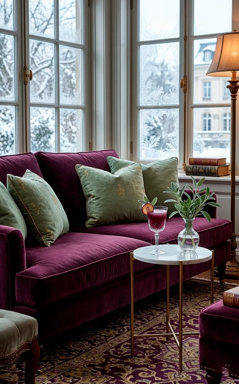
Deep Plum and Sage
If you want romance without the ‘pink princess’ energy, plum and sage are your best friends. Deep plum adds a regal weight to the room, while sage green keeps the atmosphere from feeling too heavy or gothic. I think this combo shines best in botanical gardens or conservatories where the green foliage naturally complements the purple hues. Why settle for standard greenery when you can use silver-toned eucalyptus or dusty sage leaves? Use plum in your velvet ribbons or as a bold lip color for the bridesmaids. It’s an effortless way to look sophisticated without trying too hard, IMO. ✨
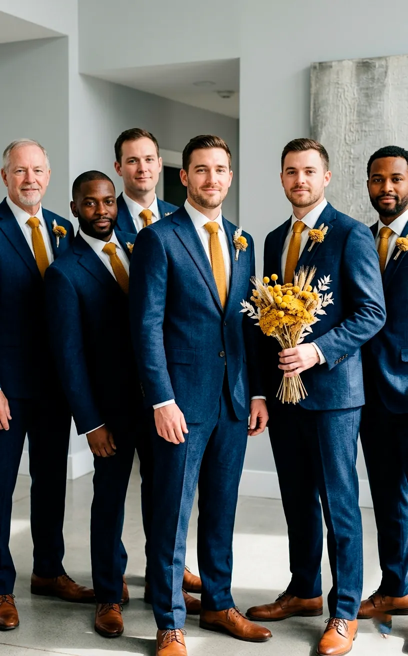
Mustard Yellow and Navy
I know what you’re thinking—yellow in the winter? Absolutely. But forget sunshine yellow; we are talking about a rich, spicy mustard. This shade feels incredibly cozy, almost like a wool blanket, when you set it against a deep navy blue background. Most people play it safe with navy and gold, but mustard provides a matte, modern edge that gold just can’t touch.
I suggest using navy for the large-scale items like bridesmaid dresses or table linens. Then, drop in the mustard through small but impactful details:
- Mustard-hued silk ties for the groomsmen
- Dried Billy balls in the bouquets
- Golden-yellow velvet seating for the lounge
Doesn’t that sound more interesting than another white-on-white wedding? The contrast creates a visual punch that looks incredible in photos, especially if you’re shooting against a snowy white landscape. It’s bold, it’s intentional, and it screams ‘I have great taste.’
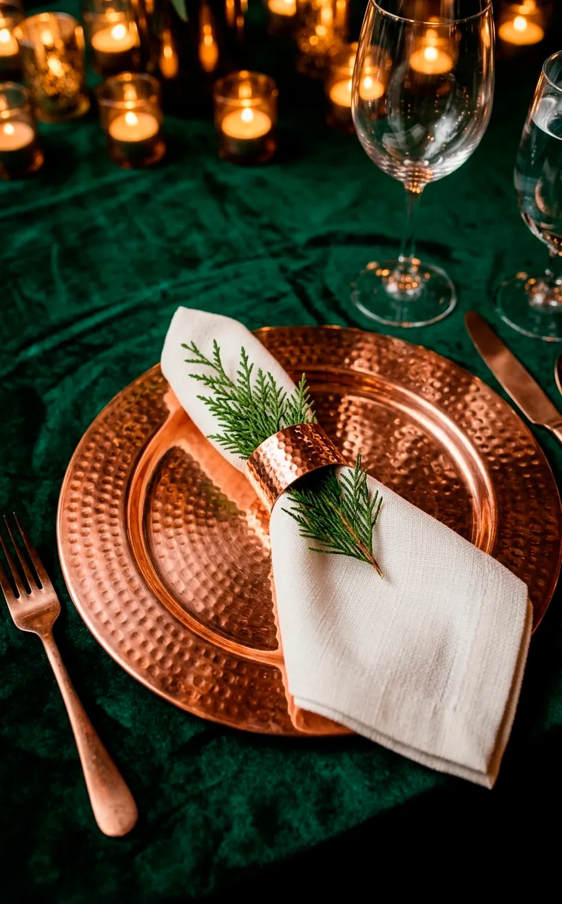
Copper and Emerald
Silver is the traditional winter metallic, but copper is far more inviting. When you pair shiny copper with a deep, moody emerald, you get a look that feels both luxurious and organic. Emerald green mimics the evergreen trees outside, while copper provides the heat. I find that copper chargers and flatware add a glow to the table that silver simply lacks.
Have you ever seen an emerald velvet table runner? It’s a total game-changer. The way the light hits the fabric makes the whole room feel expensive. You can even use copper wire fairy lights inside glass cloches to create ‘warm’ lanterns.
Items for a metallic emerald vibe:
- Hammered copper Moscow mule mugs
- Emerald green glass taper holders
- Copper leaf accents on a white wedding cake
- Dark green forest foliage like ferns or moss
This palette works best when you keep the textures varied. Think shiny metal against soft velvet. To lean into the cozy factor, you might even consider adding some forest green rugs to your lounge space for that extra layer of warmth.
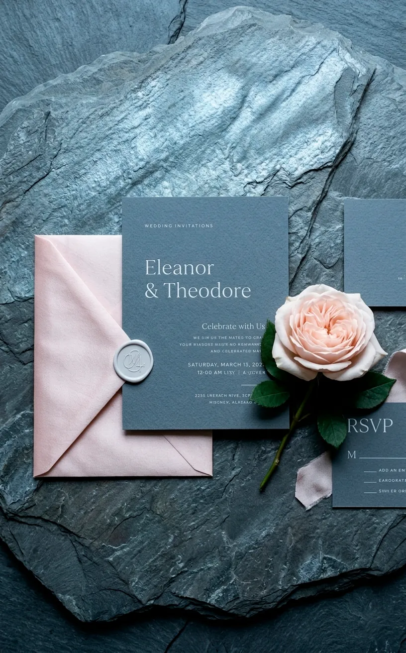
Blush and Slate Grey
Forget the ‘pretty in pink’ stereotypes for a second. Blush pink takes on a totally different personality when you surround it with hard, cold slate grey. It’s the perfect balance of masculine and feminine energy. I think of it like a pink sunset over a rocky mountain peak—unexpectedly rugged yet soft.
Use slate grey for your invitation suites and menu cards to set a serious tone. Then, soften the blow with blush-colored florals like ranunculus or garden roses. It prevents the wedding from looking too ‘sweet’ and gives it a contemporary, high-fashion feel. Seriously, who knew grey could look this romantic? FYI, this is a great way to satisfy a partner who hates anything too ‘girly.’
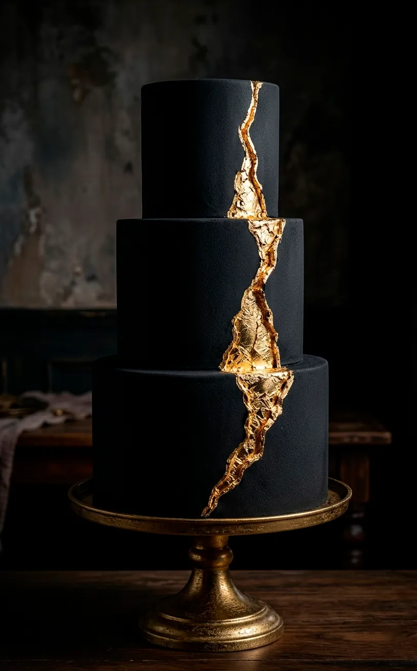
Black and Gold
Wait, don’t roll your eyes! I know black and gold sounds like a New Year’s Eve party, but it’s a classic for a reason. To make it modern, you have to embrace the black more than the gold. Think black-on-black textures with just a tiny hint of gold leaf. It’s dramatic, it’s sultry, and it makes your wedding feel like a high-end gala. Why go for ‘bright and airy’ when you can go for ‘dark and mysterious’? Use black taper candles and black glassware to really lean into the mood. It’s a bold move, but it pays off in sheer elegance.
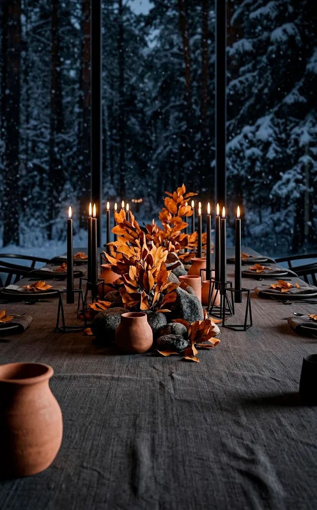
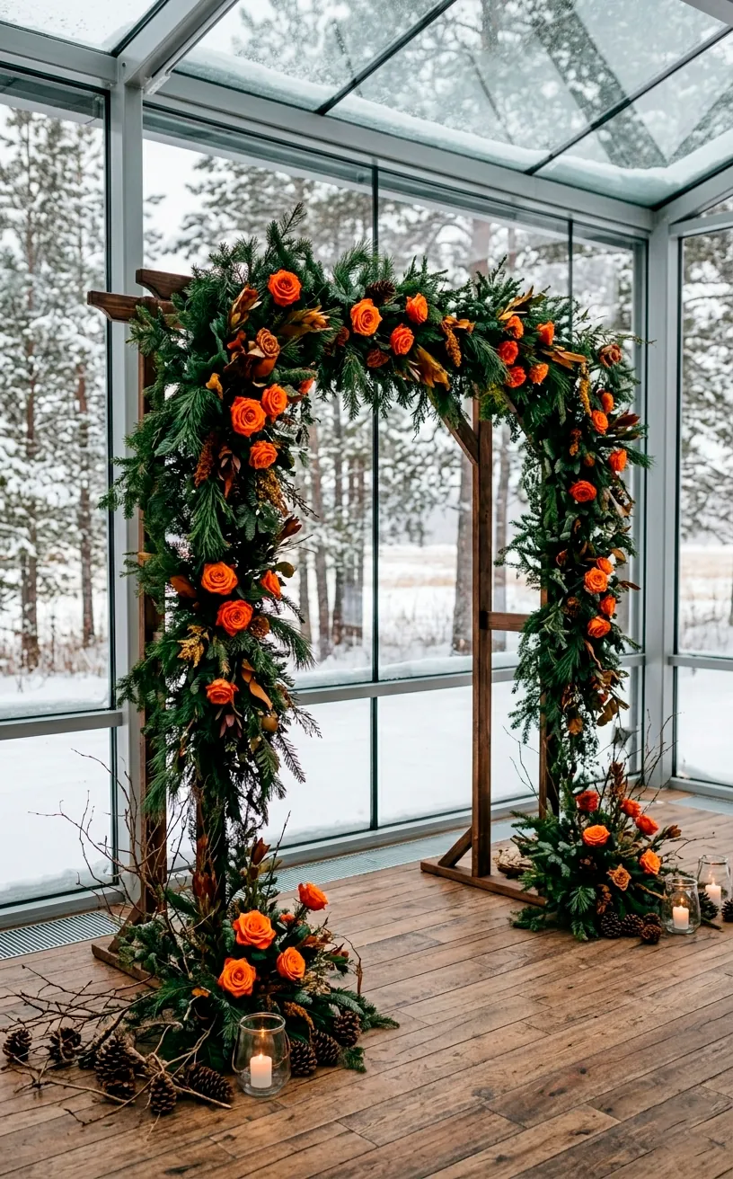
Burnt Orange and Forest Green
This is the ultimate ‘transition’ palette if you’re getting married in late winter. It’s like the forest floor meets the winter frost. Burnt orange offers a rustic charm, while forest green keeps things feeling lush and alive. I personally love seeing grooms in forest green velvet blazers—it’s such a vibe.
Does anyone else think white flowers are overrated? In this scheme, I’d ditch the white entirely and go for deep orange dahlias and heavy green foliage. You can pull the whole look together with wood accents. Think reclaimed wood tables, bark-covered place card holders, and maybe some leather chair ties. It feels lived-in, cozy, and completely authentic to the season without relying on a single snowflake motif.
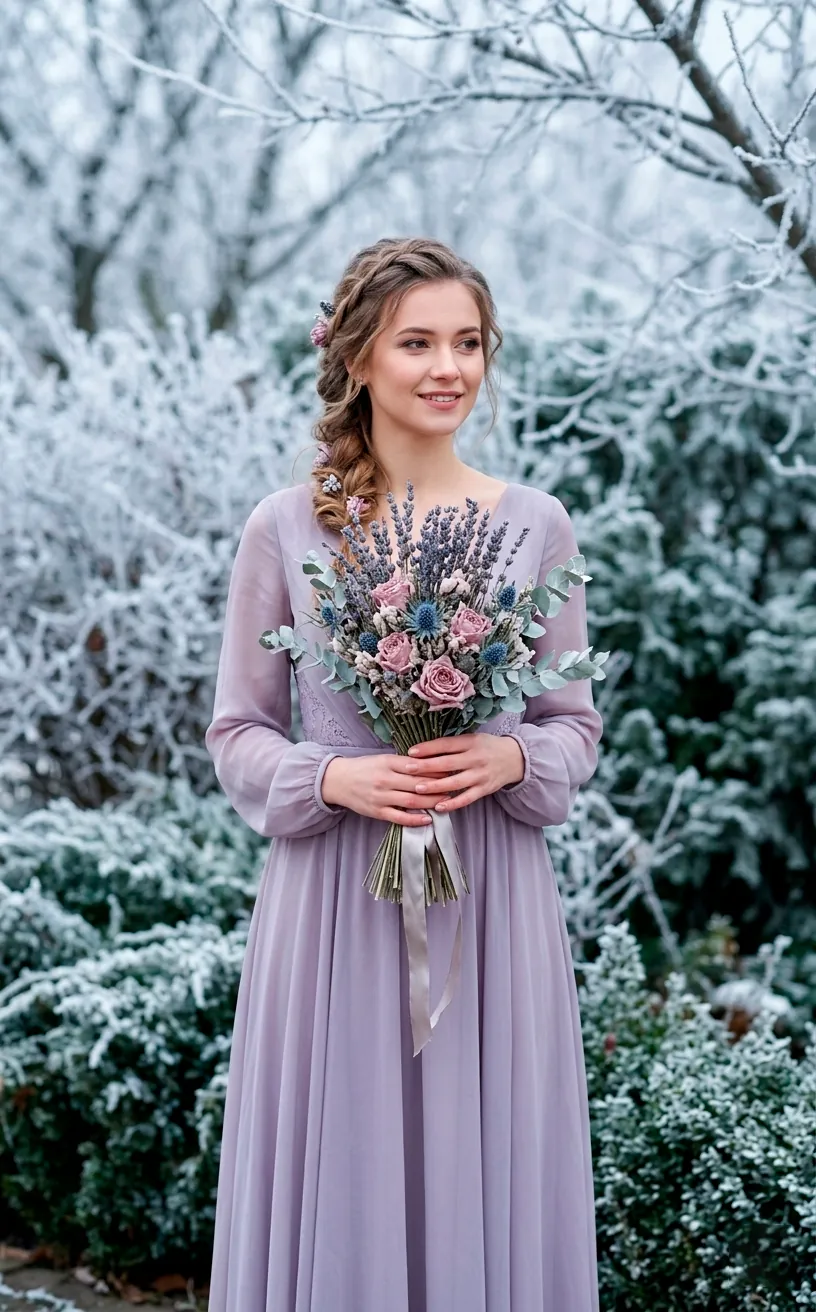
Icy Lavender and Dusty Rose
If you really want to lean into the ‘cold’ aesthetic but hate blue, try lavender. But be careful—we aren’t doing ‘springtime lilac.’ We want muted, icy lavender paired with a dusty rose. This combo looks like a winter morning just before the sun fully rises. It’s ethereal and a bit dreamy.
I find that mixing these colors in sheer, layered fabrics works wonders. Think tulle overlays or chiffon runners that catch the light. It’s a very soft look, so you’ll want to ground it with some metallic accents like pewter or brushed nickel. Isn’t it nice to have a palette that feels light without being neon? It’s the visual equivalent of a cashmere sweater.
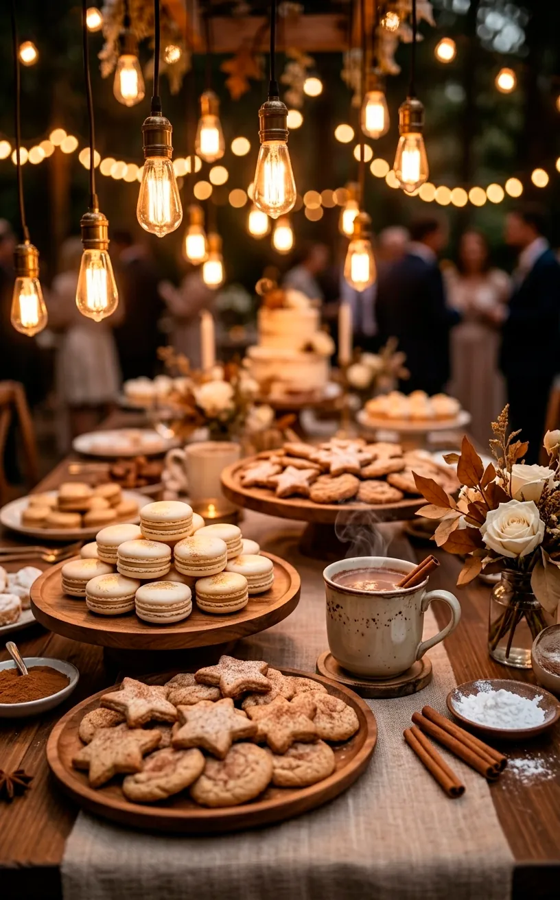
Cinnamon and Cream
This is for the couple who wants their wedding to feel like a giant hug. Cinnamon is a warm, spicy brown that looks incredible next to a rich, buttery cream. It’s much more modern than the standard ‘chocolate brown’ of the early 2000s.
Ways to use cinnamon and cream:
- Cream-colored pampas grass in tall floor vases
- Cinnamon-tinted glass chargers
- A hot cocoa bar with cinnamon sticks
- Creamy wool rugs under the ceremony altar
I love how this palette interacts with candle lighting. The cream reflects the light while the cinnamon absorbs it, creating a multi-dimensional glow.
It’s basically the ‘latte’ of wedding palettes—creamy, warm, and totally addictive. If you’re worried it might look too plain, add some gold accents or varied textures like knit fabrics and smooth ceramic. This is the ultimate ‘hygge’ wedding look, and I am here for it.
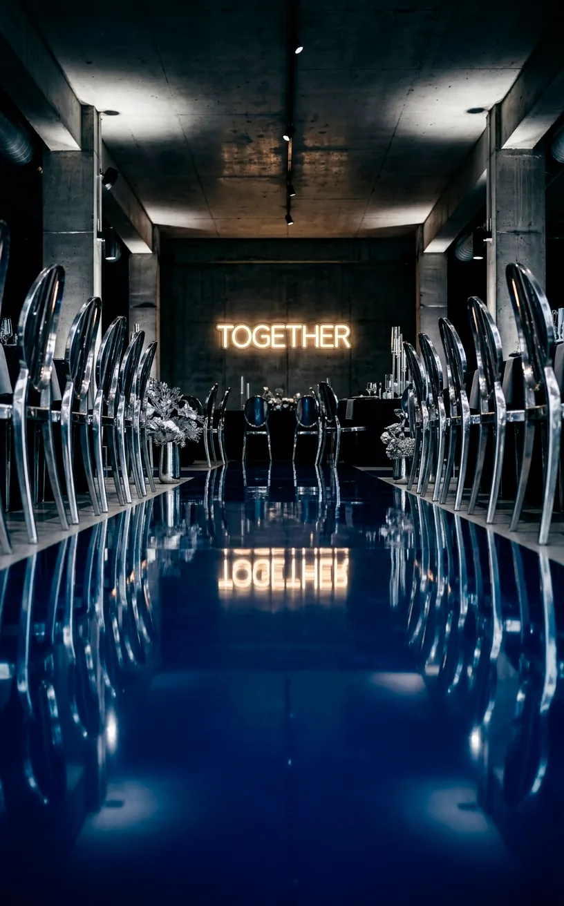
Midnight Blue and Silver Chrome
Let’s end with a bang. If you want a ‘celestial’ or ‘night sky’ vibe, midnight blue and silver chrome are unbeatable. Chrome is much shinier and more industrial than standard silver, giving the wedding a futuristic, sleek feel. It’s like a starry night in the middle of a big city. Why settle for matte when you can have a mirror-like finish? This palette looks best at night under bright, white LED lights or neon signs. It’s sharp, clean, and definitely makes a statement. Just imagine a midnight blue floor with chrome chairs—absolute perfection. IMO, it’s the coolest way to do a winter wedding without a single pinecone in sight.
The Final Verdict
Your winter wedding doesn’t have to follow the rules. Whether you go for the earthy heat of terracotta or the futuristic shine of chrome, picking an unexpected palette ensures your day feels like *you*. Which one of these combos are you grabbing for your big day? Let me know in the comments! Whatever you choose, just make sure it keeps you and your guests feeling cozy and cool all night long. Happy planning!
Related posts
See AllEarthy Terracotta Sunroom Ideas for a Mediterranean Vibe
Transform your space into a sunny European retreat. Discover simple, earthy terracotta sunroom ideas that bring authentic Mediterranean vibes straight …
Read more15 Playful Memphis Style Attic Loft Ideas with Graphic Shapes
Transform your attic loft with playful Memphis style decor! Discover 15 bold ideas using graphic shapes, vibrant colors, and quirky …
Read more15 Custom Built-In Bed Ideas for a Luxury Kids Room
Ready to transform that chaotic playroom into a high-end sanctuary? Discover 15 jaw-dropping built-in bed ideas that blend luxury, smart …
Read moreA Step-by-Step Guide to Total Laundry Room Organization
Transform your chaotic laundry space into an organized, functional oasis with this step-by-step guide. We share smart storage hacks, sorting …
Read more