












Sharing a tiny bedroom usually ends in turf wars and visual chaos. I tackled this exact nightmare with my nephews, realizing standard decor just shrinks the space further. Want a cheat code? Bold geometric patterns. They visually organize the room, define boundaries, and inject massive personality without eating up square footage. Let’s fix that cramped room today.
1. Half-Wall Hexagons
Ever tried telling two kids where their side of the room begins? It’s a losing battle. Painting massive, color-blocked hexagons across the lower half of the walls instantly zones the space. You get a built-in wainscoting effect that anchors their beds while leaving the top half airy and bright. Plus, it hides those inevitable scuff marks perfectly. If you want a weekend project that completely redefines the room’s flow, this is your winner.

2. High-Contrast Checkerboard Rugs
Floor space is sacred in a shared room.
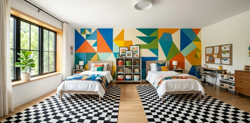
Throwing down a thick, high-contrast checkerboard rug immediately distracts from the cramped footprint. The grid pattern creates a psychological illusion of order, making toy clutter feel slightly less apocalyptic.
I’m totally obsessed with washable versions for obvious reasons. They anchor the center of the room, giving both kids a designated play zone that feels intentionally designed rather than just leftover floor. Want to boost the impact? Check out these high contrast palettes.

3. Oversized Triangle Wall Murals
Forget delicate wallpaper that takes days to align perfectly. Slapping a giant, asymmetrical triangle mural across the main accent wall is the easiest way to fake architectural interest.
Drawing the eye diagonally upward makes a low ceiling feel endlessly tall. It’s dramatic, cheap, and you literally only need painters tape and two contrasting paint colors. It brings an edgy, modern vibe that kids won’t instantly outgrow in a year.

4. Color-Blocked Chevron Bedding
Bedding is where you can go wild without commitment.
Matching beds can look a bit institutional, IMO. 😅
Instead, grab identical chevron duvet covers but in inverted colorways. This coordinates the room flawlessly while letting each kid maintain their distinct identity.
The sharp zig-zags add a huge dose of kinetic energy to the space. It’s a brilliant trick to make the room feel cohesive without resorting to boring, identical twin setups.

5. Asymmetrical Floating Square Shelves
Storage is always a crisis in small shared spaces. Instead of bulky bookcases, install a scattered grid of square floating shelves above the dressers.
Varying the sizes and offsetting their alignment creates functional wall art. One kid gets the left cluster, the other gets the right. It perfectly solves the storage wars while adding rigid, eye-catching geometry right at eye level.

6. Concentric Circle Ceiling Decals
Why do we always ignore the ceiling? When floor space is maxed out, looking up is your best bet. Applying a massive concentric circle decal above the room’s central light fixture draws the eye upward immediately. It acts like a giant bullseye of style, making the room feel wider and more expansive. Plus, kids lying in their bunks finally have something cool to stare at instead of blank drywall.

7. Diagonal Stripe Window Treatments
Curtains are a prime spot to inject some serious pattern play.
Thick, diagonal stripes on Roman shades completely disrupt the boring rectangular lines of standard windows. The slanted lines trick your brain into thinking the windows are wider than they actually are.
Stick to two bold colors to keep it from looking like a circus tent. It’s a crisp, tailored look that blocks out the morning sun while scoring major design points.

8. Grid-Patterned Wallpaper Ceilings
If you want to push the envelope, wallpapering the ceiling in a tight, minimalist grid pattern is absolutely brilliant.
The repetitive grid provides a structured canopy over the chaos below. It contrasts beautifully with organic kid clutter and makes the whole room feel like a custom-designed treehouse. Seriously, this single feature elevates a basic bedroom into a magazine-worthy space instantly.

9. Interlocking Diamond Floor Tiles
Ripping up old carpet? Good call.
Laying down interlocking diamond carpet tiles or vinyl planks is a game-changer.
You can easily swap out individual squares when (not if) someone spills grape juice.
The diamond motif naturally guides people through the room, making a narrow layout feel like a purposeful pathway rather than a cramped corridor. It’s practical geometry at its absolute finest.

10. Geometric Color-Split Doors
Don’t leave the bedroom door out of the fun! Taping off a sharp diagonal line from the top left corner to the bottom right and painting two different colors creates a mind-bending entrance. This split-color geometry sets the bold tone before you even step foot inside. It’s a wildly cheap hack that completely erases the builder-grade boredom of standard six-panel doors. Your kids will literally fight over who gets to close it.

11. Scalloped Arch Headboards
I know scallops feel a bit soft, but when supersized, they become striking geometric arches.
Painting a solid, oversized arch directly onto the wall behind each bed frames their sleeping zones beautifully. It creates a faux headboard that takes up exactly zero inches of floor space.
You can use contrasting colors for each sibling to define their territory. It’s a visually commanding shape that softens the hard edges of standard bedroom furniture. Need more storage around those beds? Explore these clever over-the-bed storage ideas.

12. Tetris-Inspired Storage Cubbies
Standard toy boxes just eat up the room. Enter modular, Tetris-style storage blocks that stack into stepped geometric formations.
Building a staggered storage wall maximizes vertical space while looking incredibly intentional. The L-shapes and squares interlock tightly. Check out these benefits:
- Maximizes vertical wall space
- Easily reconfigured as kids grow
- Acts as a massive structural focal point
It’s organization disguised as a retro arcade game.

13. Symmetrical Starburst Light Fixtures
The dreaded boob light has to go.
Swapping out standard flush mounts for a sharp, geometric starburst chandelier changes everything.
The intersecting metal rods cast amazing, angular shadows across the ceiling at night.
It provides that crucial ambient light for two kids reading in bed while acting as a floating metallic sculpture. It pulls the whole room’s aesthetic together effortlessly.

14. Polka Dot Accent Walls
Hear me out: dots are geometric too. But instead of tiny, chaotic sprinkles, opt for massive, perfectly spaced black polka dots on a crisp white wall. This structured contrast adds a playful rhythm that feels incredibly modern and chic. It’s high-impact, ridiculously easy to execute with wall decals, and strikes the perfect balance between kid-friendly whimsy and sophisticated graphic design.

15. Overlapping Trapezoid Rugs
Who says you only need one rug? Layering two odd-shaped trapezoid rugs at overlapping angles breaks up a boring rectangular floor plan.
The colliding shapes create a dynamic, textured center that makes the room feel multidimensional.
It visually separates their play areas while adding tons of much-needed warmth. It’s a slightly chaotic but totally brilliant way to wrap up a shared room remodel.

Conclusion
Transforming a cramped, shared kids’ room doesn’t require knocking down walls; it just takes a little geometric magic. From high-contrast checkerboard rugs to massive painted arches, these bold patterns trick the eye, define personal zones, and add immense character. You can ditch the boring symmetry and create a space they’ll actually love sharing. So, which pattern are you trying first? Let me know in the comments!
Related posts
See All15 Vintage Circus Inspired Details for Playful Kids Bedroom Decor
Bring the magic of the big top home! Discover 15 playful, vintage circus-inspired decor details that will transform your kid's …
Read moreThe Complete Guide to Styling a Dining Room Credenza for Everyday Elegance
Give your dining room credenza the ultimate glow-up. Discover easy, elegant styling tips that balance everyday function with show-stopping design.
Read more15 Dried Citrus and Cinnamon Garlands for a Naturally Cozy Kitchen
Forget mass-produced decorations. Transform your kitchen into a naturally cozy, aromatic sanctuary with these 15 beautiful dried citrus and cinnamon …
Read moreThe Dog-Friendly Camper: Designing a Van Interior for Your Pets
Transform your camper van into the ultimate dog-friendly adventure mobile! Discover clever interior design hacks, durable materials, and cozy setups …
Read more