


Picking a dining room color usually feels like a high-stakes gamble where the prize is a room you actually want to show off. We’ve all seen those ‘safe’ beige rooms that look more like a waiting room than a place for a dinner party. You deserve better. I’ve found that the right palette creates a mood that lingers long after the dessert is gone. Let’s upgrade your space with some truly iconic combinations that never go out of style.
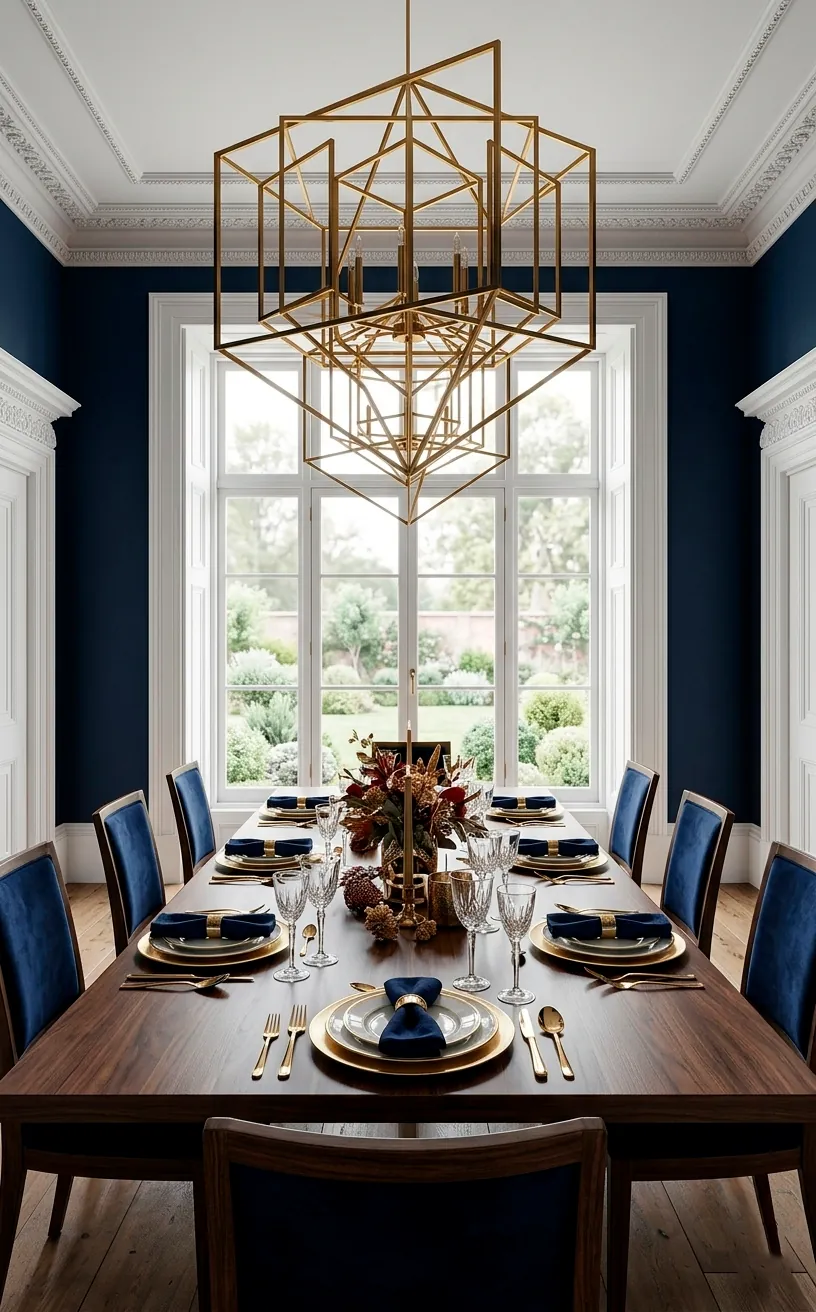
Navy Blue and Gold Accents
Navy blue behaves like a neutral with a high-fashion backbone. I honestly believe dark walls make a dining room feel more intimate, almost like a secret club where everyone actually likes each other. You pair this with polished gold accents and suddenly the room screams luxury, even if you’re just serving takeout. Why settle for boring when you can have drama? It keeps the vibe regal yet grounded without feeling too stuffy. FYI, dark shades like this actually hide those accidental wine splashes better than white. For a bit of extra shine, check out these golden brass accents that really make the navy pop.
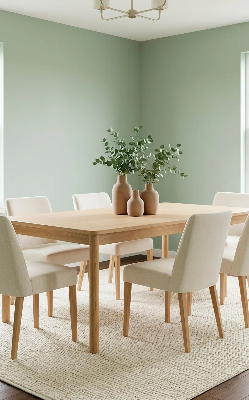
Sage Green and Cream
Ever noticed how a spa makes you forget your mortgage? That’s the power of sage green. It brings the outdoors inside without the bugs or the humidity. I find that cream-colored furniture softens the green and prevents the room from looking like a forest floor.
This combo works wonders for smaller spaces. Light cream upholstery bounces light around while the sage keeps things interesting. You don’t want a room that feels like a cardboard box, right?
I suggest adding a few wooden elements to ground the look. It adds a layer of organic texture that feels incredibly high-end. Trust me, your guests will feel instantly relaxed when they walk in. 🌿
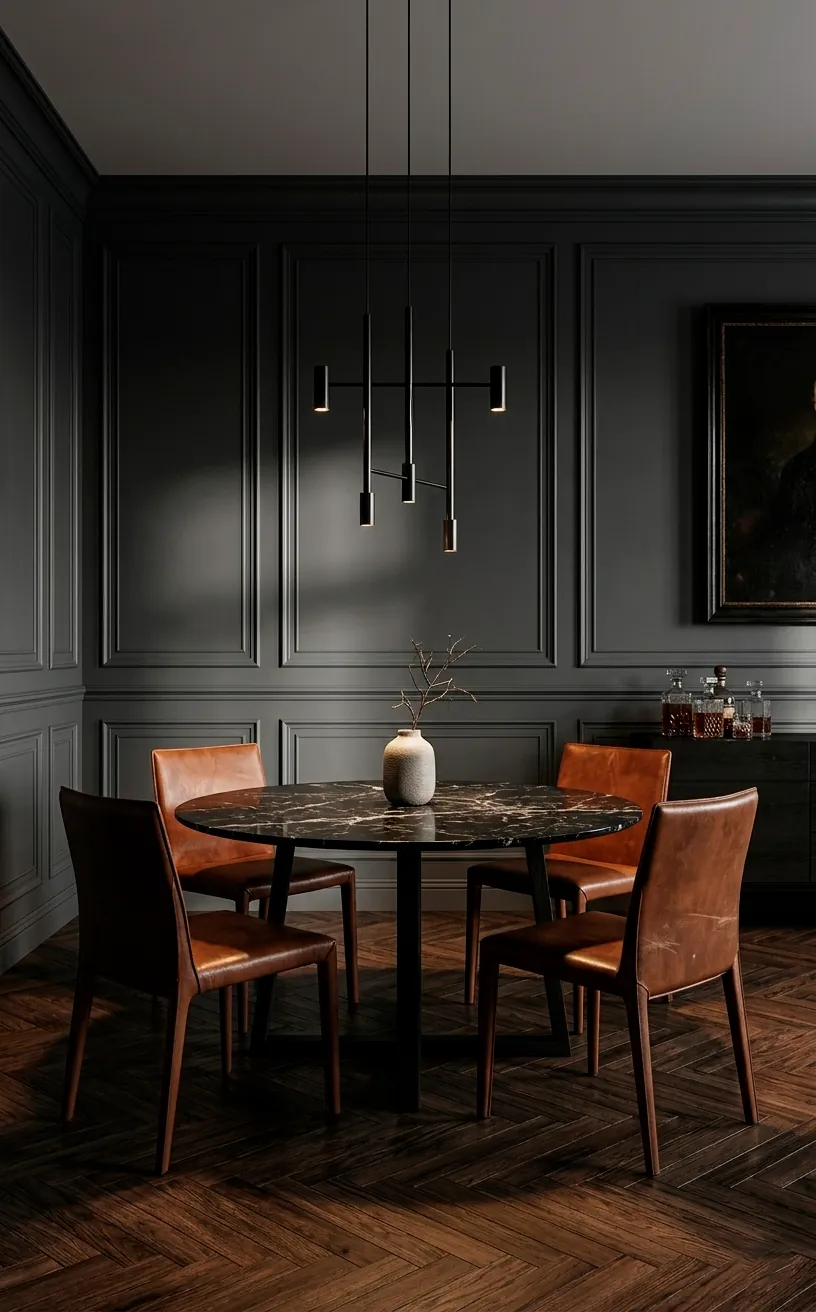
Charcoal and Cognac Leather
If you want that ‘expensive cigar lounge’ vibe without the smell of old tobacco, this is your winner. Charcoal grey walls provide a moody, sophisticated backdrop that lets warm furniture shine. I think cognac leather chairs offer the perfect punch of warmth against the cool grey.
Does it feel too dark? Not if you use the right lighting. I always recommend a statement light fixture to break up the shadows. It creates a focal point that keeps the eye moving.
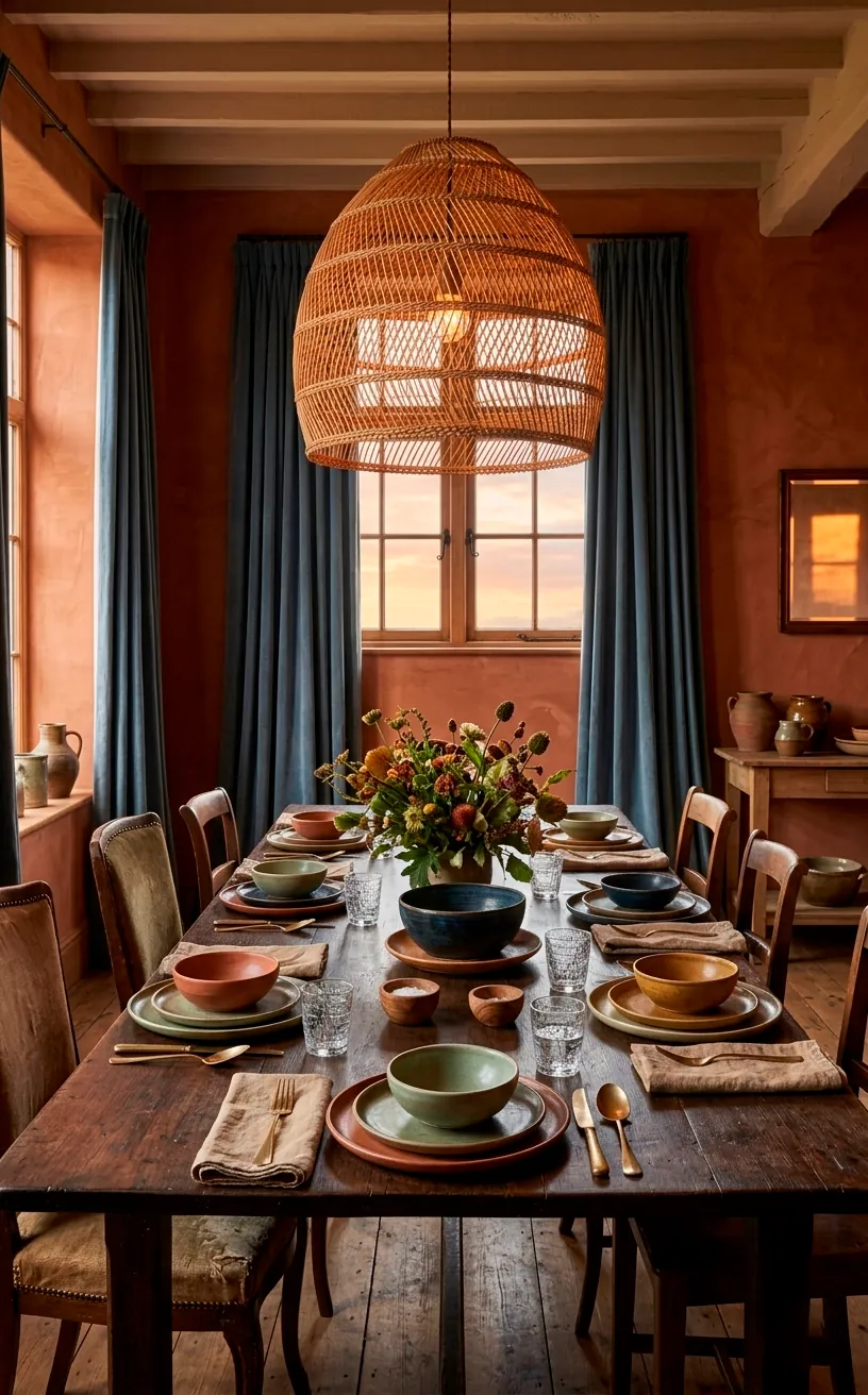
Terracotta and Slate Blue
This isn’t your grandma’s Southwest decor. Terracotta has made a massive comeback, and IMO, it’s the best way to add ‘soul’ to a room. It feels warm and lived-in. But you need something to cool it down, or it’ll look like a clay oven.
Enter slate blue. This dusty, muted blue acts as the perfect anchor. I love seeing blue curtains against a terracotta wall. It creates a visual balance that feels curated over time rather than bought from a catalog.
You can also bring in slate blue through your table linens or a rug. This keeps the terracotta from becoming overwhelming.
Elements to consider for this look:
- Terracotta potted plants
- Slate blue velvet table runners
- Woven rattan light fixtures
- Matte black flatware
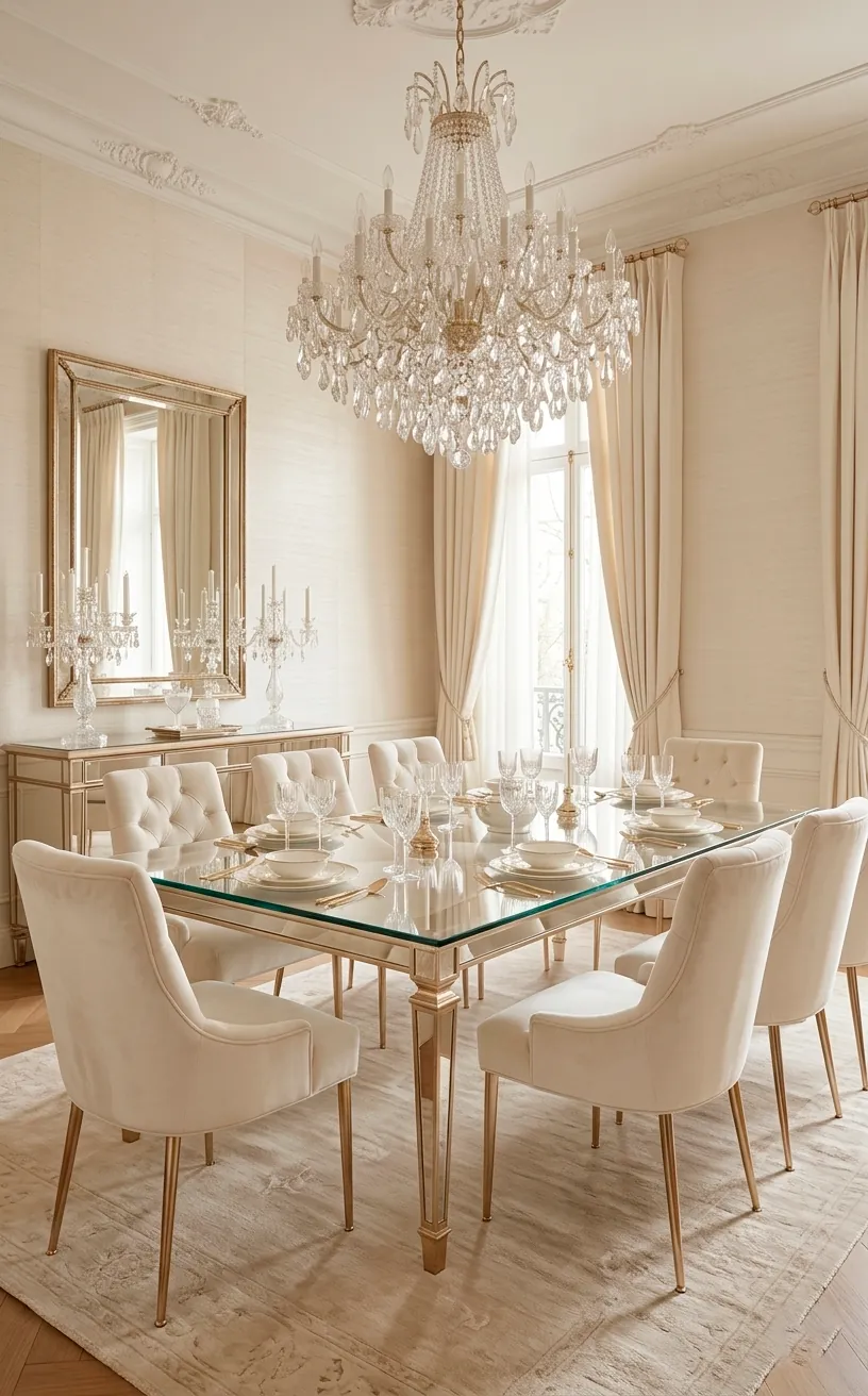
Champagne and Ivory
Monochromatic rooms often get a bad rap for being boring, but champagne and ivory are pure luxury. I see this palette in five-star hotels all the time because it feels ‘expensive.’ You’re layering different shades of the same family to create depth.
Use metallic champagne finishes on your table legs or mirror frames. It adds a subtle shimmer that keeps the ivory from looking flat. Who doesn’t want their dining room to feel like a glass of bubbly?
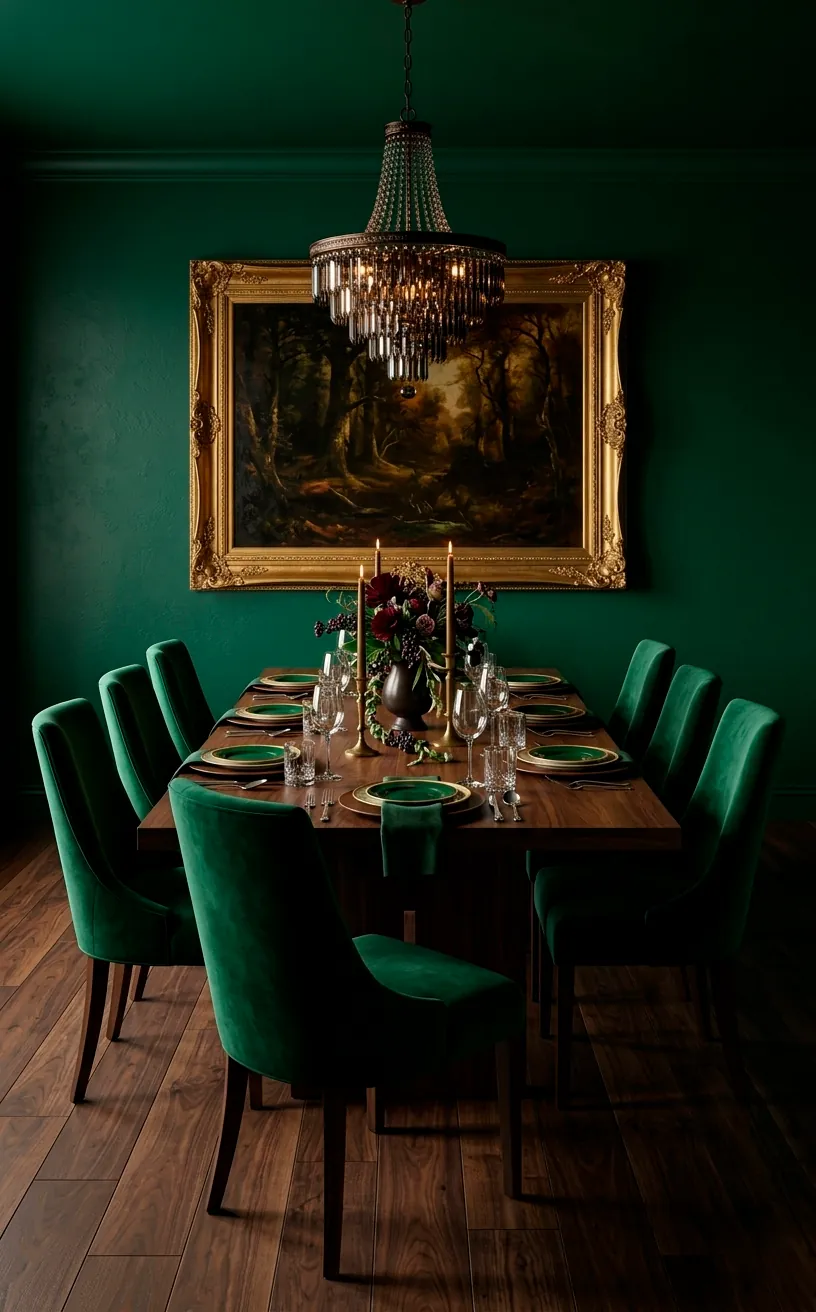
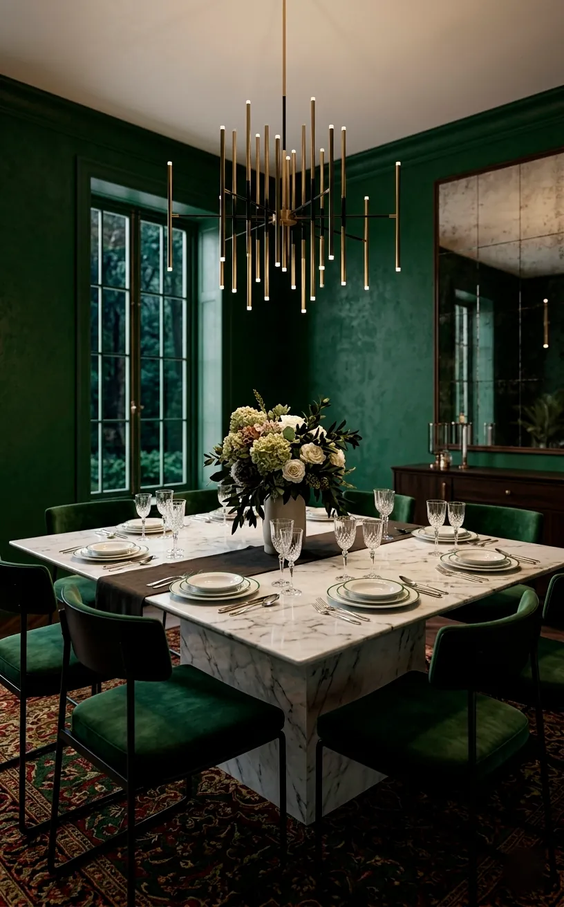
Emerald Green and Walnut
Emerald green is the king of jewel tones. I find that it pairs best with rich walnut wood because the warmth of the wood balances the coolness of the green. It’s a very ‘old money’ look that feels incredibly grounded. Bold walls allow your furniture to stand out as art pieces. Just make sure you have enough light, or you’ll feel like you’re dining in a cave—unless that’s your thing! 🥂
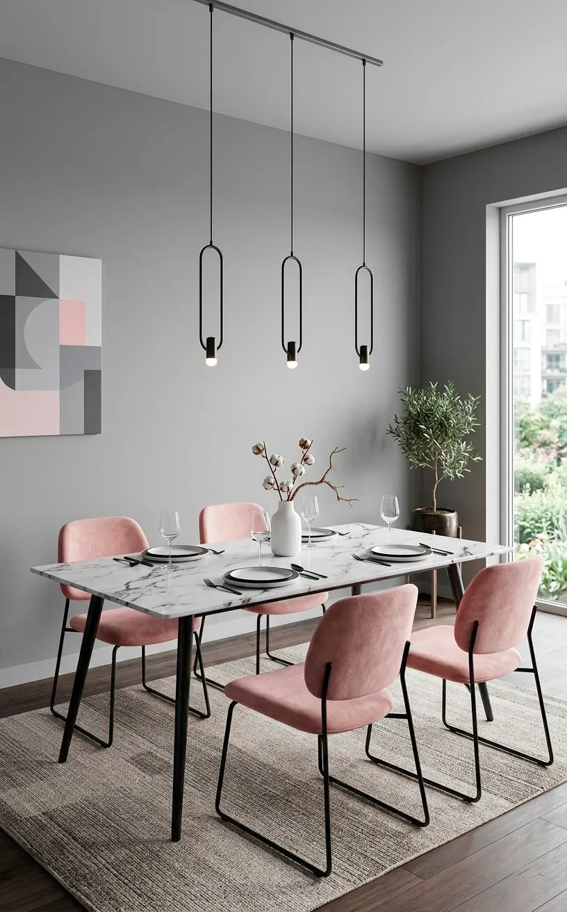
Blush Pink and Grey
Forget the ‘nursery’ associations; blush pink is a sophisticated neutral when done right. I love pairing it with a medium charcoal or dove grey. It takes the sweetness out of the pink and makes it feel mature.
You can use pink for the chairs and keep the walls grey, or vice versa. It’s a soft, welcoming palette that makes everyone look good under the dinner lights.
I suggest adding black hardware to keep the look modern. Without a dark anchor, the room might float away into a cloud of cuteness. We want elegance, not a candy shop.
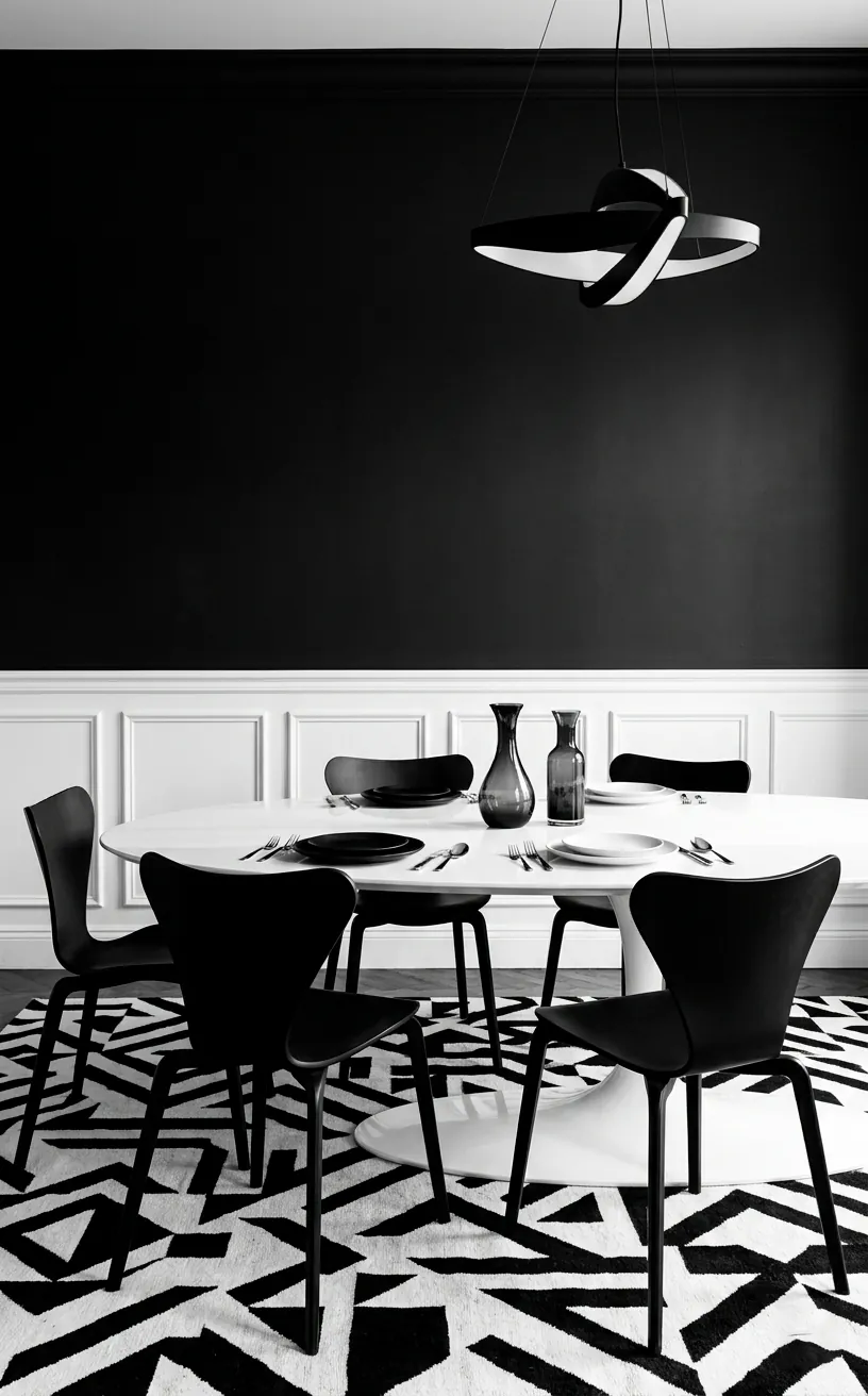
Black and White
You can’t argue with a classic. Black and white is the tuxedo of interior design. I think it’s the easiest way to make a dining room look intentional and sharp.
Try a black table with white chairs for an inverted look. It’s unexpected and keeps the room from feeling too traditional. Just watch out for dust—black surfaces are basically magnets for it.
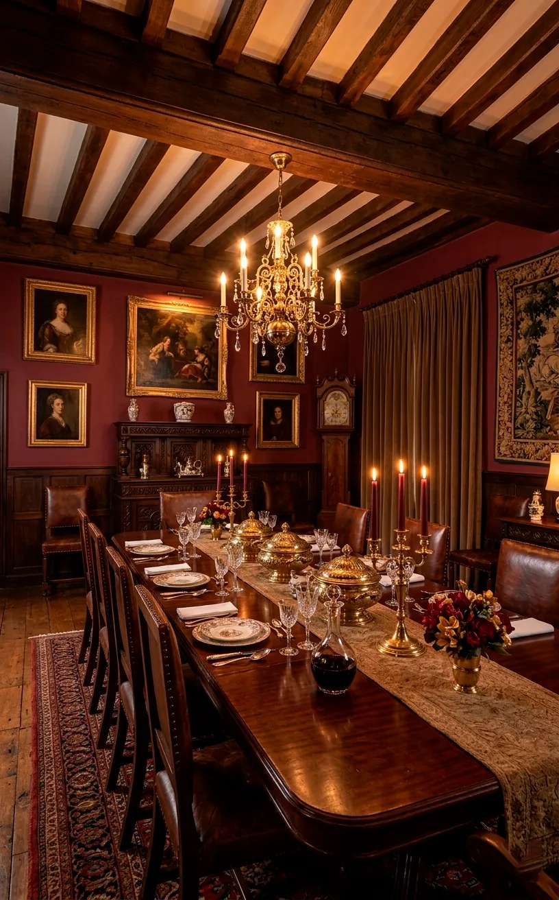
Burgundy and Brass
This palette feels like a vintage wine cellar in the best way possible. Burgundy is a heavy color, so I suggest using it on an accent wall or through heavy drapes. It adds a layer of ‘heritage’ to the home.
Brass hardware is the only way to go here. The yellow tones in the brass cut through the purple-red of the burgundy, making both colors look richer.
Ever wonder why old libraries look so cozy? It’s the deep reds. They make a space feel enclosed and safe.
Tips for this look:
- Use brass candlesticks
- Choose burgundy velvet for chairs
- Add a dark wood table
- Incorporate a Persian-style rug with red tones
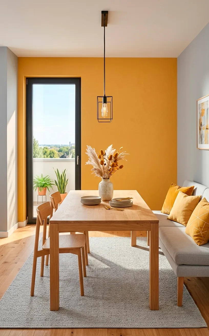
Ochre and Dove Grey
Ochre is like a moody version of yellow that actually graduated college. It’s sophisticated, earthy, and warm. I love it because it brings ‘sunlight’ into a room even on a cloudy day. Pair it with dove grey to keep it grounded. Grey acts like a cooling agent, preventing the ochre from feeling too loud. It’s a cheerful combo that still feels grown-up. ☀️
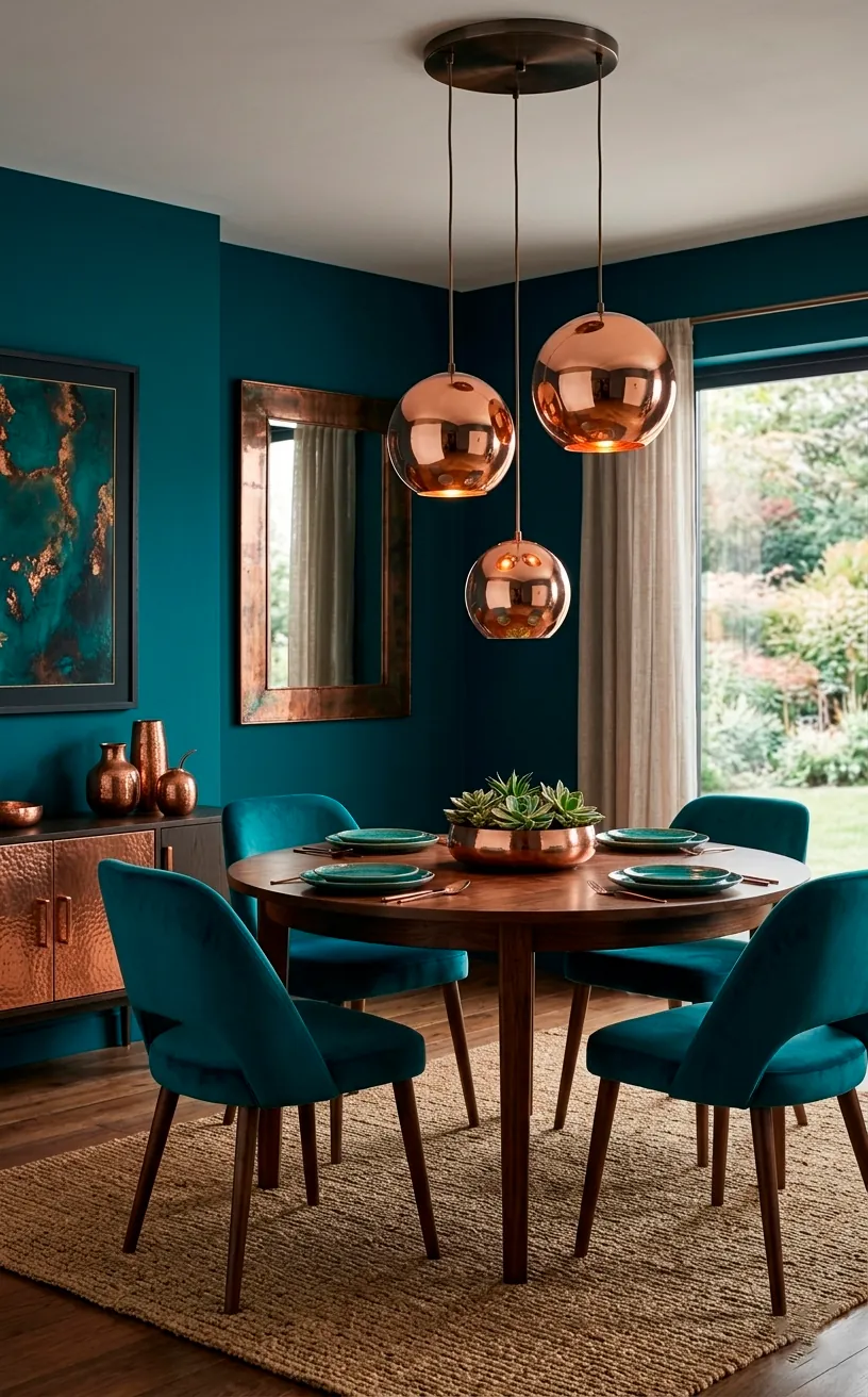
Teal and Copper
Teal is the cooler, more interesting cousin of navy. I think it’s perfect for someone who wants color but still wants an elegant vibe. Copper accents are the secret sauce here.
The orange tones in copper are the direct opposite of teal on the color wheel. This means they make each other ‘pop’ naturally.
Use copper through your light fixtures or even your flatware. It’s a modern, energetic combination that feels very ‘now.’
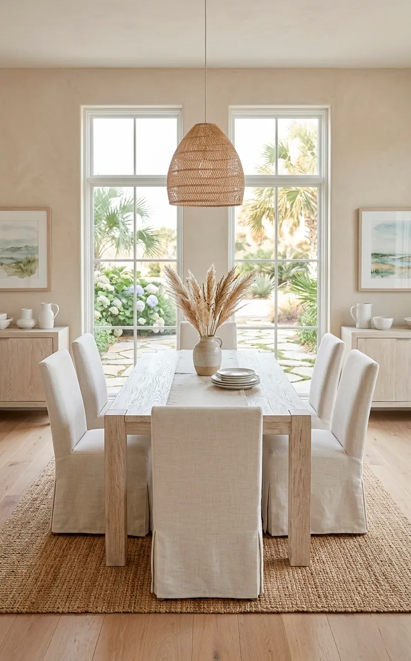
Sand and Linen
This is for the lovers of ‘quiet luxury.’ Sand and linen create a space that feels like a beach house in the Hamptons. It’s all about texture over color.
I recommend using different weights of linen for your curtains and table runners. It keeps the monochromatic look from feeling flat. It’s light, airy, and effortlessly chic.
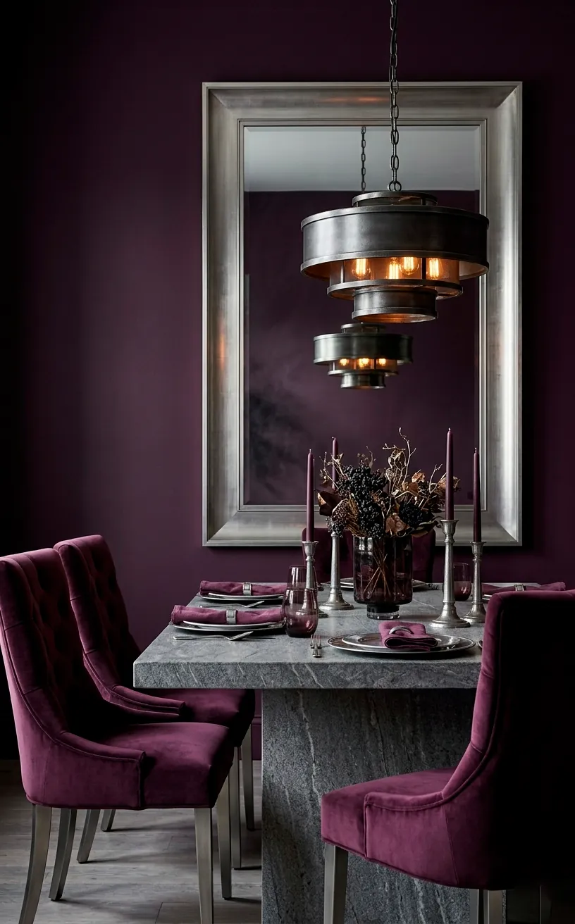
Plum and Pewter
Want something a little mysterious? Plum is an underrated choice for dining rooms. It feels regal but a bit more modern than burgundy.
Pair it with pewter or brushed silver. Unlike gold, silver-toned metals keep the plum feeling cool and contemporary. I find this combo works best in rooms with high ceilings where the dark color can really breathe.
Don’t be afraid of the dark! Deep colors like plum create a fantastic backdrop for a candlelit dinner.
Elements to mix in:
- Brushed silver picture frames
- Plum silk drapery
- Grey stone tabletops
- Pewter serving platters
Forest Green and Marble
This is the ultimate ‘nature meets luxury’ palette. Forest green provides a deep, organic vibe, while white marble adds a sharp, clean contrast.
I love a forest green accent wall behind a marble-topped sideboard. It’s a look that feels timeless and incredibly sturdy. It’s the kind of room that looks just as good in twenty years as it does today.
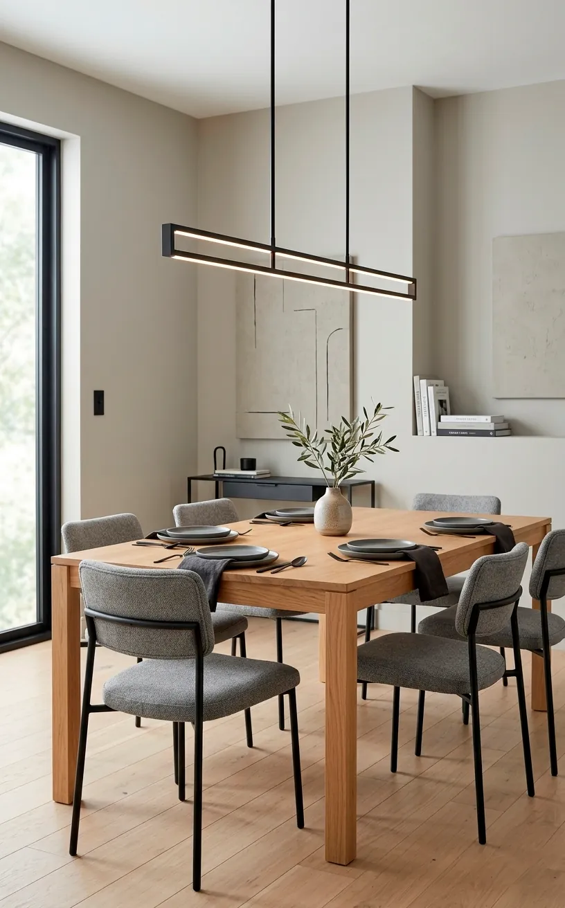
Greige and Matte Black
If you want a fail-proof modern look, go with greige. It’s the perfect middle ground between grey and beige. I find that matte black hardware is the best way to wake up a greige room. It adds definition and a bit of ‘edge’ to an otherwise soft space. It’s clean, functional, and very sophisticated. For more ideas on how to make simple furniture look like a million bucks, check out these minimalist furniture pieces that really anchor a room.
Ready to Paint?
You don’t need a massive budget to make your dining room look like a million bucks; you just need a cohesive plan. Whether you go for the moody drama of Navy and Gold or the airy vibes of Sand and Linen, remember that your home should reflect you. So, which of these palettes is calling your name? Let me know in the comments because I’m dying to hear what you’re picking first!
Related posts
See AllEarthy Terracotta Sunroom Ideas for a Mediterranean Vibe
Transform your space into a sunny European retreat. Discover simple, earthy terracotta sunroom ideas that bring authentic Mediterranean vibes straight …
Read more15 Playful Memphis Style Attic Loft Ideas with Graphic Shapes
Transform your attic loft with playful Memphis style decor! Discover 15 bold ideas using graphic shapes, vibrant colors, and quirky …
Read more15 Custom Built-In Bed Ideas for a Luxury Kids Room
Ready to transform that chaotic playroom into a high-end sanctuary? Discover 15 jaw-dropping built-in bed ideas that blend luxury, smart …
Read moreA Step-by-Step Guide to Total Laundry Room Organization
Transform your chaotic laundry space into an organized, functional oasis with this step-by-step guide. We share smart storage hacks, sorting …
Read more