












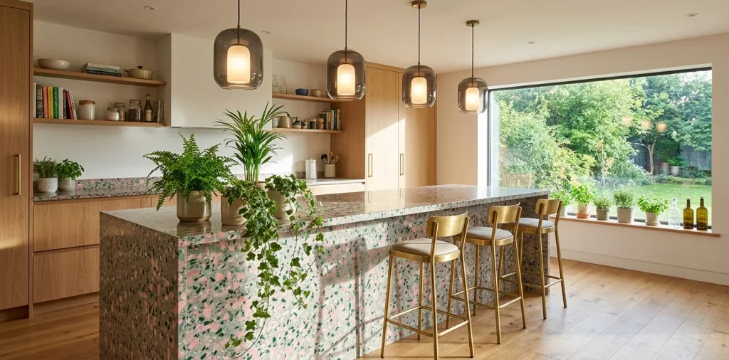

I remember the exact moment I realized white quartz was officially putting me to sleep. Don’t get me wrong, it’s safe, but where is the personality? Enter terrazzo. This brilliant, speckled material is throwing a much-needed color party in our spaces right now. If you want a counter that actually smiles back at you, I’ve rounded up some incredible setups that steal the show.
1. The Classic Blush Pink Stunner
We are starting strong with a soft, romantic blush pink base featuring oversized chunks of marble and recycled glass. This design completely transforms a basic kitchen island into a chic, millennial dream. I saw this setup in a boutique hotel cafe and immediately wanted to rip out my own boring counters. You just pair it with matte black hardware to keep it from looking like a nursery. The contrast is seriously stunning. Do you prefer warm or cool tones in your kitchen? Because this warm blush literally makes everything look golden during golden hour. It completely changes the room’s mood.

2. Moody Midnight Blue with Copper Flecks
Sometimes you want that playful pop of color wrapped in a bit of drama. A midnight blue terrazzo does exactly that.
The rich navy base grounds the space, while those tiny, reflective copper chips catch the pendant lighting perfectly. It feels a little mysterious and incredibly high-end.
You can totally pull this off in a basement speakeasy setup or a moody bachelor pad. Honestly, it hides cocktail spills like a pro. FYI, copper bar tools look ridiculous next to this counter, so stick to brushed nickel or matte black instead to balance the metallic shine.

3. The Oversized Confetti Explosion
Want to make a statement that practically screams good times? Go for an oversized macro-terrazzo where the chips are massive and brightly colored. We are talking mustard yellows, teal blues, and deep reds all swimming in a creamy white binder.
This isn’t for the faint of heart, but it brings unbelievable joy to a space. I highly recommend keeping the surrounding cabinetry ultra-minimalist. Let the counter be the main character! Top design pairings:
- Flat-panel oak cabinets
- Matte white hardware
- Simple glass dome pendants
- Minimalist wooden bar stools

4. Sage Green and Earthy Neutrals
Green kitchens are having a massive moment right now, and a sage terrazzo counter is the cherry on top.
It blends beautiful olive and terracotta specks into a calming pale green base.
Why does this work so beautifully? Because it brings the outside in without requiring you to actually keep a plant alive.
It feels organic, fresh, and perfectly balanced. Add some rattan bar stools, and you instantly have a boho-chic paradise. Check out this guide if you love those earthy vibes: warm japandi coffee bar ideas for zen mornings.

5. Neon Pops on a Concrete Base
If you want industrial vibes but refuse to live in a gray box, this design bridges the gap perfectly. We take a raw, industrial gray concrete base and embed it with shockingly bright neon pink and electric yellow chips. The juxtaposition of rough industrialism and playful neon is an absolute showstopper. It gives off distinct modern art gallery vibes. I’d pair this counter with slick acrylic bar stools and some minimalist track lighting. It keeps the space edgy while proving you actually know how to have fun with your decor without taking yourself too seriously.

6. Monochromatic Black and White
Who says a pop of color actually has to be colorful? A stark white base with jet-black and charcoal chips provides a graphic, punchy look that commands attention.
It gives you that playful, speckled texture of terrazzo while maintaining a strict, sophisticated color palette. This is the ultimate choice for minimalists who want texture without the rainbow.
I absolutely love seeing this paired with warm walnut cabinets to soften the harsh contrast. It feels timeless but undeniably trendy at the exact same time. It grounds the room perfectly.

7. The Retro Mustard Yellow
Let’s embrace some serious 70s nostalgia with a mustard yellow terrazzo. This warm, golden base looks incredible when mixed with amber, white, and brown stone chips.
It instantly warms up a cold room and pairs flawlessly with vintage mid-century modern furniture. Throw a couple of ribbed velvet bar stools underneath this bad boy, and you have the perfect spot for sipping retro cocktails. Ever thought you’d crave a yellow counter? Me neither, but here we are. It brings an undeniable smile to anyone walking into the kitchen.

8. Minty Fresh Pastel Paradise
Feeling a little daring? A mint green base with soft peach and white flecks delivers a retro diner vibe that feels surprisingly modern.
I find this combination incredibly cheerful for a morning coffee station.
It completely wakes up the space without relying on harsh artificial lighting.
To keep it looking grown-up, stick to sleek, handleless cabinetry and brushed nickel hardware. You definitely want to avoid anything too kitschy, or it might accidentally look like a 1950s ice cream parlor. Balance the sweetness with sharp, modern lines.

9. The Subtle Sand and Seaweed
For those who love coastal decor but hate the literal anchor motifs, this subtle mix is perfection. A sandy beige base peppered with seafoam green and muted blue glass chips whispers coastal living without screaming it.
It provides a gorgeous, tactile surface that feels incredibly relaxing. You can easily anchor this look with light ash wood tones and plenty of natural linen textures nearby. It genuinely feels like a breezy summer day captured in stone. It is the perfect neutral canvas for your morning routine.

10. Terracotta Dream with White Flecks
Bring the warmth of the Mediterranean right into your kitchen with a rich terracotta terrazzo. Featuring a deep, earthy rust-colored base scattered with bright white and cream marble chunks, it completely grounds a space. I adore this material for a standalone bar cart area or a small kitchen island. It pairs beautifully with exposed brick walls and sprawling pothos plants. It feels baked in the sun, adding a stunning, rustic charm that standard polished stone simply cannot replicate. It brings life into modern, sterile spaces instantly.

11. Peachy Keen and Coral
Let’s talk about a color that genuinely flatters everyone. A soft peach terrazzo base mixed with vibrant coral and gold flakes offers an incredibly warm, inviting aesthetic.
This setup literally casts a flattering glow on anyone sitting at the counter. It is the ultimate trick for making your kitchen feel permanently sunlit.
You should definitely match this counter with brass or champagne bronze fixtures. The metallic warmth pulls those gold flecks right to the surface, creating a truly luxurious finish. It is soft, elegant, and perfectly cheerful.

12. Deep Emerald Green Elegance
If you want to inject some serious luxury into your home bar, a dark emerald green base is the way to go. Loaded with bright white quartz and gold leaf flakes, this material feels incredibly opulent. It completely redefines the concept of a moody, dramatic bar setup. You sit down at this counter, and you immediately feel like ordering a very expensive martini. The richness of the emerald contrasts perfectly with warm, ambient under-cabinet lighting. It is bold, unabashedly glamorous, and entirely unforgettable. I love styling it with crystal glassware.

13. The Lilac and Lavender Whisper
Who knew purple could look so incredibly sophisticated in a kitchen?
A pale lilac base featuring tiny silver and charcoal specks offers a totally unexpected pop of pastel.
This delicate hue brings a soft, feminine energy to rigid architectural spaces.
I recommend pairing it with sleek, minimalist white barstools and plenty of natural light. It feels remarkably fresh and completely sidesteps the usual kitchen color clichés. If you want to lean into those moody, warm tones elsewhere, consider pairing it with a style moody burgundy kitchen neutral aesthetic.

14. The “Everything But the Kitchen Sink” Mix
Sometimes you just need to throw the rulebook out the window. This custom mix features a neutral gray base loaded with literally every color of the rainbow—red, blue, yellow, green, and pink chunks all fighting for attention.
It is unapologetically chaotic and incredibly fun. Because the counter is doing so much heavy lifting, you absolutely must keep the rest of your decor quiet. Let this wild, vibrant surface be the undisputed star of your dining area. It hides crumbs like an absolute champion while keeping the party going all day long.

15. Icy Blue and Frosted Glass
Channel some crisp, refreshing energy with a pale icy blue base embedded with translucent frosted glass chips. It looks exactly like sunlight hitting a glacier.
This cooling color palette works wonders in small, cramped kitchens by visually opening up the space.
The translucent glass pieces actually catch and refract your pendant lighting. I love seeing this specific material paired with crisp white shaker cabinets and polished chrome hardware for a spotless, clean aesthetic. It feels incredibly clean, vibrant, and surprisingly energetic.

16. Warm Cocoa and Caramel
Let’s cozy up the kitchen with a rich cocoa-brown terrazzo base featuring swirls of caramel and cream stone. This delicious color combination brings an immense amount of warmth to cold, modern homes. It feels incredibly inviting, much like a hot cup of coffee on a rainy morning. You can effortlessly enhance this earthy counter with woven leather barstools and matte bronze lighting fixtures. It totally shatters the myth that modern kitchens have to feel sterile and unapproachable. It embraces comfort while looking wildly sophisticated. 🤩

17. The Bubblegum Pop
Ready to fully embrace your playful side? A vibrant bubblegum pink terrazzo with oversized black and white marble chips delivers serious pop-art vibes.
It is bold, slightly eccentric, and guarantees a smile from every single guest. You just keep your walls bright white and let this counter act as a massive, functional piece of contemporary art. Honestly, life is way too short to live with boring countertops anyway! It takes immense confidence to pull off, but the results are absolutely iconic and deeply personal.

18. Subtle Gray with Jewel Tones
If you want color but fear commitment, this is your perfect compromise.
Start with a soft, unassuming dove gray base that blends into any standard kitchen.
Then, sprinkle in tiny, brilliant jewel-toned chips like ruby, sapphire, and emerald.
From a distance, it looks like a subtle gray counter, but up close, it reveals a magical, sparkling secret. It gives you that much-desired pop of color without overwhelming the senses or dictating the rest of your decor choices. It truly offers the best of both worlds.

19. The Golden Hour Glow
Imagine a terrazzo counter that captures the warmth of sunset perfectly. We are looking at a soft tangerine base filled with cream and amber flecks. This cheerful, radiant material instantly boosts the mood of any room it occupies. I find it especially effective in kitchens that lack natural sunlight, as it artificially warms up the environment. You just add some hanging planters and natural wood shelving, and you suddenly have a tropical, sunny retreat right in the middle of your house. It completely cures the winter blues IMO.

20. High-Contrast Checkerboard Illusion
We finish with a mind-bending custom design: a terrazzo mix poured to look like a blurred, speckled checkerboard. It uses alternating patches of white-based and black-based terrazzo with shared red flecks throughout to tie them together.
This design pushes the boundaries of traditional countertops and enters the realm of bespoke craftsmanship.
It is incredibly daring and requires a highly skilled installer, but the payoff is phenomenal. You end up with a kitchen island that completely defies expectations and starts conversations instantly.

Conclusion
Choosing a speckled surface feels daring, but it pays off in spades. You get a completely unique focal point that hides crumbs like a champion while keeping the vibe light and fun. From moody dark bases with neon chips to soft pastels that make mornings feel like a spa trip, there is a speckle ratio for everyone. Which one are you grabbing first? Let me know in the comments!
Related posts
See All15 Vintage Circus Inspired Details for Playful Kids Bedroom Decor
Bring the magic of the big top home! Discover 15 playful, vintage circus-inspired decor details that will transform your kid's …
Read moreThe Complete Guide to Styling a Dining Room Credenza for Everyday Elegance
Give your dining room credenza the ultimate glow-up. Discover easy, elegant styling tips that balance everyday function with show-stopping design.
Read more15 Dried Citrus and Cinnamon Garlands for a Naturally Cozy Kitchen
Forget mass-produced decorations. Transform your kitchen into a naturally cozy, aromatic sanctuary with these 15 beautiful dried citrus and cinnamon …
Read moreThe Dog-Friendly Camper: Designing a Van Interior for Your Pets
Transform your camper van into the ultimate dog-friendly adventure mobile! Discover clever interior design hacks, durable materials, and cozy setups …
Read more