


You can almost smell the salt air and hear the gulls just thinking about a kitchen makeover, can’t you? Most people settle for a boring beige box, but you clearly have better taste than that. If you want your morning coffee to feel like a sunrise at the beach, choosing the right blue is your secret weapon. I’ve spent way too much time staring at paint swatches to help you find the hues that actually work. Let’s get your kitchen looking less like a suburban pantry and more like a high-end seaside villa! 🌊
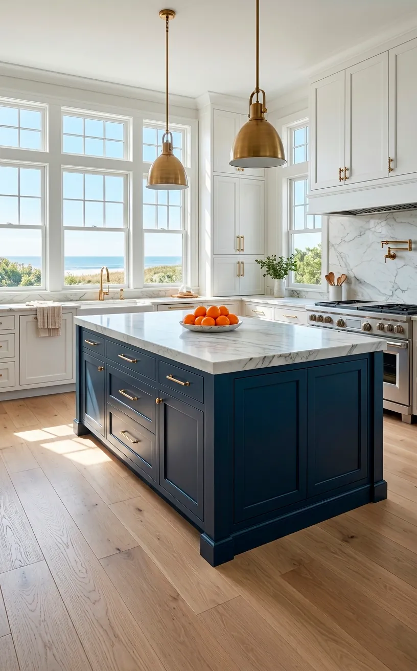
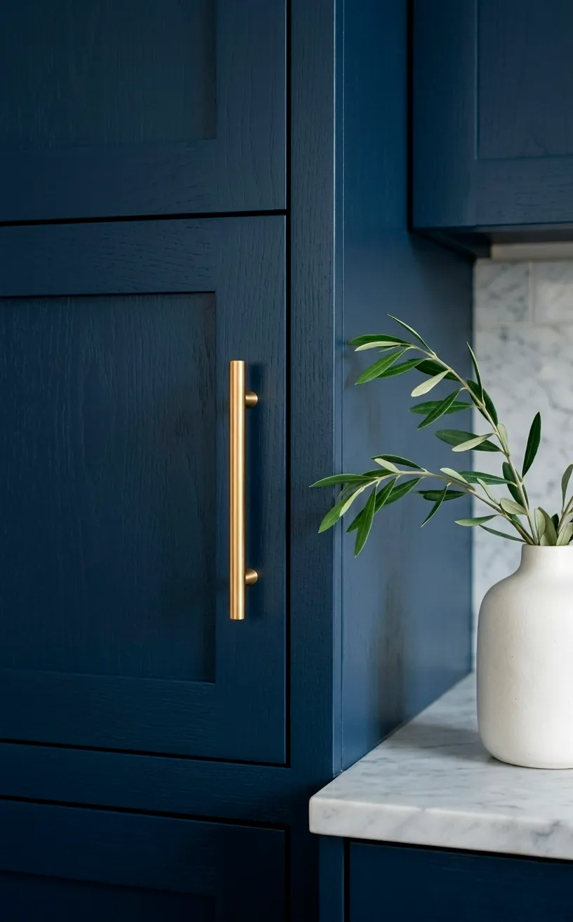
Classic Navy for That Deep Sea Drama
If you want your kitchen to feel grounded yet undeniably coastal, Navy Blue is the undisputed heavyweight champion. I’m talking about that deep, ink-like blue that reminds you of the ocean right before a storm—moody, sophisticated, and surprisingly neutral. It’s like the perfect pair of dark denim; it goes with absolutely everything. I once helped a friend paint her island this color, and it instantly hid every single fingerprint her three kids managed to leave behind. Seriously, navy is a lifesaver for high-traffic zones! Ever wondered why it looks so expensive? It’s because it provides a high-contrast backdrop that makes white marble and brass hardware pop like jewelry. You really can’t go wrong with a color that feels both timeless and nautical. Check out this guide on mastering navy and white nautical design.
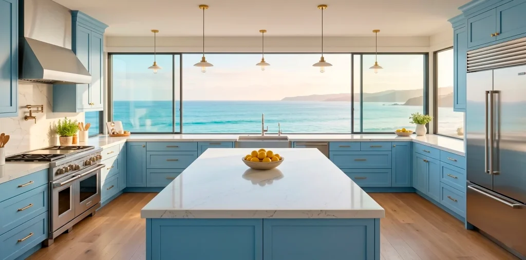
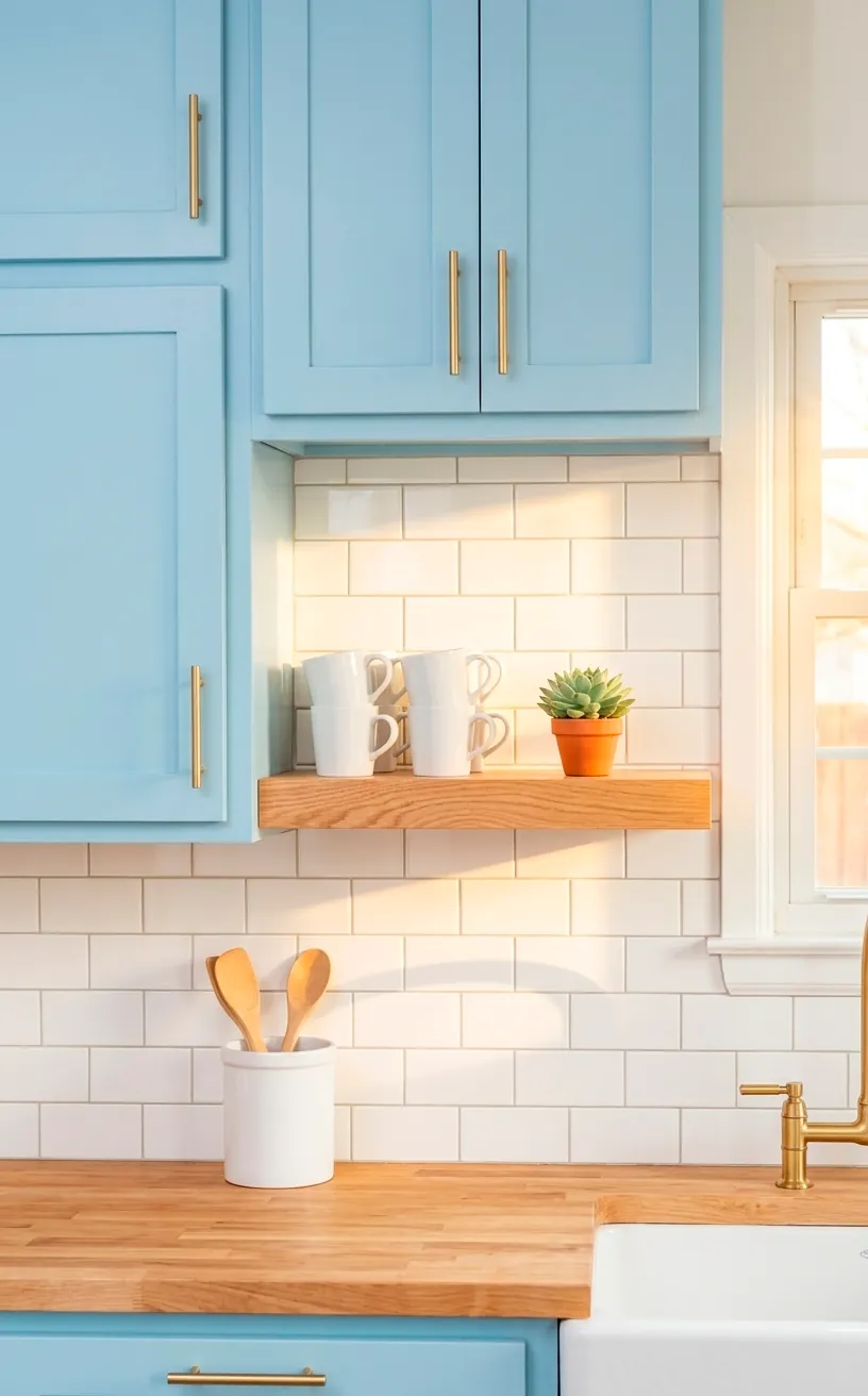
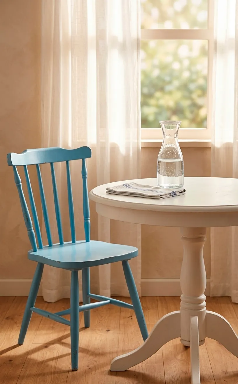
Breezy Sky Blue for Endless Summer Vibes
Maybe you aren’t ready for the drama of the deep sea and just want something that feels like a clear July afternoon. Enter Sky Blue. This shade is the ultimate mood lifter, IMO. It opens up even the tiniest kitchens and makes them feel like they’re part of the horizon.
Why this shade wins:
- It reflects natural light like a dream.
- It pairs perfectly with light-toned woods.
- You won’t feel like the walls are closing in on you during a marathon meal prep session.
I personally love using this on the upper cabinets to keep the ceiling feeling tall. It’s light, it’s airy, and it’s basically a hug for your house. Plus, it makes your stainless steel appliances look remarkably sleek rather than cold and industrial. Isn’t that what we all want?
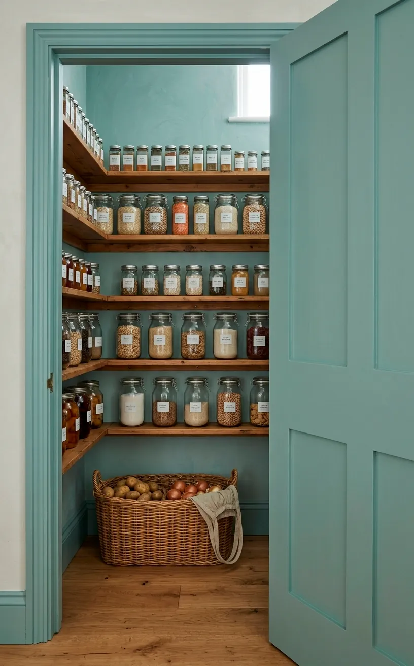
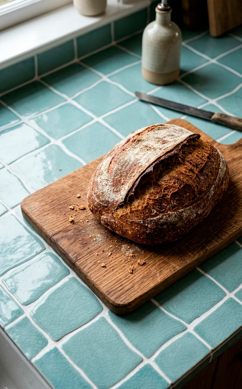
Muted Seafoam for a Relaxed Shoreline Feel
Seafoam isn’t just for your grandmother’s bathroom anymore, I promise. Modern seafoam is more of a sophisticated dusty teal that feels incredibly calming. It sits right on that line between green and blue, much like the shallow water at the edge of the beach. I find it works best when you want a ‘beachy’ look without the cliché anchors and seashells everywhere. It’s subtle, it’s chic, and it feels like a literal deep breath every time you walk into the room. ⚓
It works especially well if you have a lot of natural textures like rattan or wicker. The green undertones in the paint play off the organic fibers beautifully. Honestly, it’s the easiest way to get that ‘designer’ coastal look without trying too hard.
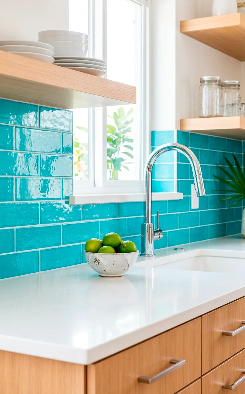
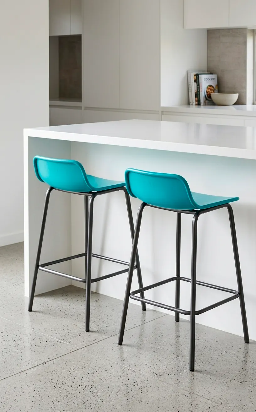
Punchy Turquoise for a Tropical Escape
Are you the type of person who orders the brightest drink on the menu? Then Turquoise is your spirit animal. This isn’t a color for the faint of heart; it’s a bold statement that says, ‘I’d rather be in the Caribbean.’ It brings a vibrant energy that most kitchens desperately need.
Tips for turquoise:
- Use it on a backsplash for a major focal point.
- Accents are your friend if you’re scared of full-cabinet commitment.
- Balance it with crisp white to avoid looking like a candy shop.
I once saw a kitchen with turquoise bar stools, and I haven’t stopped thinking about them since. They looked so playful against a white island! It’s the perfect way to inject some personality into a space that usually feels too functional. Who says cooking has to be a chore? With colors this bright, you might actually enjoy flipping pancakes on a Sunday morning.
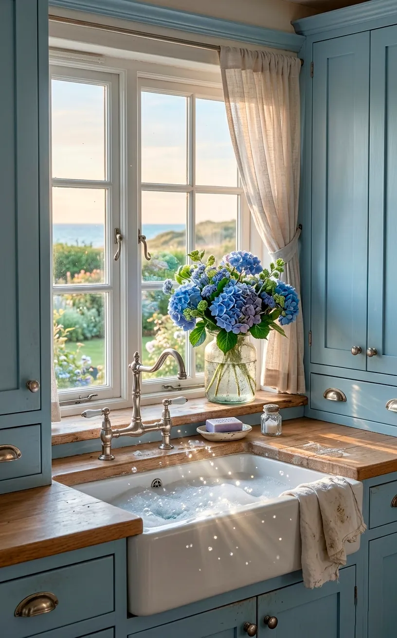
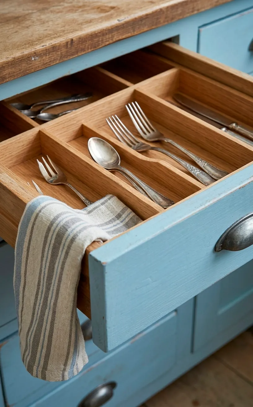
Soft Powder Blue for Vintage Coastal Charm
If you’re obsessed with that ‘Coastal Grandmother’ aesthetic—you know, the one with the linen pants and the perfectly manicured hydrangeas—Powder Blue is your go-to. It’s soft, dusty, and has a slight grey undertone that keeps it from looking like a nursery. Powder blue feels nostalgic and cozy, like a well-worn beach towel. I suggest pairing this with silver or nickel hardware to lean into that cool, crisp feeling. It’s a very ‘quiet luxury’ choice that doesn’t scream for attention but definitely gets noticed. It’s the kind of color that makes you want to bake a pie, even if you don’t know how to use your oven.
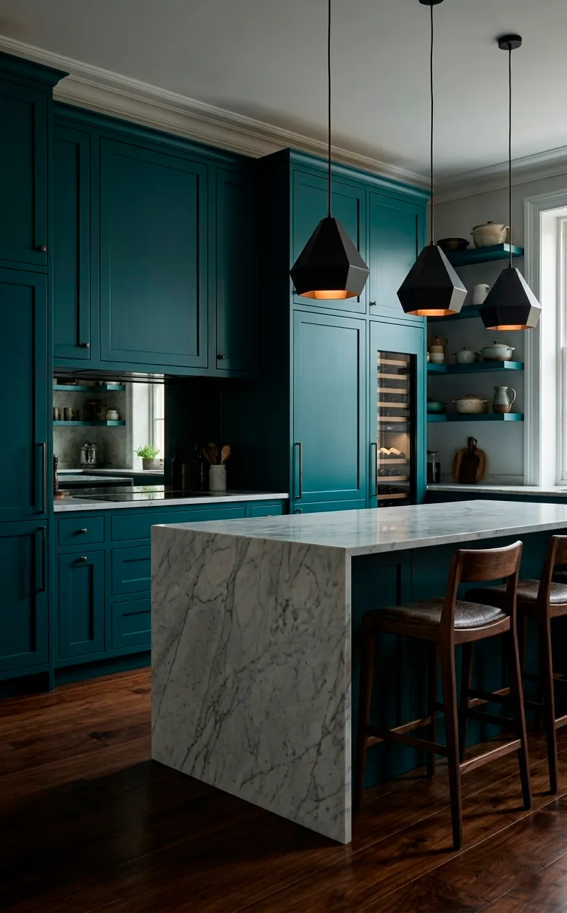
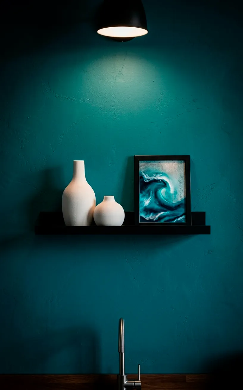
Deep Teal for a Sophisticated Cove
Teal is the cooler, more mysterious cousin of turquoise. It has a depth and richness that feels incredibly high-end. Think of it as the color of deep lagoons or those hidden coves you find while hiking.
I love using teal because it bridges the gap between modern and traditional so well. If you have an open-concept home, a teal kitchen acts as a stunning anchor for the whole floor plan. It’s bold enough to be interesting but dark enough to feel permanent.
FYI, it looks phenomenal with dark wood floors. The richness of the blue-green tones against a chocolatey wood is just chef’s kiss. Just make sure you have enough lighting, or you might feel like you’re cooking in an actual cave—though a very stylish one!
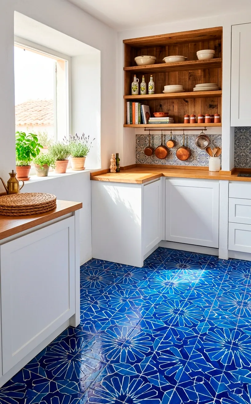
Electric Cobalt for a Mediterranean Edge
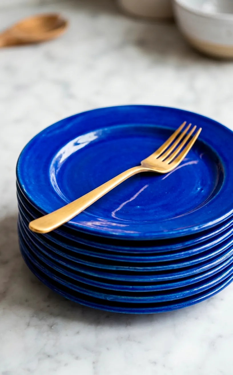
Do you want your kitchen to feel like a getaway to Santorini? Cobalt is the answer. This is an energizing, high-pigment blue that practically vibrates with life. It’s the color of Greek shutters and deep Mediterranean waters. I usually recommend using this in small, potent doses. Think about a cobalt blue tiled floor or maybe just the base of the kitchen island. It’s a very social color—it invites conversation and makes the room feel like the heart of the home. Have you ever noticed how food looks better against blue? It’s a weird science thing, but cobalt really makes white plates pop. It’s vibrant, it’s daring, and it’s a total vibe.
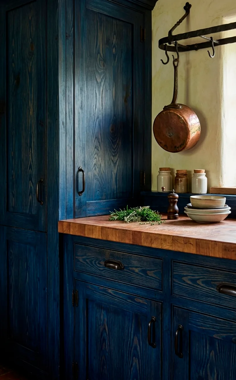
Weathered Indigo for a Rustic Nautical Touch
Last but not least, we have Indigo. This is the shade for those who love the rugged, weathered side of coastal living. It’s that deep, slightly purple-blue that looks like a faded fisherman’s sweater. It feels grounded and honest.
Why indigo works:
- It hides scuffs and stains remarkably well (praise be!).
- It looks incredible with ‘distressed’ or reclaimed wood.
- It adds a layer of texture that flatter blues just can’t match.
I personally think indigo looks best when it’s not perfectly uniform. A slightly chalky or hand-brushed finish gives it that lived-in, coastal cottage feel that I absolutely adore. It’s less about ‘perfect’ and more about ‘personality.’ If you’re looking for more ways to use these hues, check out these fresh ways to style coastal blue in your home. It’s all about creating that flow from the kitchen to the rest of your sanctuary. ✨
Conclusion
Choosing the right shade of blue can truly transform your kitchen from a standard cooking zone into a calming, ocean-inspired sanctuary. Whether you crave the deep drama of navy or the cheerful vibes of sky blue, there is a perfect hue waiting for your cabinets. I hope these ideas helped you narrow down your favorites! So, which one are you grabbing first to start your coastal renovation? Let me know in the comments, and don’t be afraid to go bold with your brushes! 🍹
Related posts
See AllEarthy Terracotta Sunroom Ideas for a Mediterranean Vibe
Transform your space into a sunny European retreat. Discover simple, earthy terracotta sunroom ideas that bring authentic Mediterranean vibes straight …
Read more15 Playful Memphis Style Attic Loft Ideas with Graphic Shapes
Transform your attic loft with playful Memphis style decor! Discover 15 bold ideas using graphic shapes, vibrant colors, and quirky …
Read more15 Custom Built-In Bed Ideas for a Luxury Kids Room
Ready to transform that chaotic playroom into a high-end sanctuary? Discover 15 jaw-dropping built-in bed ideas that blend luxury, smart …
Read moreA Step-by-Step Guide to Total Laundry Room Organization
Transform your chaotic laundry space into an organized, functional oasis with this step-by-step guide. We share smart storage hacks, sorting …
Read more