


Listen, I’ve spent way too many Saturday afternoons turning my walls into Swiss cheese because I thought ‘eyeballing it’ was a legitimate design strategy. Spoiler alert: it’s not. If you want your home to feel like a curated sanctuary rather than a dorm room, you need to master a few non-negotiable rules. I’m talking about the kind of balance that makes your brain sigh with relief the second you walk into the room. Whether you’re a minimalist or a maximalist, these spacing secrets will save your drywall and your sanity. 🎨
The Magic 57-Inch Rule
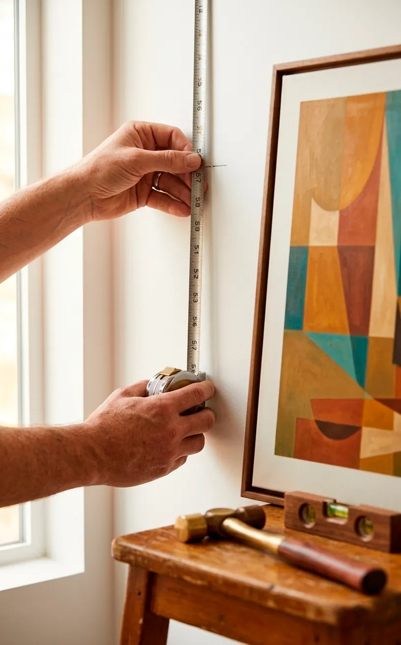
Ever walk into a house and feel like you need a ladder just to see the paintings? People constantly hang their art way too high. To fix this, I always follow the museum standard: the center of your piece should sit exactly 57 inches from the floor. This magic number represents the average human eye level, and sticking to it creates instant harmony throughout your entire home.
I vividly remember my first apartment where I hung a massive landscape so high I could barely see the horizon while standing. It looked ridiculous, FYI. Now, I pull out my tape measure every single time. You just mark the 57-inch spot, calculate the distance from the wire to the top of the frame, and hammer away. Your neck will thank you, and your guests won’t feel like they’re at a giraffe convention.
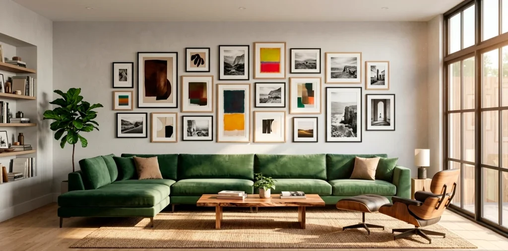
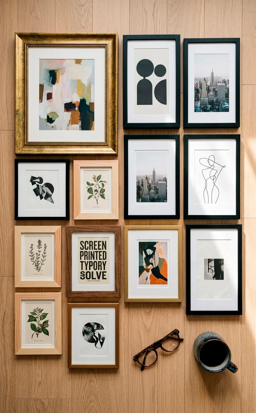
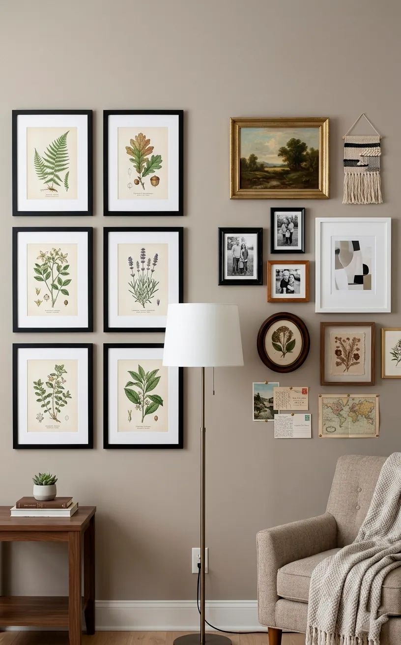
Treat Groupings as One Unit
When you’re dealing with a gallery wall, don’t think about the individual frames as separate entities. That’s a one-way ticket to Clutterville. Instead, I treat the entire collection as a single, massive piece of art. I usually lay everything out on the floor first to find the outer ‘boundary’ of the group. If the total shape looks wonky on the floor, it’ll look even worse on your wall. Keep the overall silhouette balanced, and suddenly that random mix of postcards and oil paintings looks like a deliberate masterpiece. This mindset shift completely changed how I approach my hallway decor.
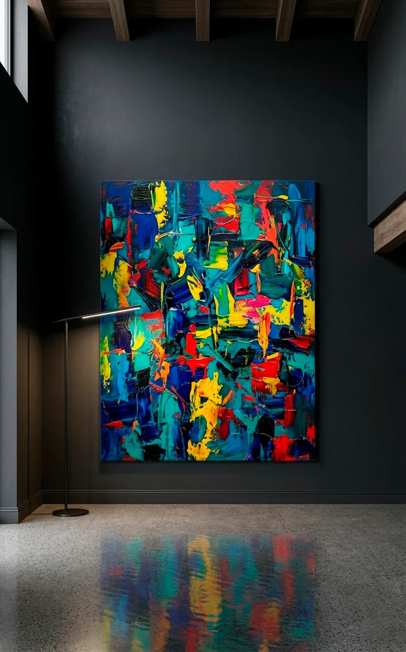
Scale for the Space
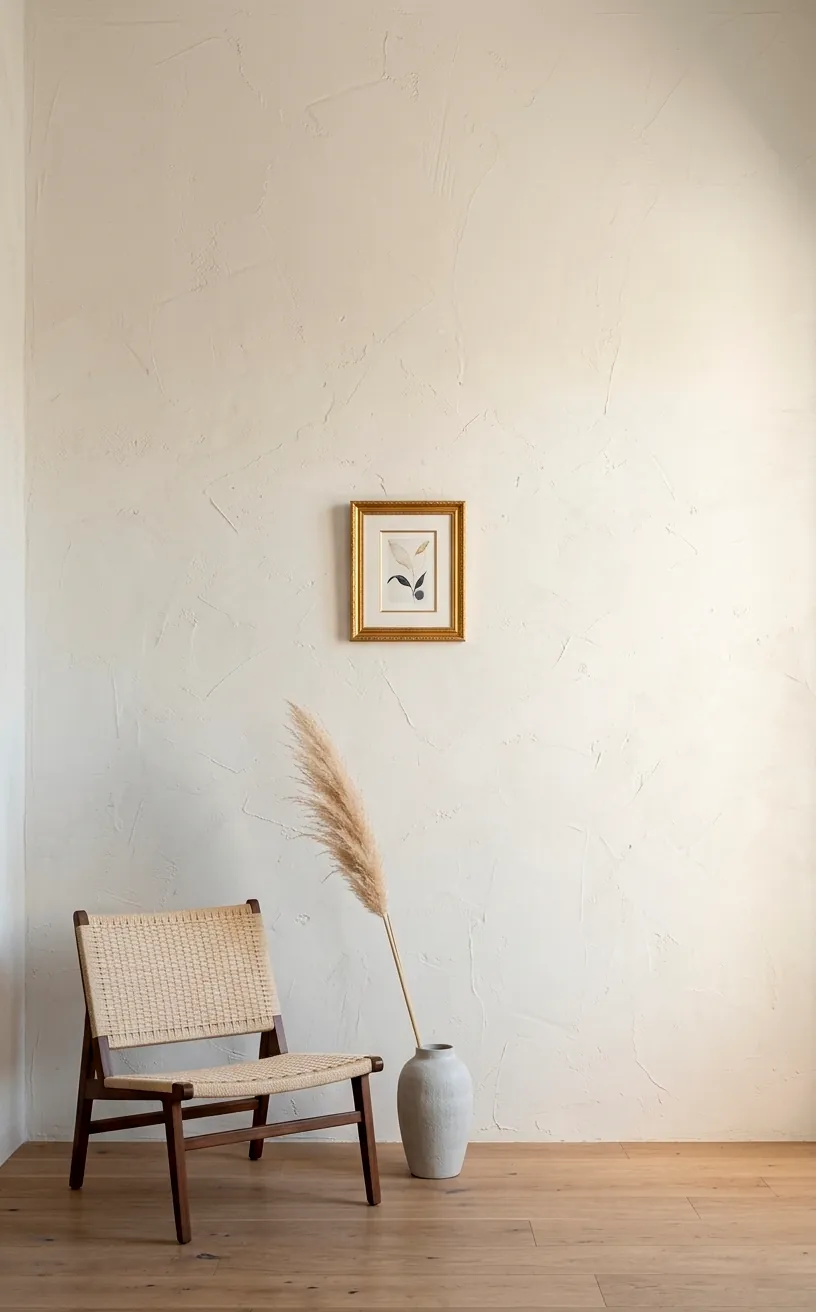
Size matters, and I’m tired of seeing tiny 8×10 prints floating in a sea of empty drywall. It looks lonely. If you have a massive wall, you need a massive piece or a very tight grouping.
Small art works best in narrow spots, like between windows or in a cozy nook. I once tried to put a single polaroid on a 12-foot wall. It looked like a postage stamp in the desert. Learn from my embarrassment!
You must match the scale of the art to the scale of the architecture. Big walls demand bold statements. If you can’t afford a giant canvas, just use multiple smaller ones to create that visual ‘bulk’ you need for the room to feel anchored.
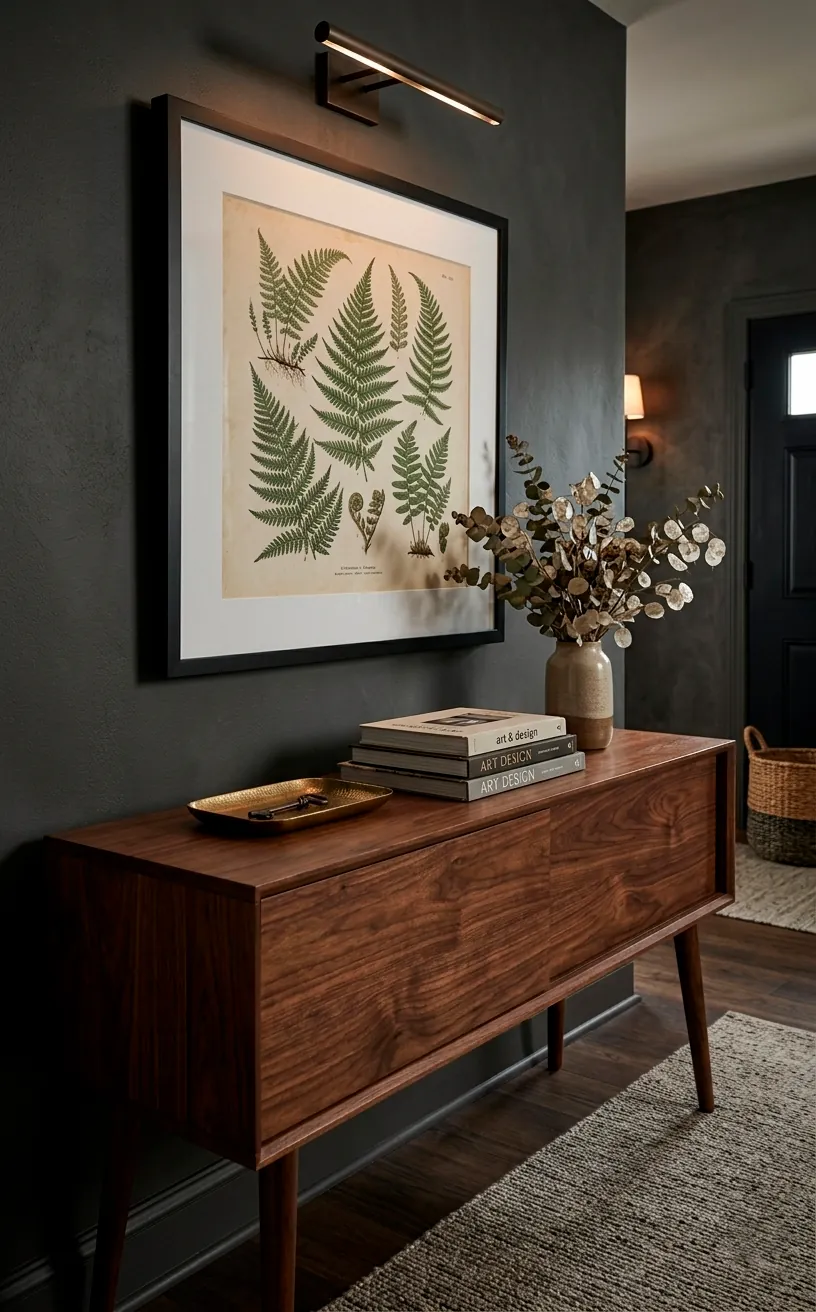
Anchor to Your Furniture
Art shouldn’t just float in the abyss; it needs a best friend. In my house, that friend is usually a sofa, a console table, or a headboard. I always hang the bottom of the frame about 6 to 10 inches above the furniture. This creates a visual connection so the art feels like it belongs to the room’s layout rather than just being stuck on a random wall. If the gap is too big, the art feels disconnected and awkward. Keep it close, keep it cozy, and the whole setup will look infinitely more intentional. For more layout inspiration, check out my thoughts on small bedroom bed placement.
I find that a 6-inch gap works wonders for low-profile furniture. It makes the ceiling feel higher too. Seriously, try it and watch your living room transform instantly.
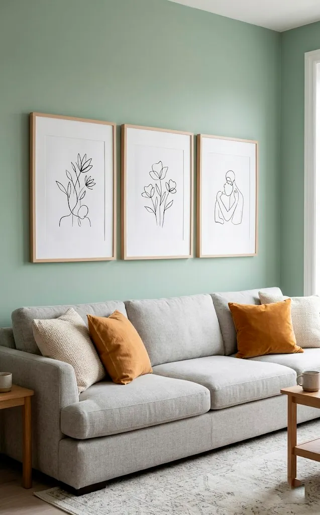
The Two-Thirds Rule
Don’t you hate it when a painting looks like it’s being eaten by the sofa underneath it?
Or worse, when a tiny frame looks like a speck of dust above a massive sectional? To avoid this, I use the Two-Thirds Rule.
Basically, your art (or your group of art) should span about 60% to 75% of the width of the furniture below it.
This proportion creates a balanced ‘weight’ that feels stable to the human eye. If the art is wider than the furniture, the whole room feels top-heavy and stressful. If it’s too narrow, it looks like an afterthought. Aim for that ‘just right’ sweet spot, and your room will finally feel finished.
Balance Visual Weight
Balance isn’t just about inches; it’s about how ‘heavy’ an item looks. A dark, thick-framed oil painting has way more visual weight than a light, frameless watercolor of the same size. I always try to balance these ‘weights’ across the wall. If I put a heavy piece on the left, I need something equally substantial or a larger, lighter grouping on the right to compensate.
Think of it like a seesaw for your eyes. You don’t want the room to feel like it’s tipping over! I usually mix my heavy frames with lighter ones to keep things interesting but grounded. This prevents one side of the room from feeling too cluttered while the other feels empty.
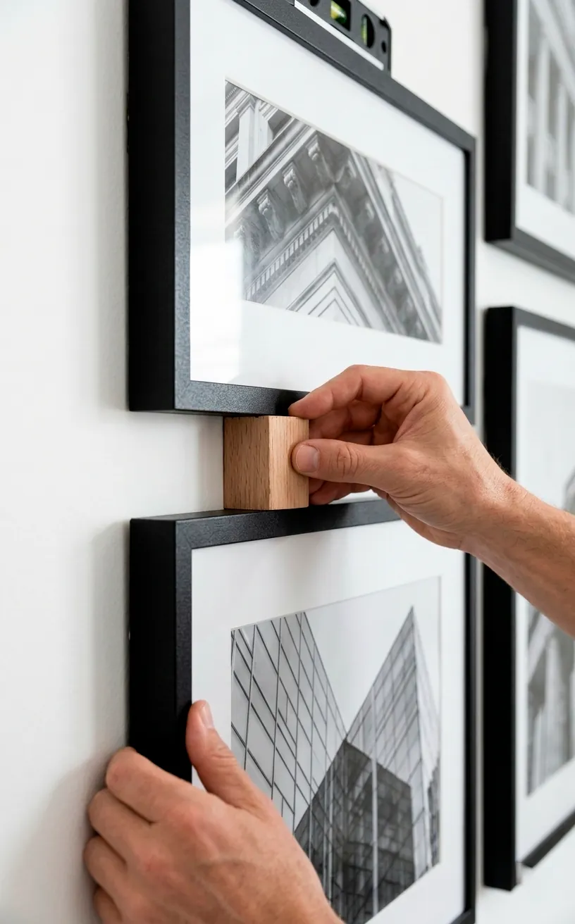
Mind the Spacing Gaps
The gap between your frames is just as important as the frames themselves. In a gallery wall, I generally stick to a 2 to 3-inch gap between pieces. Any closer and they start to look cramped; any further and they look like they’re trying to escape each other. Consistency is king here—if you use a 2-inch gap between the first two pieces, keep that spacing consistent for the whole wall. This creates a grid-like structure that anchors the ‘chaos’ of an eclectic collection. IMO, a uniform gap is the secret sauce that separates a professional job from a DIY disaster. It’s a small detail, but man, does it make a difference when you stand back and look at the final result.
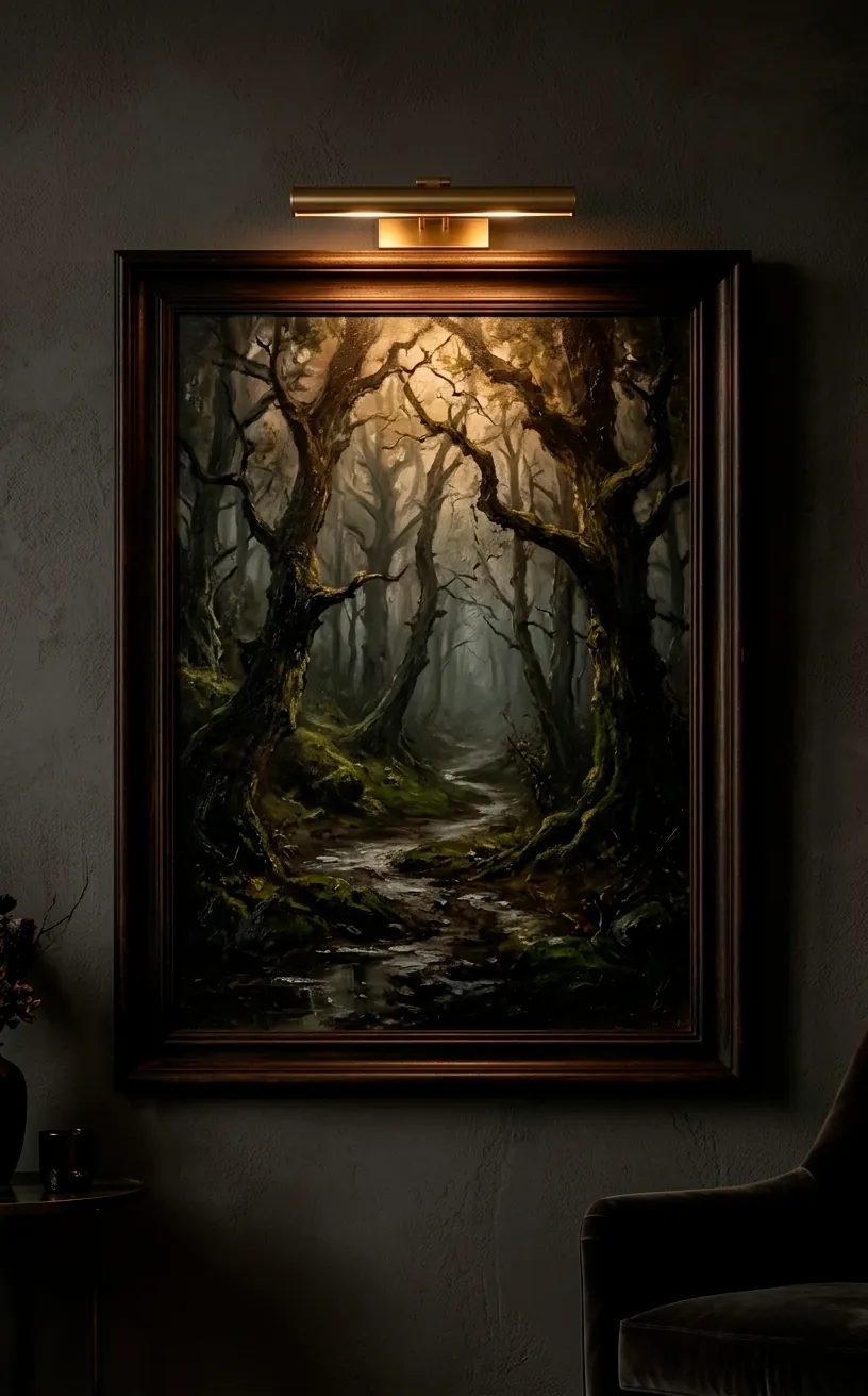
Don’t Ignore the Lighting
You can have the most perfectly spaced art in the world, but if it’s in the dark, what’s the point? Or worse, what if a massive glare from a window makes the piece invisible? I always consider where the light hits before I drive a single nail.
I love using battery-operated picture lights for a high-end look without the electrical bill. Just make sure the light doesn’t cast a harsh shadow from the frame onto the art itself. Glare is also a vibe-killer, so if your wall faces a bright window, consider non-reflective glass or canvas pieces instead. Lighting really is the final touch that makes art ‘pop’ and feel truly premium.
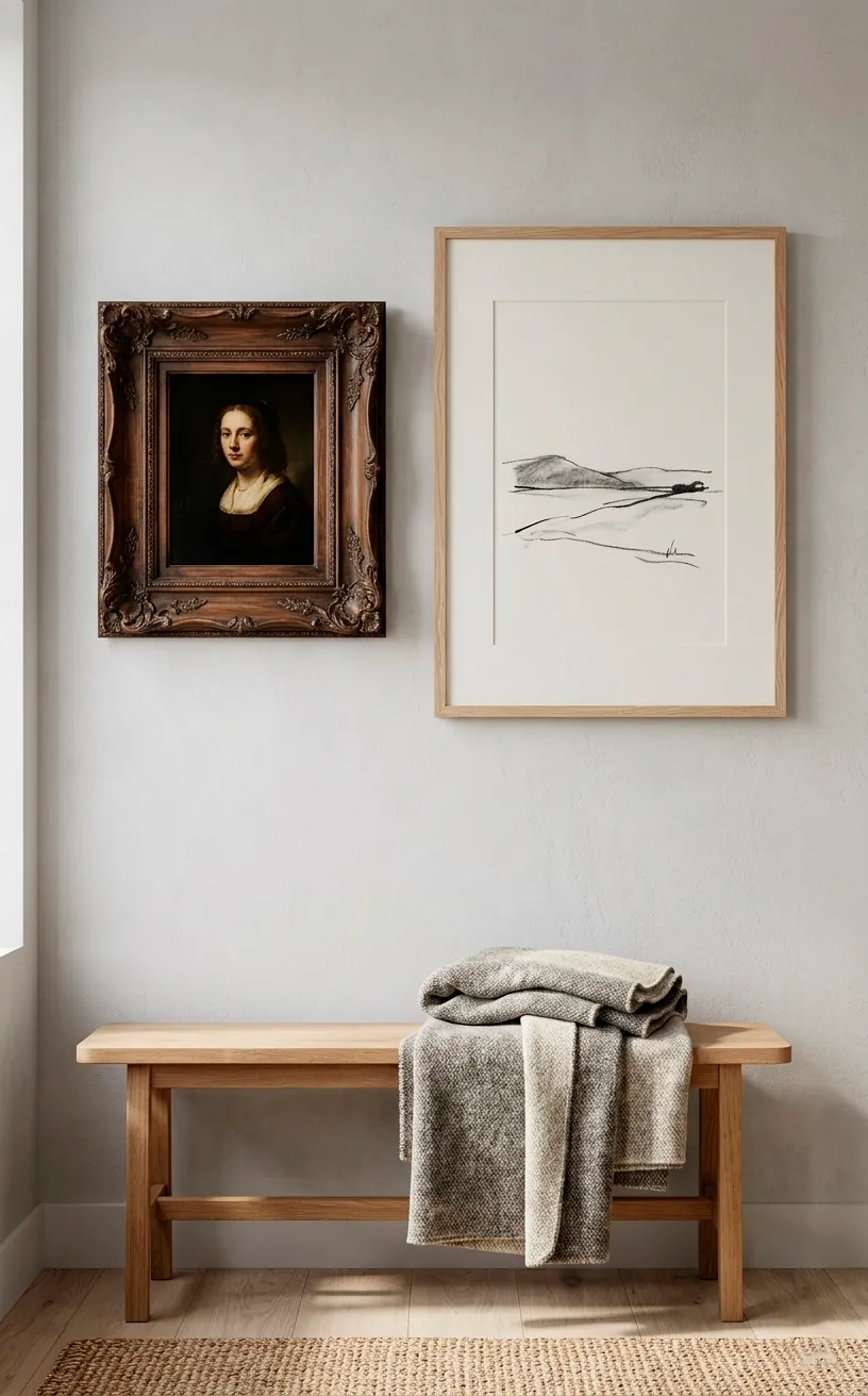
Symmetry vs. Asymmetry
Deciding between symmetry and asymmetry is like choosing between a tuxedo and a leather jacket. Both are cool, but they give off totally different vibes. I use symmetry (matching frames in a perfect grid) when I want a room to feel formal, calm, and structured. It’s very ‘old money’ and sophisticated. On the other hand, asymmetry is my go-to for a relaxed, creative, and lived-in feel.
Just remember: even an asymmetrical layout needs balance. You can’t just throw things at the wall and hope for the best. I still follow the visual weight rules even when my frames are all different sizes and heights. It’s an organized mess, and that’s why it works so well for cozy dens or creative offices.
Embrace Negative Space
Sometimes, the best thing you can put on a wall is… nothing.
I know, I know. It’s tempting to fill every square inch of your home with cool stuff, but ‘visual rest’ is a real thing. Your eyes need a place to land that isn’t busy or crowded.
If you have a massive gallery wall in one spot, leave the adjacent wall blank or very minimal. This prevents the room from feeling like it’s closing in on you.
Think of negative space as the silence between notes in a song. Without it, everything is just noise. I always find that a well-placed ’empty’ spot makes my actual art look even more special and expensive. If you’re styling a quiet corner, you might find some great ideas in my guide to sophisticated monochrome reading nooks.
The Final Verdict
At the end of the day, your home should reflect you, but these rules give you a solid foundation to build on. Start with the 57-inch rule and watch how much better everything feels. Don’t be afraid to pull out the tape measure—precision is your friend! Once you nail the spacing, your art will finally start doing the heavy lifting in your decor. So, which wall are you tackling first this weekend? Let me know in the comments, and good luck with those hammers—try to keep your thumbs out of the way! 😎
Related posts
See AllEarthy Terracotta Sunroom Ideas for a Mediterranean Vibe
Transform your space into a sunny European retreat. Discover simple, earthy terracotta sunroom ideas that bring authentic Mediterranean vibes straight …
Read more15 Playful Memphis Style Attic Loft Ideas with Graphic Shapes
Transform your attic loft with playful Memphis style decor! Discover 15 bold ideas using graphic shapes, vibrant colors, and quirky …
Read more15 Custom Built-In Bed Ideas for a Luxury Kids Room
Ready to transform that chaotic playroom into a high-end sanctuary? Discover 15 jaw-dropping built-in bed ideas that blend luxury, smart …
Read moreA Step-by-Step Guide to Total Laundry Room Organization
Transform your chaotic laundry space into an organized, functional oasis with this step-by-step guide. We share smart storage hacks, sorting …
Read more