












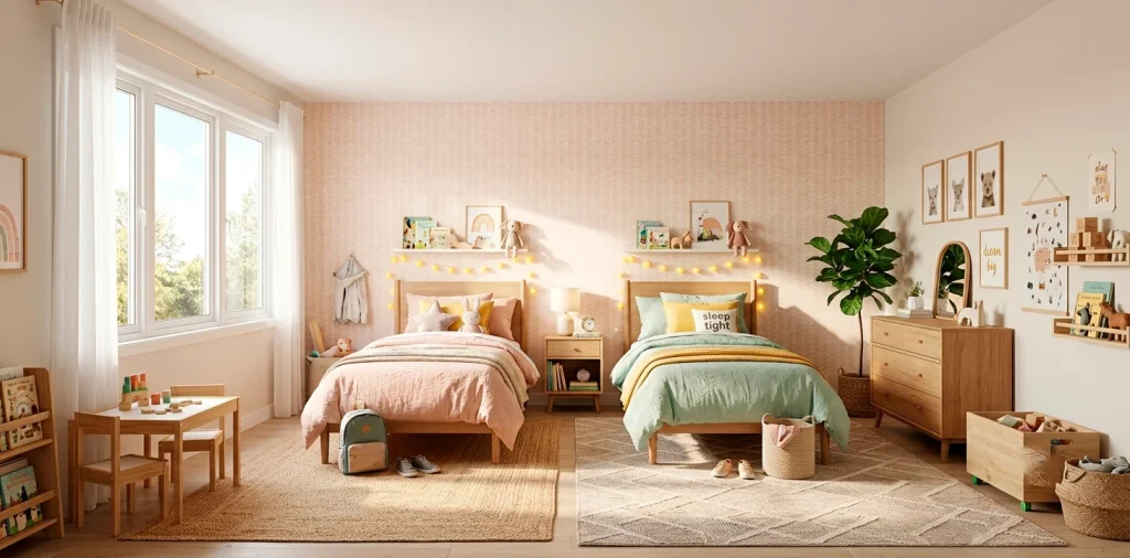

Getting two kids to agree on anything is a minor miracle, right? Sharing a bedroom usually means epic battles over who gets which corner. I found that leaning into soft, calming pastels creates a neutral, happy middle ground that actually works. We are looking at 15 playful pastel palettes that bring massive personality without the sibling rivalry. Let’s fix that room!
Mint & Lavender
I absolutely love combining cool mint with soft lavender for a shared space. It offers this incredibly fresh, spring-like vibe that feels surprisingly gender-neutral. One kid claims the green side, the other takes the purple, and suddenly peace reigns supreme in the house.
Symmetry is overrated, IMO. Paint the ceiling mint and use lavender for the bedding and area rugs. It brings a cozy warmth while keeping the energy light and playful. Ever thought about matching these tones with warm oak furniture? It grounds those airy colors perfectly. Adding texture is key here, which reminds me, you might want to check out these tactile felt board ideas for a kids’ room.

Butter Yellow & Sky Blue
Nothing screams cheerful quite like butter yellow and sky blue. If your kids’ room lacks natural light, this duo fakes a sunny day beautifully. Use yellow as your primary accent color on window treatments or a shared dresser, while letting a soft blue cover the walls to prevent the room from feeling like a giant lemon. I tried a stark white here once, and it just looked clinical. The soft blue is much more forgiving on mysterious wall smudges. Trust me, you need that forgiveness. Add some woven baskets for toy storage, and you have a room that feels both vibrant and completely organized! ☀️

Blush Pink & Sage Green
Let’s talk about the ultimate botanical dream team.
Blush pink and sage green together look like a perfectly curated indoor garden. I find this palette grows with the kids remarkably well.
You won’t have to repaint when they suddenly decide they are “too old” for primary colors. The green brings a soothing, earthy element, while the blush keeps things sweet and lighthearted.
Design elements:
- Sage green wainscoting
- Blush pink velvet floor cushions
- Minimalist brass reading lamps

Peach & Soft Gray
Peach is making a massive comeback, and pairing it with a soft, warm gray instantly modernizes a shared bedroom. The gray acts as a brilliant anchor, stopping the peach from feeling overly sweet or cloying. Gray upholstered twin headboards against a playful peach accent wall create a striking focal point that anchors the entire space. I highly recommend bringing in some crisp white linens to keep the contrast sharp and clean. It feels sophisticated but totally appropriate for little ones. Have you ever noticed how gray just magically makes every warm tone pop?

Lilac & Pale Aqua
If you want a room that feels like a whimsical mermaid lagoon without going overboard on themes, this is your winner.
Lilac and pale aqua bounce off each other beautifully. The aqua feels refreshing and energetic, while the lilac adds that essential touch of calm needed for winding down at night.
I highly suggest using aqua for larger furniture pieces, like a shared wardrobe or bunk bed frame, and sprinkling lilac through soft textiles. Throw in some metallic silver accents to really sell that magical, slightly aquatic vibe without being painfully obvious. 🧜♀️

Coral & Mint
This palette packs the most punch on our list. Soft coral and mint are practically begging for a playful, energetic layout. They are complementary colors, meaning they naturally make each other stand out when placed side-by-side.
To keep it from feeling chaotic, use a creamy white as your base. Paint the walls off-white and bring in the coral and mint through alternating bedspreads and a shared patterned rug. It keeps the vibrancy high but leaves a visual resting place for the eyes. Nobody wants a bedroom that causes sensory overload right before bedtime, right?

Lemon & Sherbet Pink
Looking for a palette that feels like a trip to an old-school ice cream parlor? Lemon and sherbet pink are your best friends here. This combo is ridiculously fun and bursting with pure joy. Keep the tones very muted—think the color of a faded vintage t-shirt—so it doesn’t cross into neon territory. A lemon-yellow painted ceiling paired with soft pink walls creates an enveloping, warm glow that kids absolutely adore. Add some natural rattan furniture to bring a little texture and ground the sweetness. It is basically a guaranteed smile every time you open the door! 🍦

Dusty Rose & Powder Blue
Here is a classic that never fails.
Dusty rose and powder blue offer a vintage, almost storybook quality to a shared bedroom. It is nostalgic, yet totally fresh when paired with modern furniture lines.
I love how the muted, slightly grayish undertones in both colors prevent them from clashing. They just sit beautifully together, proving you can definitely have an elegant space for energetic little ones.
Room details:
- Powder blue blackout curtains
- Dusty rose tufted armchairs
- Distressed cream area rugs

Pistachio & Cream
Sometimes the best pastel palette is the quietest one. Pistachio green paired with a rich, warm cream creates a ridiculously calming sanctuary. This is my top pick if your kids share a tiny room, because these light, airy shades physically push the walls out and make the space feel twice as big. Focus heavily on textures here rather than loud patterns. Think chunky cream knit blankets, smooth pistachio ceramic lamps, and fluffy sheepskin rugs between the beds. It creates a gentle, tactile environment that feels incredibly safe and soothing for sleep.

Periwinkle & Muted Mustard
Okay, hear me out on this one. It sounds a bit wild, but periwinkle and muted mustard yellow are a designer’s dream team.
The cool, purplish-blue of the periwinkle perfectly balances the warm, earthy zing of the mustard. It feels a little retro and wildly creative, perfect for kids who love art and building things.
Keep the periwinkle on the walls and use the mustard strictly for accents—like a painted bookshelf or cozy throw blankets. It adds an unexpected pop of genius that elevates the entire shared room. Honestly, I’d steal this color combo for my own office.

Seafoam & Melon
If you want a tropical vacation vibe without gluing plastic palm trees to the walls, seafoam green and melon orange are the way to go. It is crisp, warm, and highly energetic.
Balance is everything with this duo. I prefer splitting the room horizontally—seafoam wainscoting on the bottom half of the walls, and a soft melon painted above. It visually unifies the shared space while celebrating both colors equally. Toss in some crisp white bed frames to keep the colors looking sharp and intentional. Who wouldn’t want to wake up in a room this happy? 🍉

Orchid & Vanilla
Soft orchid purple and warm vanilla bring a totally luxe, cloud-like feeling to a kids’ room. Unlike stark white, vanilla offers a creamy warmth that makes the space feel incredibly inviting. Use orchid as a ceiling color to draw the eye up, making the room feel taller. Pair it with soft vanilla walls and light birch wood furniture to keep the atmosphere breezy and uncluttered. I adore this palette because it feels so dreamy and peaceful, which is exactly the vibe you want when begging two toddlers to please just go to sleep already.

Apricot & Soft Teal
This palette is pure magic.
Soft apricot brings a lovely, gentle warmth, while soft teal adds a cooling, grounded element. They sit beautifully opposite each other on the color wheel.
I actually used this in a playroom once, and the energy shift was incredible. The kids somehow played calmer, and the space felt incredibly pulled together.
Accent pieces:
- Teal painted wooden beds
- Apricot geometric wall decals
- Natural jute storage baskets

Mint & Sand
We are bringing the beach inside with this one! Mint green and a warm, sandy beige create a serene, grounded environment. Sand acts as the ultimate neutral, giving the eye a rest while the mint provides a playful splash of color. I love utilizing natural wood tones here, like a gorgeous maple or ash bunk bed, to bridge the gap between the two shades. Keep the bedding a crisp white with mint piping for a subtle, tailored look. It is basically a coastal retreat shrunk down for your favorite tiny humans, and it completely eliminates any chaotic visual clutter. 🏖️

Lavender & Blush
We are finishing strong with the ultimate sweet-tooth palette. Lavender and blush pink create a room so charming it practically gives you a toothache—in the best way possible, of course.
Because these colors are so similar in their soft value, they blend together like a watercolor painting. To keep the room from feeling completely washed out, introduce strong, dark accents.
A charcoal gray rug or matte black light fixtures anchor the sweetness and add a necessary modern edge. It proves that pastel rooms can still have some serious attitude and style! FYI, if you want more soft color inspiration, check out these pretty pastel palettes for a cottage laundry room.

Conclusion
Decorating a shared kids’ room doesn’t have to end in tears or boring white walls. By embracing these playful pastel palettes, you create a space that feels energetic, personalized, and perfectly unified. Whether you lean toward mint and lavender or that unexpected periwinkle and mustard, there is a combo here that works. Which one are you grabbing first? Let me know in the comments!
Related posts
See All15 Vintage Circus Inspired Details for Playful Kids Bedroom Decor
Bring the magic of the big top home! Discover 15 playful, vintage circus-inspired decor details that will transform your kid's …
Read moreThe Complete Guide to Styling a Dining Room Credenza for Everyday Elegance
Give your dining room credenza the ultimate glow-up. Discover easy, elegant styling tips that balance everyday function with show-stopping design.
Read more15 Dried Citrus and Cinnamon Garlands for a Naturally Cozy Kitchen
Forget mass-produced decorations. Transform your kitchen into a naturally cozy, aromatic sanctuary with these 15 beautiful dried citrus and cinnamon …
Read moreThe Dog-Friendly Camper: Designing a Van Interior for Your Pets
Transform your camper van into the ultimate dog-friendly adventure mobile! Discover clever interior design hacks, durable materials, and cozy setups …
Read more