












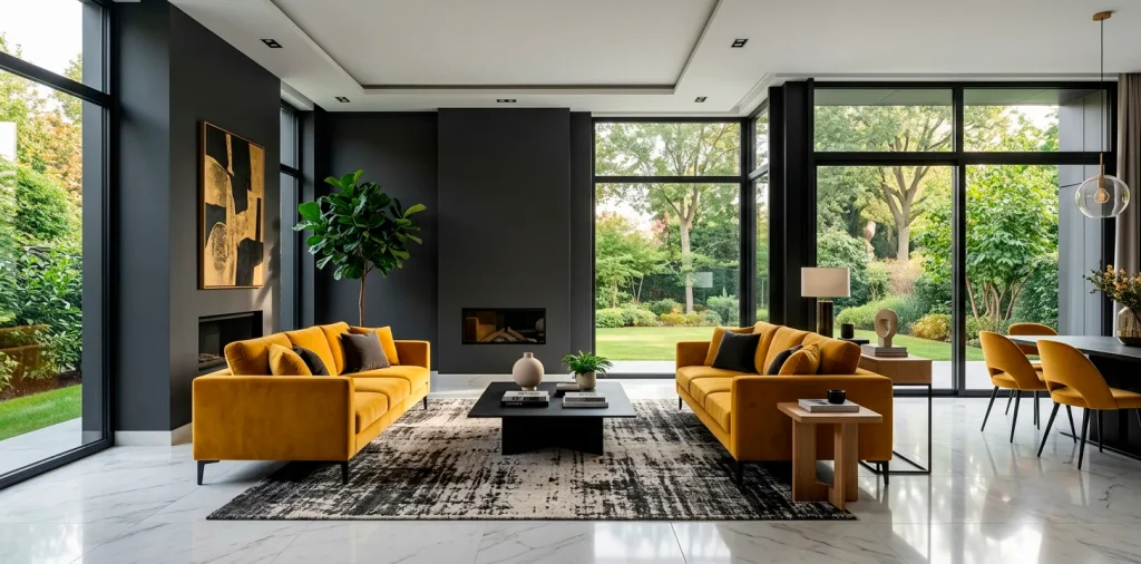

Sick of staring at beige walls that look like a bowl of oatmeal? I totally get it. We often play it safe with our decor, but sometimes you just need to crank up the volume. High-contrast color schemes for a bold living room absolutely transform a lifeless space into an unforgettable experience. Let’s ditch the boring and inject some serious personality into your home.
Classic Black and Crisp White
You can never go wrong with the ultimate power couple. Black and white creates an instant sophisticated edge that practically commands attention. I once painted my entire fireplace matte black against stark white walls, and it completely changed the room’s DNA. 😎
Want to keep it from feeling like a sterile hospital? Texture is your absolute best friend here. Warm it up immediately with layered fabrics.
Key textures to include:
- Chunky knit throw blankets
- Woven rattan storage baskets
- Faux fur accent pillows

Deep Navy and Mustard Yellow
Ever wondered why museums use dark backgrounds for vibrant art? It forces the colors to pop. Navy and mustard do exactly that in your house. The deep, moody blue anchors the space while flashes of mustard bring a sunny, unexpected warmth. I highly recommend picking a velvet mustard sofa as your focal point because it feels incredibly luxurious against a dark backdrop. It basically screams quiet luxury without the boring beige. If you need a place to sit and admire this combo, check out these best velvet accent chairs.

Emerald Green and Soft Blush
This pairing sounds like a weird retro candy wrapper, but IMO it works absolute magic on your walls. I promise you won’t regret it.
Emerald green brings that rich, moody forest energy that everyone obsesses over right now. It wraps the room in a cozy, dramatic hug.
Then you hit it with soft blush pink accents to completely disarm the heaviness. The pink acts as a visual palate cleanser.
The contrast sits right at the intersection of masculine and feminine design. Throw in some brass hardware, and you suddenly live in a boutique hotel.

Charcoal Grey and Burnt Rust
For an industrial vibe that still feels surprisingly cozy, charcoal and rust simply dominate. The cool, stormy grey tempers the aggressive heat of burnt orange. You instantly get a room that feels like a chic downtown loft on a rainy autumn afternoon. I always suggest adding natural leather elements to amplify that raw, grounded aesthetic without trying too hard. Toss a vintage rust-colored leather ottoman in the center, and watch the whole room come to life. It completely eliminates that cold, unfinished warehouse feeling.

Rich Plum and Chartreuse
Ready to really push the boundaries? Plum and chartreuse unapologetically scream high fashion and demand absolute confidence.
The deep, velvety purple acts as your dramatic canvas, while neon-leaning green slices right through the dark mood. FYI, it takes serious guts to pull this off, but the visual payoff is massive.
Just keep your furniture silhouettes sleek and modern so the room doesn’t look like a funky time capsule from the seventies. Clean lines keep the wild colors grounded. Trust me, your guests will talk about this room for months.

Cobalt Blue and Tangerine
If your living room feels sleepy, cobalt and tangerine will wake it up faster than a double shot of espresso. These complementary colors sit directly opposite each other on the color wheel, creating maximum visual tension.
I love using tangerine strictly in the artwork or small decor objects. It keeps the vibrant energy high without overwhelming your retinas on a daily basis. A bold blue sofa with a single bright orange throw pillow does all the heavy lifting you need. It feels playful, modern, and perfectly balanced.

Dark Chocolate and Cream
Yes, brown is officially back, and it looks significantly better than ever.
Dark chocolate and cream offer a much softer, more organic alternative to stark black and white.
You get all that delicious high contrast but with a distinctly earthy, welcoming undertone.
To keep the room looking fresh and updated, integrate tons of natural light and light-toned wood furniture. This prevents the dark brown from feeling muddy or dated, keeping the aesthetic incredibly sharp. It feels like stepping into a perfectly frothed cappuccino.

Moody Teal and Shiny Copper
Who says contrast only comes from paint colors? Mixing a flat, moody teal with highly reflective copper creates a stunning textural contrast that elevates the whole room. The metallic surfaces catch the light and bounce it around, preventing the dark walls from feeling like a depressing cave. Add a few bold metallic light fixtures to really seal the deal. If you need a spot to display those shiny metallic accents, try installing some floating wall shelves to complete the look.

Deep Crimson and Slate Grey
Red often scares people off, but a deep crimson paired with a cool slate grey feels incredibly tailored and mature.
The slate neutralizes the aggression of the red, leaving behind pure, sophisticated drama that feels highly intentional.
I once visited a high-end lounge with this exact palette, and it felt like stepping into an exclusive secret club. You can replicate that exact vibe by keeping the lighting moody and warm. Use matte finishes on the grey walls to absorb light and let the rich red accents truly shine.

Olive Green and Vibrant Magenta
Let’s end with a wild card that absolutely stuns in person. Olive and magenta mix a grounded, earthy neutral with an explosive, artificial bright.
The muddy tones of the olive perfectly ground the loud, poppy pink.
Must-have accents for this look:
- Matte black picture frames
- Abstract magenta canvas art
- Olive velvet floor cushions
This combo proves you don’t need to play it safe to create a cohesive, gorgeous living space. It simply demands respect. I highly recommend trying this if you want an artistic, eclectic atmosphere.

Conclusion
Finding the perfect bold color scheme requires a little courage and a lot of imagination. You don’t have to settle for safe, boring walls anymore. Whether you crave the moody drama of navy or the electric shock of cobalt, these palettes guarantee your space will stand out. Now it’s your turn to ditch the beige and make a statement. Which of these combinations are you grabbing first? Let me know in the comments!
Related posts
See All15 Vintage Circus Inspired Details for Playful Kids Bedroom Decor
Bring the magic of the big top home! Discover 15 playful, vintage circus-inspired decor details that will transform your kid's …
Read moreThe Complete Guide to Styling a Dining Room Credenza for Everyday Elegance
Give your dining room credenza the ultimate glow-up. Discover easy, elegant styling tips that balance everyday function with show-stopping design.
Read more15 Dried Citrus and Cinnamon Garlands for a Naturally Cozy Kitchen
Forget mass-produced decorations. Transform your kitchen into a naturally cozy, aromatic sanctuary with these 15 beautiful dried citrus and cinnamon …
Read moreThe Dog-Friendly Camper: Designing a Van Interior for Your Pets
Transform your camper van into the ultimate dog-friendly adventure mobile! Discover clever interior design hacks, durable materials, and cozy setups …
Read more