


You know that one wall in your house that has been staring at you blankly for months? It is practically begging for a makeover. I have spent way too many weekends wrestling with levelers and command strips to leave you hanging. Let’s turn that empty void into a sophisticated masterpiece that makes your guests think you hired a professional curator. 😉
Curating Your Signature Vibe
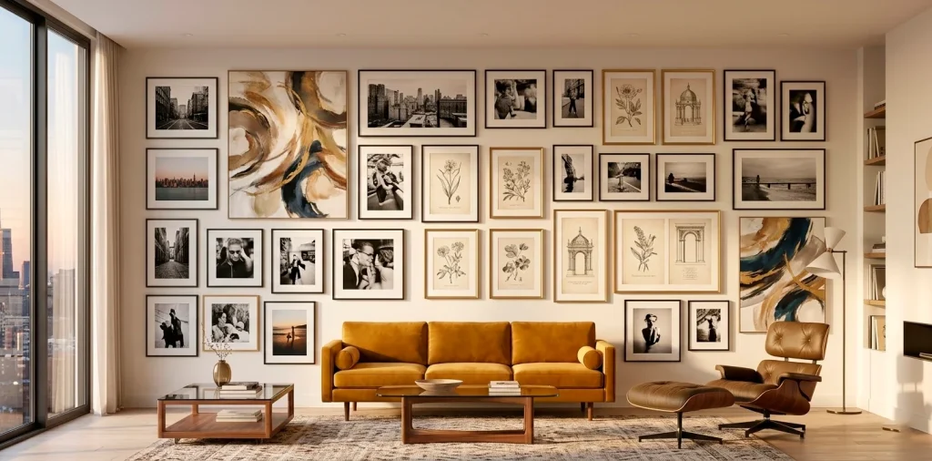
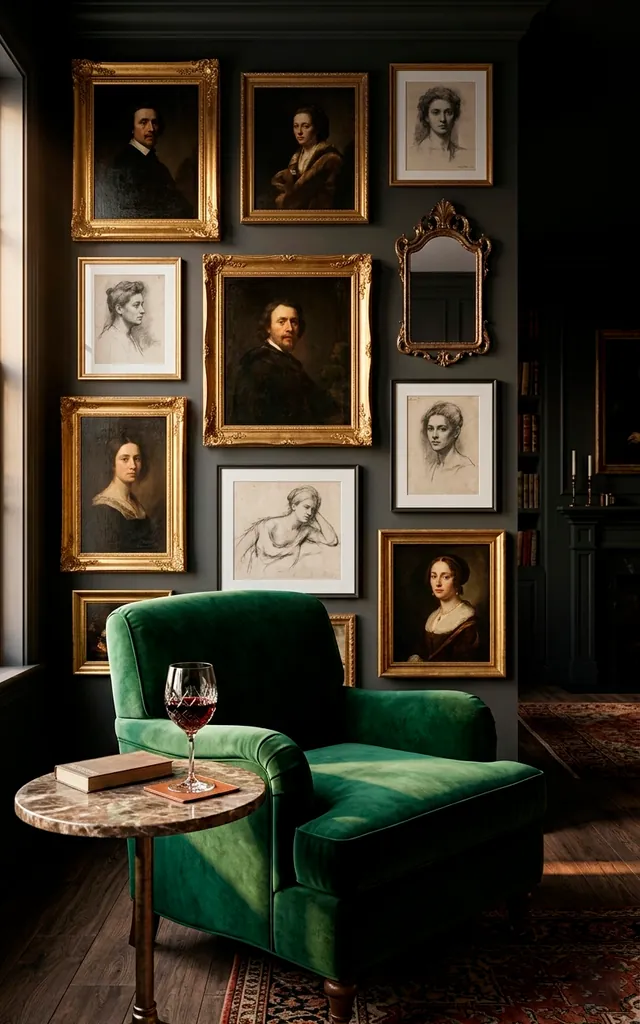
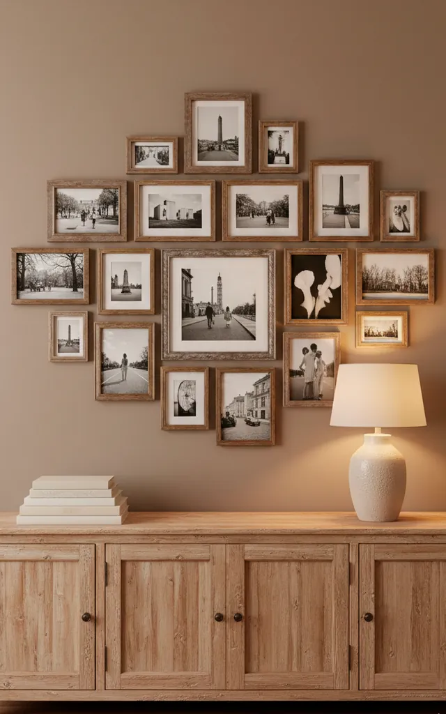
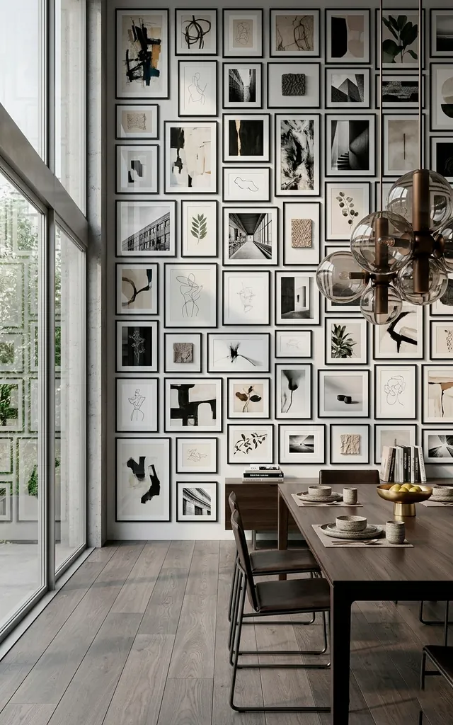
I believe a great gallery wall starts with a solid vibe check. You shouldn’t just slap every random souvenir onto the plaster and hope for the best. Ever noticed how some walls feel like a curated museum while others look like a frantic garage sale? Consistency is your best friend. I always pick a core color or a specific theme—like vintage botanicals or moody photography—to anchor the space. This creates a sophisticated thread that ties different pieces together effortlessly. Trust me, your eyes will thank you for the visual order.
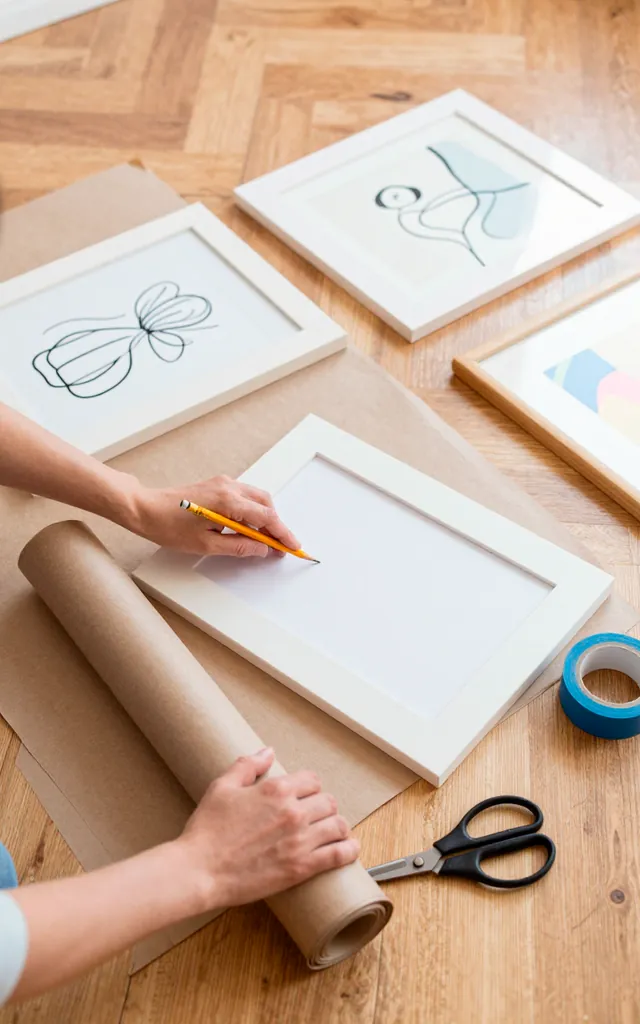
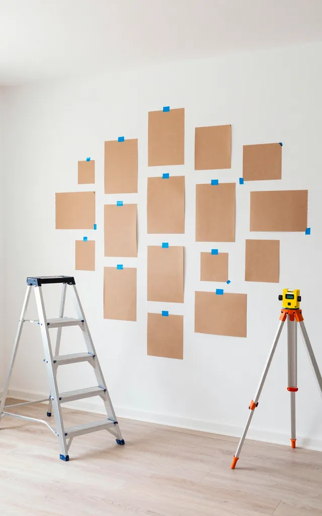
The Floor Method: Planning Without the Holes
Do you enjoy turning your wall into Swiss cheese? I didn’t think so. I highly recommend mapping your layout on the floor before picking up the hammer. I grab a roll of kraft paper and trace every frame I plan to hang. Labeling each cutout prevents total chaos later. I then tape these paper templates to the wall using painter’s tape. This allows me to step back and adjust the flow without committing to a single nail hole. It’s a total game-changer for anyone who struggles with spatial awareness.
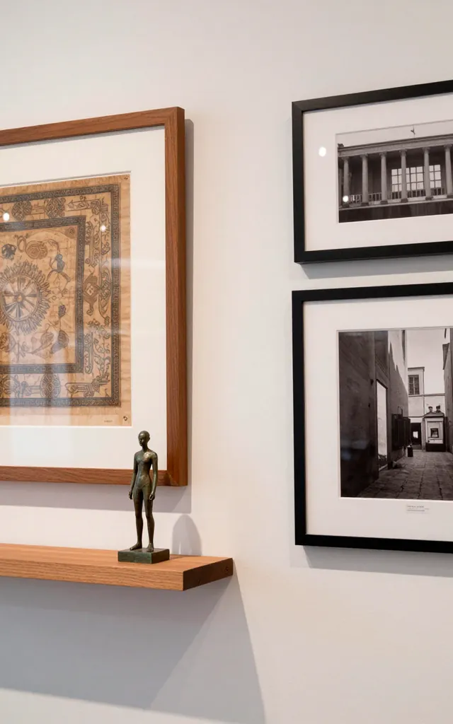
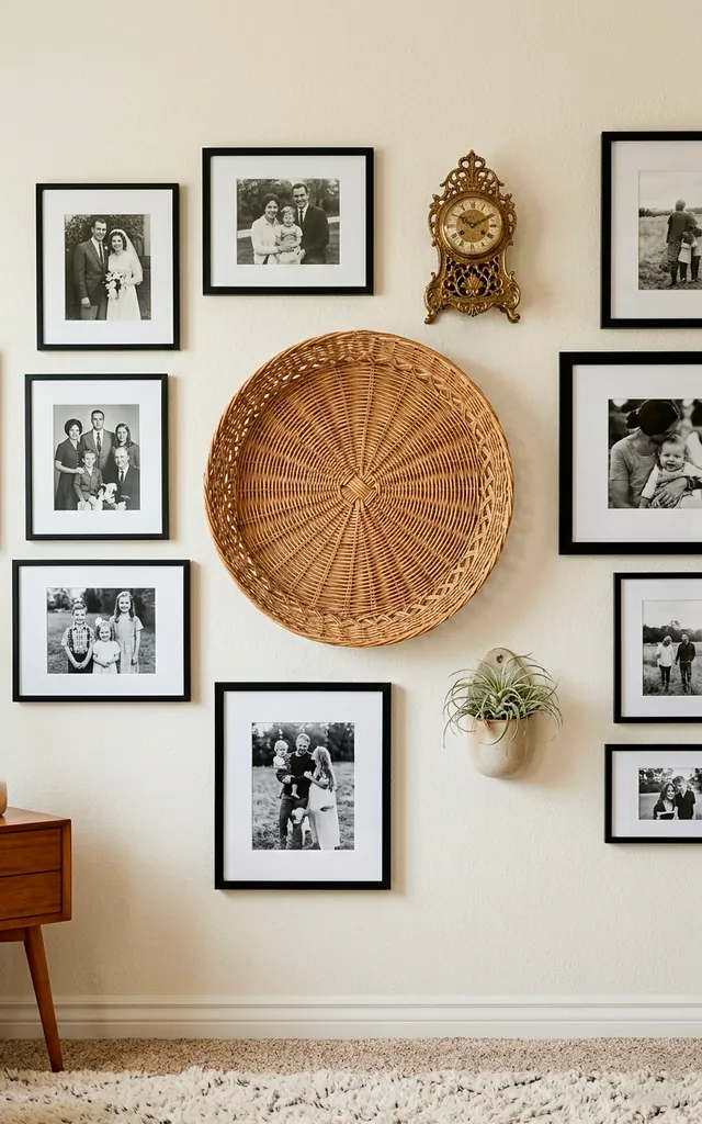
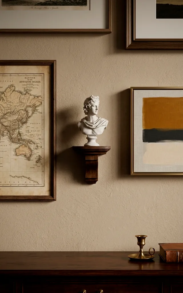
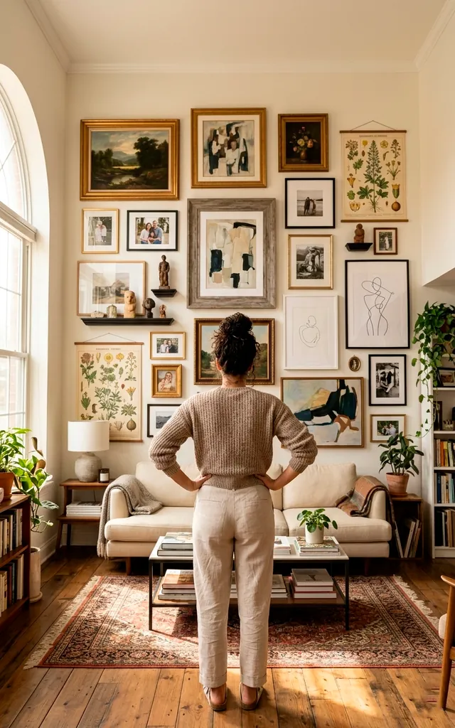
Mixing Mediums for Depth
Why limit yourself to just flat prints? I love adding three-dimensional elements to break up the monotony of rectangles. Think about incorporating objects like:
- Decorative wall plates
- Small woven baskets
- Vintage clocks
- Small sculptures on mini shelves
These items add a layer of texture that flat paper simply cannot provide. Does a wall look more expensive when it has variety? Absolutely. I suggest placing these ‘odd’ items off-center to keep the eye moving across the entire display. It keeps the viewer engaged and adds a personal, collected feel.
Choosing the Right Frames
The frame is the ‘outfit’ for your art. FYI, picking the wrong one can totally ruin the vibe. I generally choose between two paths: the uniform look or the eclectic mix. A uniform set of black or white frames creates a clean, modern grid that feels very high-end. Conversely, mixing wood tones and metals gives off a more soulful, lived-in energy. I prefer to keep at least one element constant—like the matting width—to prevent the wall from looking messy. It provides just enough structure to keep things sophisticated and intentional.
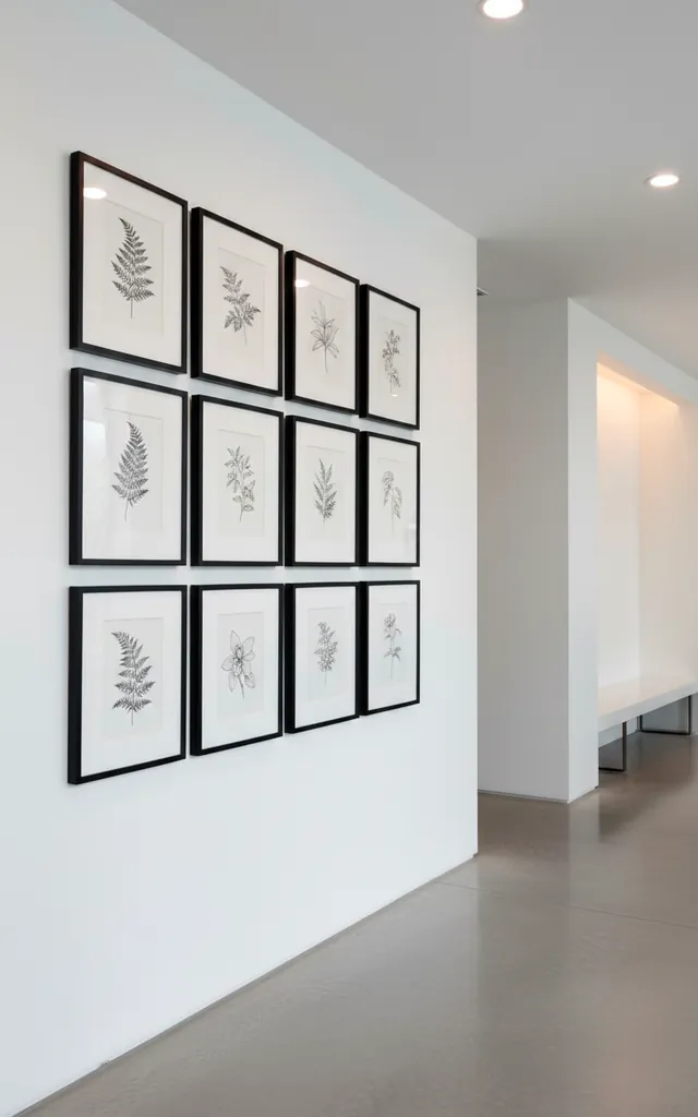
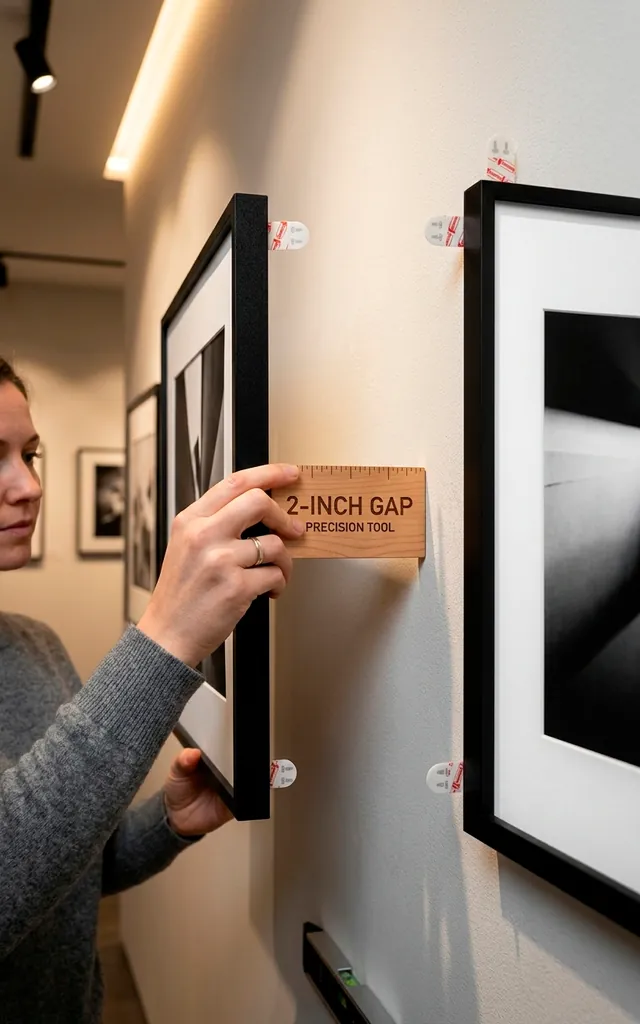
Mastering the Two-Inch Rule
Spacing is where most people fail. IMO, nothing kills a gallery wall faster than frames floating too far apart. I swear by the two-inch rule. I keep the distance between every frame consistent—usually between two and three inches. This creates a tight, cohesive unit rather than a scattered collection of lonely art. Ever seen a wall that just felt ‘off’ but couldn’t name why? It was probably the spacing. Use a spacer block (a simple piece of wood or cardboard) to ensure every gap stays identical. It makes the whole project look professional.
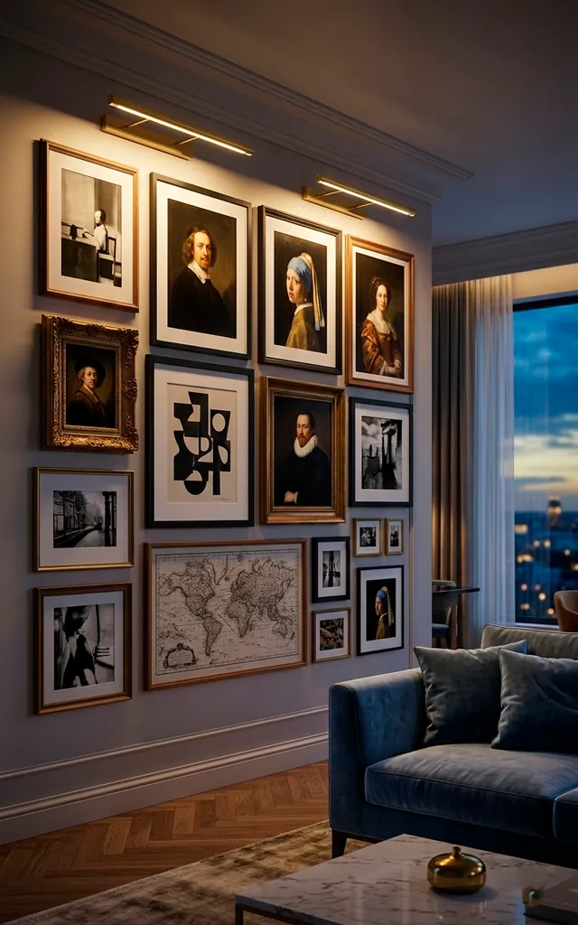
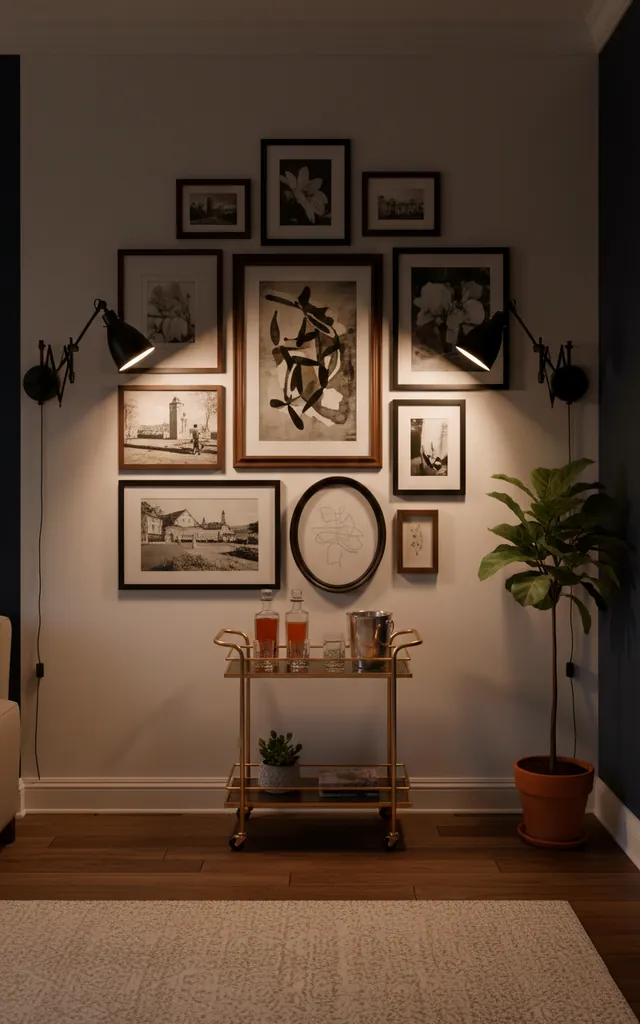
Lighting Your Masterpiece
If you don’t light your wall, did you even hang it? Proper lighting transforms a flat surface into a dramatic focal point. I love using battery-operated picture lights because they don’t require an electrician. You just mount them above your largest pieces, and suddenly, you’re living in a Parisian loft. Sconces on either side of the arrangement also work wonders. They frame the art and provide a warm glow that makes the room feel cozy. Good lighting hides a multitude of sins and makes even cheap prints look like expensive investments.
The Final Adjustments
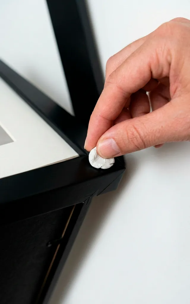
Once everything is up, take a step back and breathe. Does it feel balanced? Sometimes a wall needs a few days to ‘settle’ in your mind. I often find myself swapping one or two pieces after a week. Don’t be afraid to leave a little room for growth! A gallery wall is a living thing that can evolve as you find new treasures. If one frame looks slightly crooked, use a tiny bit of poster putty on the bottom corners to lock it in place. It prevents that annoying ’tilt’ every time someone slams a door. :/
Conclusion
Your wall finally tells a story instead of just taking up space. It takes a bit of patience and a few extra trips to the hardware store, but the payoff is worth every crooked nail. A sophisticated gallery wall is the ultimate way to show off your personality. Ready to grab the hammer and start your museum-worthy transformation? You’ve got this!
Related posts
See AllHow to Curate a Designer Mother’s Day Gift Basket
Want to spoil mom this year? Discover the secrets to building a high-end, aesthetic gift basket that looks like it …
Read moreDesigning an Immersive Gothic Banquet with Dramatic Halloween Party Decor
Create a killer gothic Halloween banquet with dramatic decor, moody lighting, and lush textures. Transform your dining space into an …
Read moreRetro-Futurism Revived: 15 Nostalgic 2026 Home Decor Trends
Discover 15 mind-blowing retro-futurism home decor trends dominating 2026. Blend nostalgic mid-century vibes with sleek space-age tech for an unforgettable …
Read moreUpcycling Glass Bottles: The Ultimate Guide to Green Vases
Stop throwing those gorgeous green wine bottles away! Discover how to upcycle glass bottles into stunning green vases. We cover …
Read more