


Your dining room probably looks fine, but ‘fine’ is just a polite word for boring, isn’t it? If your furniture is screaming for a companion that doesn’t involve beige or gray, you’ve come to the right place. I’ve spent way too many hours scrolling through decor feeds to find the perfect floor candy. Let’s spice up that walnut table with some serious personality. ☕
The Radiating Sunburst Statement
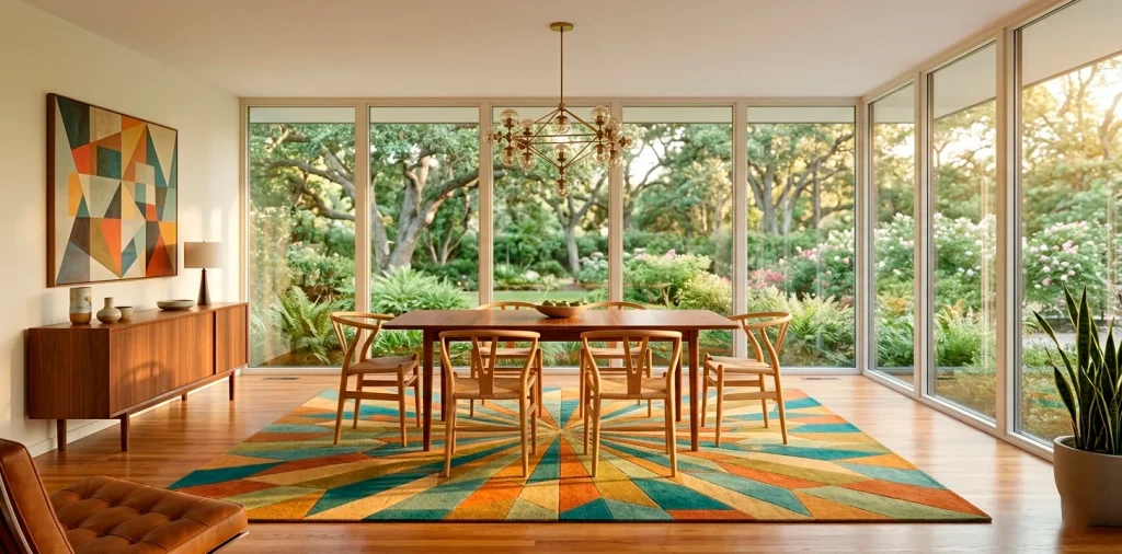
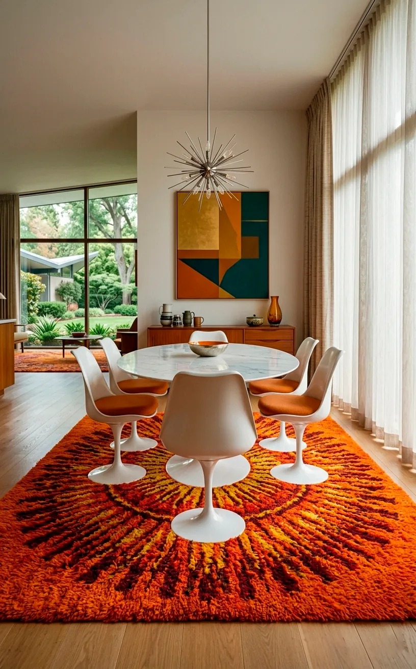
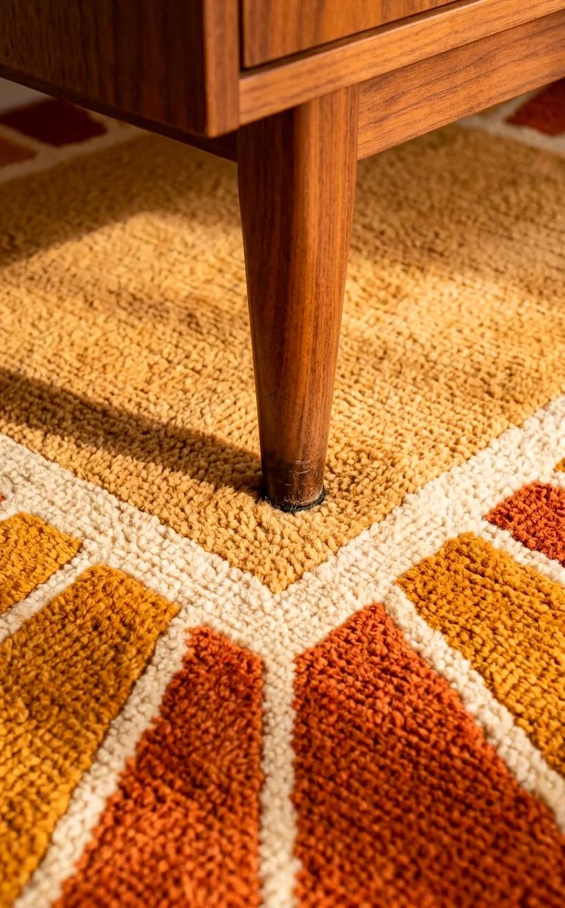
Ever felt like your room just lacks a central soul? This sunburst pattern acts like a magnet for the eyes, pulling everything toward the center of the table. I personally think the golden-yellow and burnt orange hues capture that 1960s optimism better than anything else. Why settle for a flat color when you can have a literal explosion of geometry beneath your feet?
I love how the sharp lines contrast with the organic curves of a classic Tulip table. It’s a match made in design heaven, IMO. Just make sure you don’t over-accessorize the walls, or your guests might get a little dizzy before the first course even arrives.
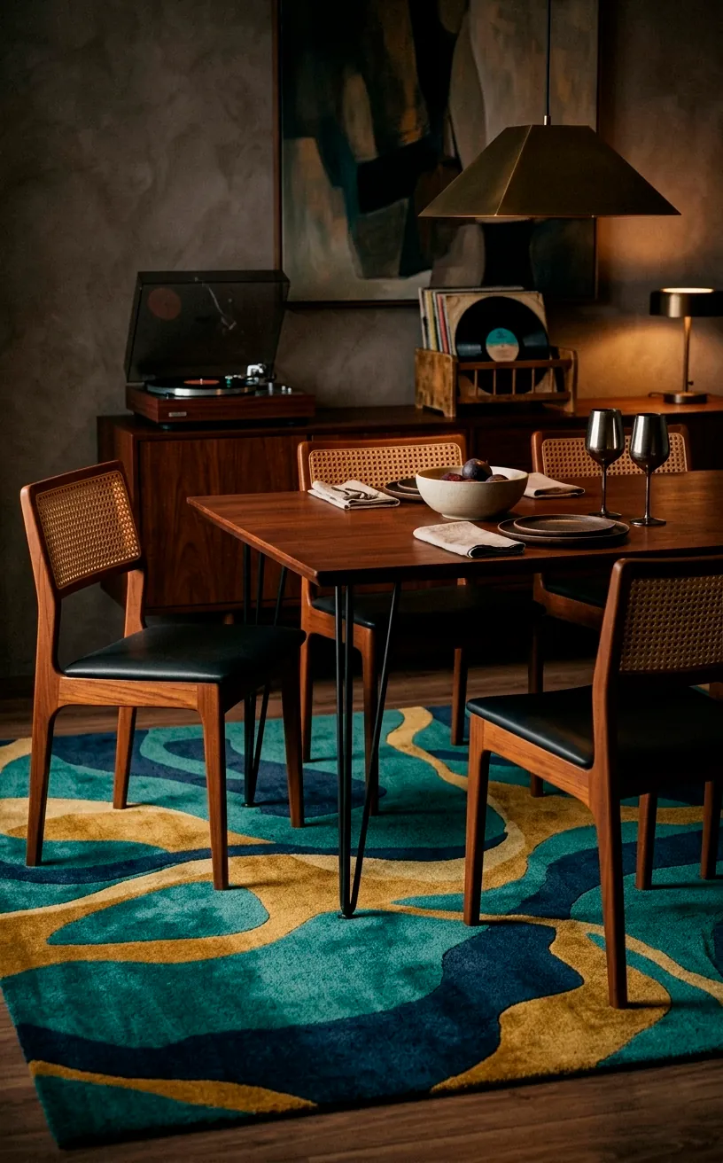
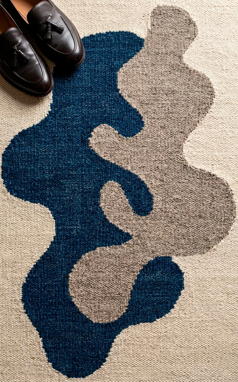
Abstract Organic Amoebas
If you hate straight lines as much as I hate lukewarm coffee, these organic shapes are your best bet. These rugs look like something a cool jazz musician would have in his lounge. I find that the asymmetrical blobs—let’s call them ‘artistic amoebas’—soften the hard angles of those iconic sharp-edged sideboards. It creates a flow that feels less like a showroom and more like a lived-in home. ✨ Plus, they hide the occasional wine spill surprisingly well, which is a total win for anyone who actually uses their dining room.
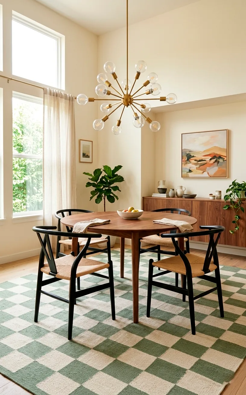
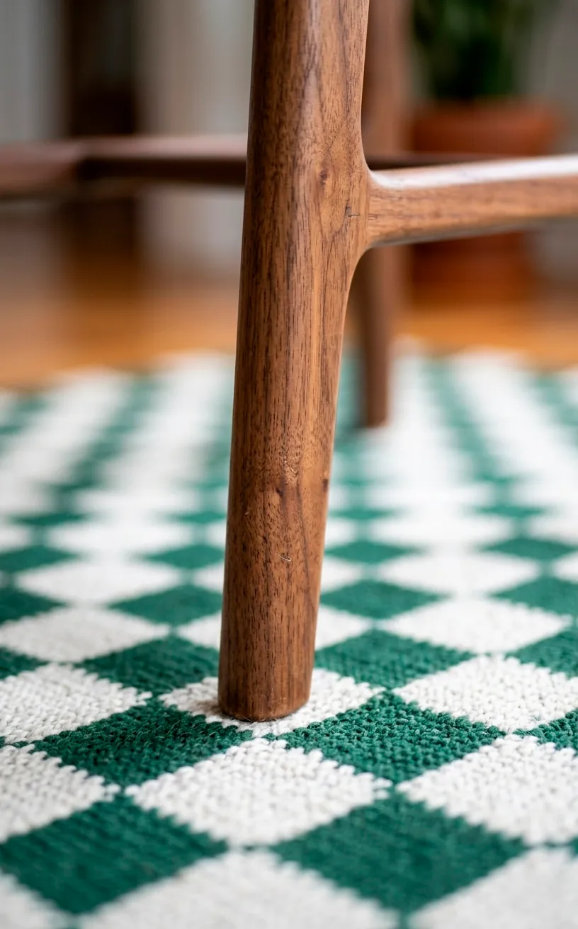
The Bold Retro Checkerboard
Checkers aren’t just for vans or diner floors anymore. A distorted or oversized checkerboard adds an instant ‘cool factor’ that’s hard to beat.
I noticed that most people play it safe with small patterns. Don’t be that person. Go big or go home! The larger squares make the room feel much more expansive.
Key features of this look:
- High-contrast color palettes like sage green and cream.
- Distorted ‘warped’ grids for a psychedelic touch.
- Low-pile construction for easy chair movement.
Does it feel a bit daring? Maybe. But your dining room should be a conversation starter, not a nap inducer. FYI, it looks killer with brass accents.
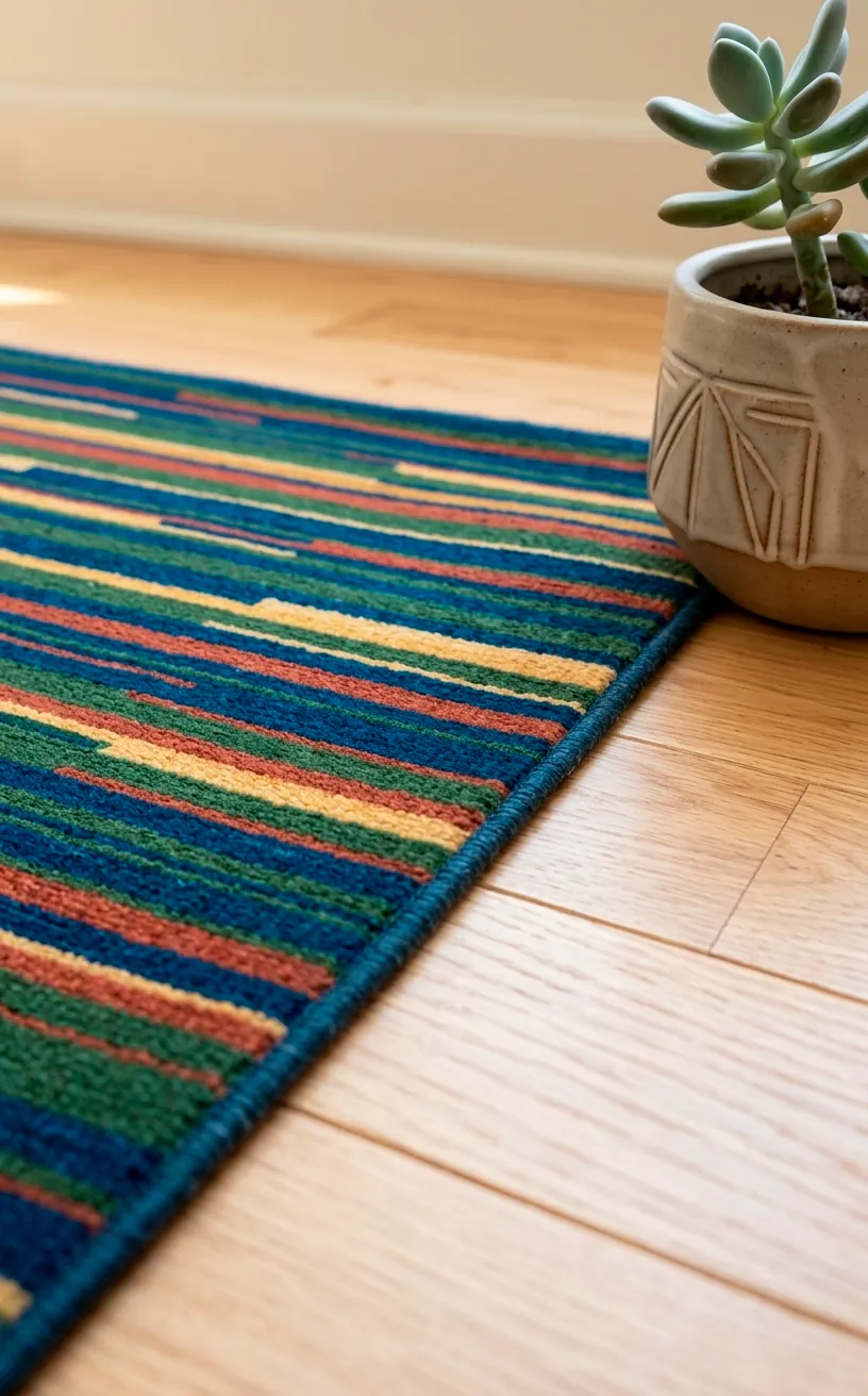
Linear Rainbows and Multi-Stripes
I’ve always felt that stripes are the ‘neutral’ of the funky world. If you want color without the chaos of complex shapes, a multi-tonal linear rug is your hero. These patterns guide the eye across the floor, making narrow dining nooks feel significantly wider than they actually are. It’s a neat little visual trick. I suggest picking a rug that incorporates the wood tones of your furniture to tie everything together seamlessly. It’s low-effort, high-impact decor at its finest.
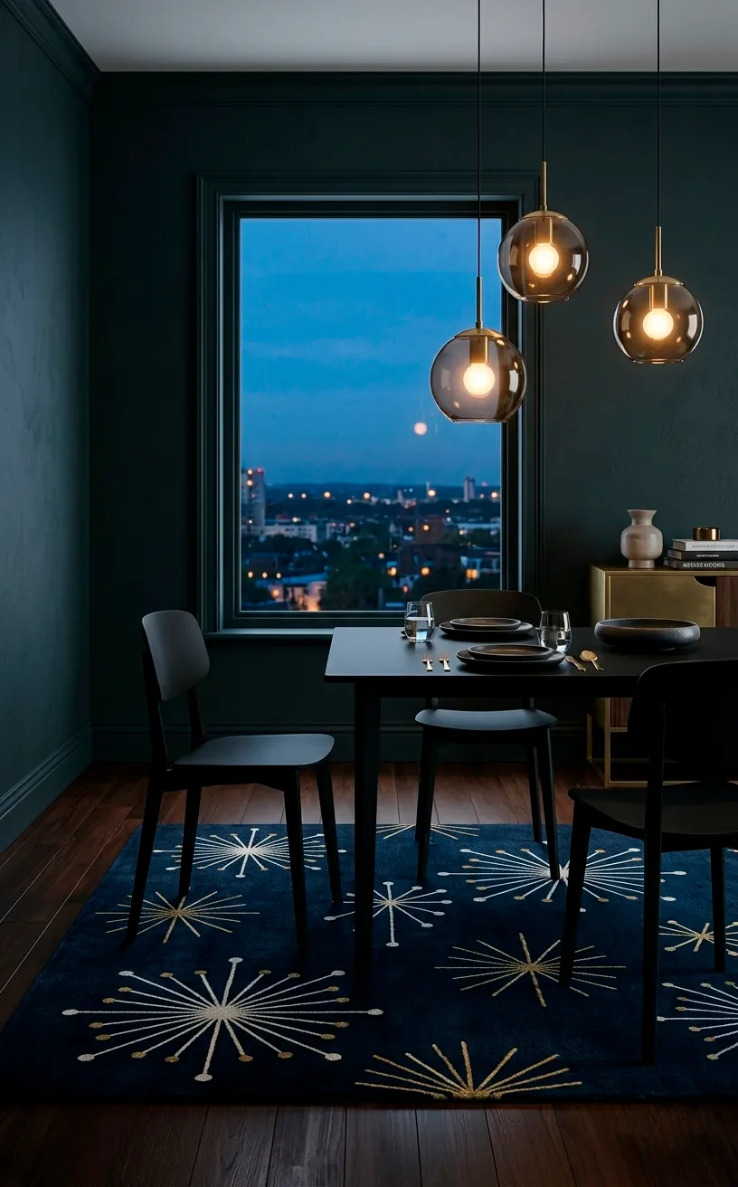
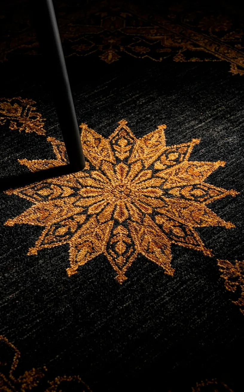
The Atomic Starburst Vibe
Nothing says ‘Mid Century Modern’ quite like the atomic starburst. It’s the ultimate throwback to the Space Age, and honestly, I’m here for it.
I recommend choosing a dark navy or charcoal background to make those stars pop. It adds a bit of drama that a lighter rug just can’t provide. Is it a little ‘The Jetsons’? Sure. But isn’t that why we love this era in the first place?
Design tips for atomic rugs:
- Pair with minimalist furniture to avoid clutter.
- Use a rug pad to prevent the stars from sliding around.
- Match your wall art to one of the star colors for a cohesive vibe.
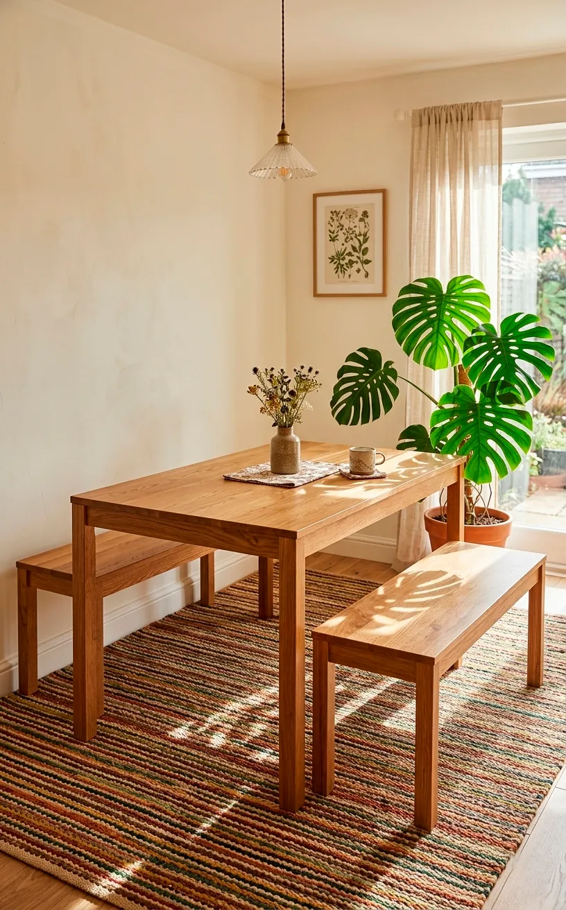
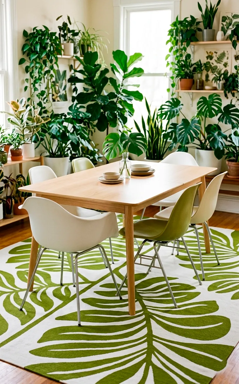
Bold Graphic Botanicals
Forget those tiny, grandma-style floral prints. We’re talking about massive, stylized graphic leaves and flowers that look like they were cut out of construction paper by a genius. I find that these rugs work exceptionally well in rooms with lots of natural light and indoor plants. It’s like bringing the garden inside, but with a much cooler, 1950s illustrative twist. The bold colors—think avocado green and poppy red—create a focal point that makes the rest of the room feel intentional and curated. It’s a vibe, trust me. 🔥
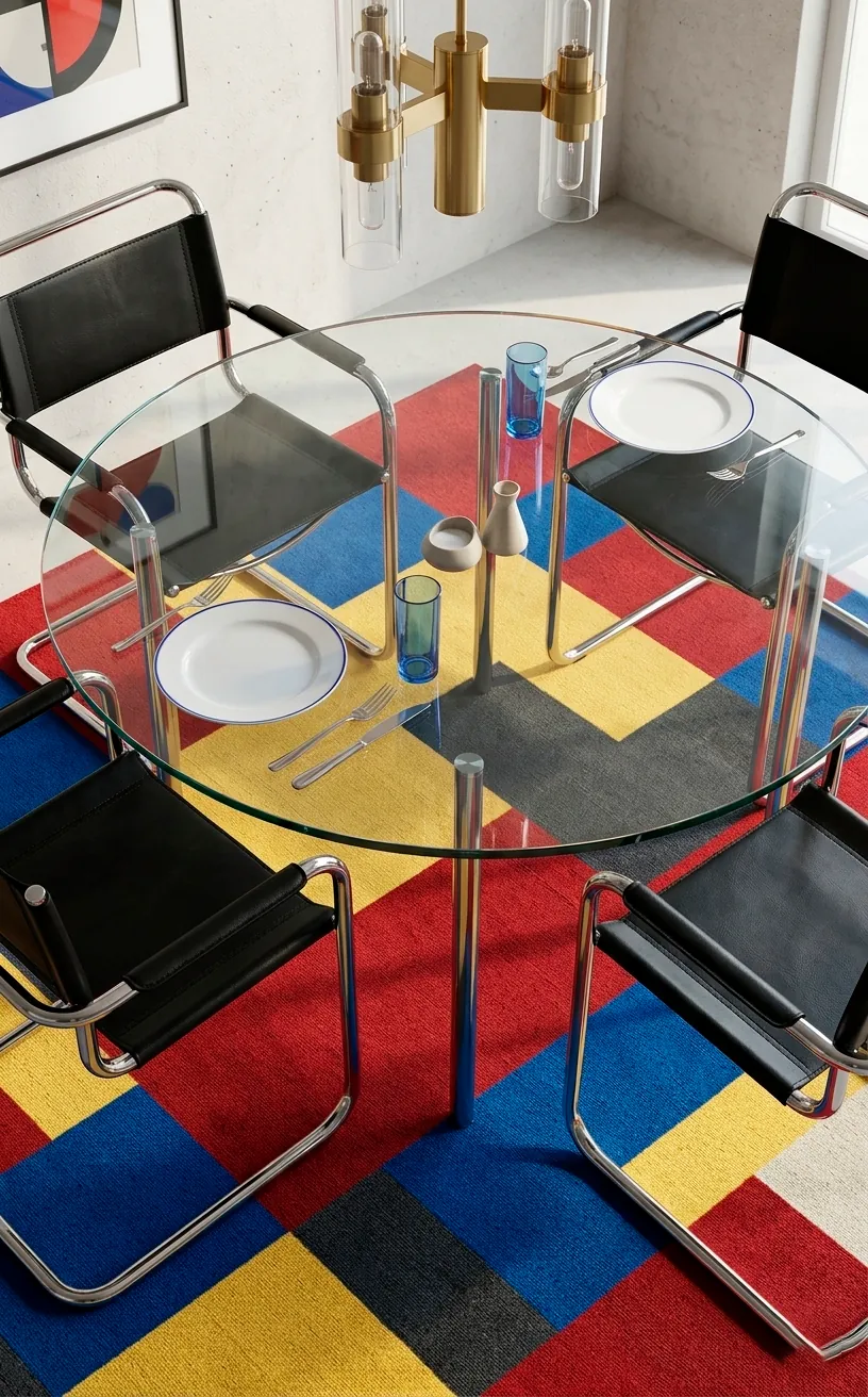
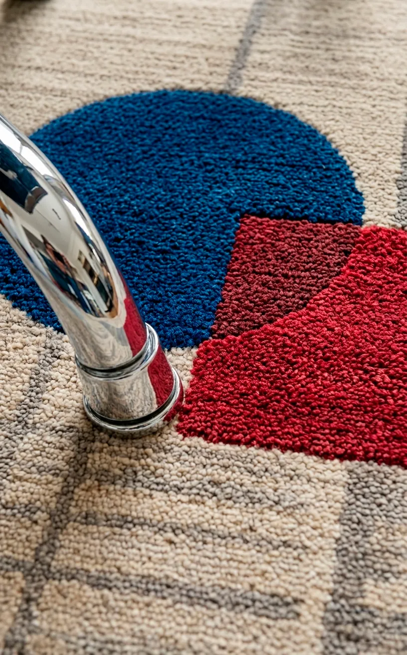
Bauhaus-Inspired Geometric Blocks
If you appreciate a bit of structure, Bauhaus-inspired designs are the way to go. These rugs use primary colors and interlocking shapes to create a floor that looks more like a gallery piece than a rug. I’ve noticed these work best in rooms where the furniture is very simple and understated.
You don’t want the rug and the chairs fighting for the spotlight, right?
Why this style works:
- The clean lines complement MCM architecture perfectly.
- Primary colors add a youthful energy to the space.
- It feels timeless rather than just ‘trendy’.
I once tried one of these in a tiny apartment, and it completely redefined the space. It’s basically an instant architecture degree for your floor.
Conclusion
Choosing a funky rug is the easiest way to stop playing it safe and start living with a bit of soul. Whether you go for the atomic stars or the bold Bauhaus blocks, just make sure it makes you smile when you walk in the room. So, which one of these patterns is calling your name? Let me know in the comments, and go give your floor some love! ✨
Related posts
See AllEarthy Terracotta Sunroom Ideas for a Mediterranean Vibe
Transform your space into a sunny European retreat. Discover simple, earthy terracotta sunroom ideas that bring authentic Mediterranean vibes straight …
Read more15 Playful Memphis Style Attic Loft Ideas with Graphic Shapes
Transform your attic loft with playful Memphis style decor! Discover 15 bold ideas using graphic shapes, vibrant colors, and quirky …
Read more15 Custom Built-In Bed Ideas for a Luxury Kids Room
Ready to transform that chaotic playroom into a high-end sanctuary? Discover 15 jaw-dropping built-in bed ideas that blend luxury, smart …
Read moreA Step-by-Step Guide to Total Laundry Room Organization
Transform your chaotic laundry space into an organized, functional oasis with this step-by-step guide. We share smart storage hacks, sorting …
Read more