












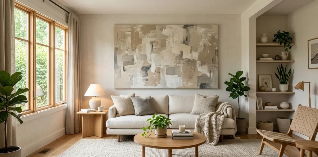

Let’s face it, decorating a tiny living room usually involves frustrating compromises. But scaling down your wall art shouldn’t be one of them! I completely ruined my first apartment by hanging a postage-stamp-sized canvas on a blank wall. Big art actually makes small spaces feel grand, and I’ll show you exactly how to pull it off flawlessly.
The ‘Too Big’ Myth
Ever heard the old rule that small spaces need small decor? Total nonsense. A single, massive piece of art expands a room visually by acting like a structural window. Instead of chopping the wall into busy, cluttered segments with a gallery layout, one big canvas gives the eye a unified place to rest.
I learned this the hard way after wasting perfectly good money on a messy gallery wall that just made my room feel claustrophobic. You want your guests to walk in and say “Wow,” not “Wow, that’s a lot of little frames to dust.” 🛋️ FYI, going big is the ultimate design cheat code.

Finding the Right Proportions
You definitely want big, but you don’t want the art swallowing your furniture whole. My golden rule for oversized art? Keep it between two-thirds and three-quarters the width of the furniture below it. If you hang a massive 80-inch wide painting over a tiny 60-inch loveseat, your sofa will look like a sad little dollhouse piece. Measure the width of your sofa, do some quick math, and boom—you have your target canvas size. IMO, getting the math right is the only boring part, but it completely guarantees a beautifully balanced look that feels intentionally designed.

Color Palettes That Don’t Scream at You
When a piece of art covers half your wall, the colors dictate the entire mood of the space. Do you really want neon green aggressively shouting at you while you try to relax with your morning coffee?
I strongly recommend pulling colors that already exist in your room. Look for artwork with a dominant background color that matches your walls, which helps the piece blend seamlessly rather than popping out aggressively.
If you love bold colors, let the art serve as your primary accent. Just keep the rest of the room subdued. If you need some inspiration for keeping your room looking expensive and cohesive while doing this, check out this guide on how to mix metallics elegant living room color scheme.

Orientation Matters: Portrait vs. Landscape
How do you decide between a tall vertical piece and a wide horizontal one? It all depends on your ceiling height and available wall space. Vertical art draws the eye upward, instantly making low ceilings feel miles higher.
Conversely, a wide, landscape-oriented canvas stretches the room horizontally. This works perfectly above a long sofa to make the room feel wider and more expansive. I always choose vertical art for narrow nooks and wide art for main seating areas. It just fixes awkward architectural proportions like magic, without knocking down any walls!

Framing Tricks for Tight Spaces
Heavy, ornate frames eat up valuable visual space. They literally box the art in and make your room feel visually heavier than it actually is.
Instead, I absolutely swear by floater frames or frameless gallery-wrapped canvases.
Floater frames leave a tiny gap between the canvas and the edge, which creates an incredibly sophisticated, lightweight look.
Here are some space-saving framing elements:
- Thin metal frames: Offer a sleek, modern vibe without the bulk.
- Light wood floater frames: Add organic warmth while remaining visually light.
- Frameless wrapped edges: Perfect for an ultra-clean, minimalist aesthetic.

Making It the Focal Point
Don’t force your oversized art to compete with a flashy rug, heavily patterned curtains, and a crazy bold sofa all at once. Let the big piece do the heavy lifting! Center the room’s layout around the artwork so it naturally grabs attention the second someone walks in. Everything else in the room should act as a quiet supporting character to your main canvas star. Less really is more when you feature a giant masterpiece. By keeping the surrounding decor slightly understated, you ensure your massive art piece shines without making the room feel like a chaotic museum.

Avoiding the Clutter Trap
A massive piece of art demands serious breathing room. If you shove tall floor lamps, giant houseplants, and bookshelves directly against the edges of your canvas, the whole setup instantly feels chaotic and crowded.
Give your art at least six to eight inches of negative space on all sides. This empty wall space acts like an invisible matte, framing the artwork and keeping the room feeling airy and wonderfully expansive.
If you struggle with cramming too much stuff into your tiny space, you might need to rethink your foundational layout. For some brilliant space-saving ideas, check out these 7 genius small living room furniture pieces.

Lighting Your Masterpiece
You just bought a gorgeous piece of oversized art, so please don’t leave it in the dark! Good lighting elevates a basic print to high-end gallery status instantly.
I always install a sleek LED picture light right above the frame. It adds this incredibly cozy, luxurious glow to the room at night without requiring expensive hardwiring. Alternatively, aim an adjustable track light or an angled floor lamp directly at the canvas to highlight the texture. It completely changes the mood of the room and makes your artwork look ten times more expensive. ✨

Conclusion
Choosing large-scale art for a small living room feels intimidating at first, but it genuinely transforms a cramped space into a bold, stylish sanctuary. Just remember to watch your proportions, pick frames that don’t weigh the room down, and give your piece the breathing room it deserves. Don’t let a small floor plan hold back your design dreams! Which massive art style are you grabbing first for your space? Let me know in the comments!
Related posts
See All15 Vintage Circus Inspired Details for Playful Kids Bedroom Decor
Bring the magic of the big top home! Discover 15 playful, vintage circus-inspired decor details that will transform your kid's …
Read moreThe Complete Guide to Styling a Dining Room Credenza for Everyday Elegance
Give your dining room credenza the ultimate glow-up. Discover easy, elegant styling tips that balance everyday function with show-stopping design.
Read more15 Dried Citrus and Cinnamon Garlands for a Naturally Cozy Kitchen
Forget mass-produced decorations. Transform your kitchen into a naturally cozy, aromatic sanctuary with these 15 beautiful dried citrus and cinnamon …
Read moreThe Dog-Friendly Camper: Designing a Van Interior for Your Pets
Transform your camper van into the ultimate dog-friendly adventure mobile! Discover clever interior design hacks, durable materials, and cozy setups …
Read more