


Have you ever stared at the seasonal decor aisle and thought, why does everything look like a plastic red, white, and blue explosion? Same here. I love honoring Memorial Day, but my home definitely does not need to look like a cheesy souvenir shop. That is exactly why I shifted to using modern typography for my patriotic styling. It is clean, meaningful, and surprisingly chic.
Ditching the Plastic for Clean Lines
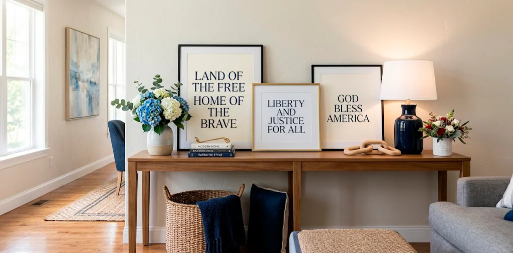
Let’s talk about the elephant in the room: traditional patriotic decor can be overwhelmingly loud. Instead of fighting with tangled nylon flags or shiny foil stars, I exclusively rely on crisp, modern typography to set the weekend’s mood. Think bold sans-serif quotes beautifully framed on a living room mantel, or a sleek metal word sign resting casually on your entryway console. It instantly modernizes your space while keeping the profound sentiment intact. Why shout your patriotism with cheap plastic when you can state it with undeniable, sophisticated style?

Choosing the Right Fonts for Impact
Not all fonts are created equal, especially when you are styling a specific holiday. I highly recommend sticking to minimalist sans-serifs or elegant, structured serif fonts.
They look incredibly sophisticated and completely avoid that dreadful “live, laugh, love” farmhouse script vibe. We are aiming for museum-quality remembrance here, not a discount bin aesthetic!
Try combining a bold, blocky font for main words like “Remember” with a much smaller, delicate font for the supporting text. Contrast is your best friend when designing these visual moments. Ever wondered why professional prints look so good? It is always the contrast.

The Magic of Felt Letter Boards
I am fully convinced that felt letter boards will never go out of style if you use them correctly. They are the absolute perfect, flexible canvas for your Memorial Day typography.
You can easily swap out your everyday quotes for lines from classic American poems, or simply spell out “Honor and Remember” in crisp white letters against a moody black or navy felt background. Styling tips:
- Keep the message under ten words.
- Use generous negative space around the letters.
- Prop the board next to a simple white ceramic vase.
It honestly takes five minutes but looks incredibly intentional and chic.

Integrating Subtle Red, White, and Blue
FYI, you definitely do not need to paint your walls blue to achieve a patriotic vibe.
Instead, I introduce color strictly through the typography itself or its immediate surroundings. A striking navy blue typography poster nestled in a bright white frame delivers a massive visual punch without overwhelming the room.
Want a splash of red? Just place a small, vibrant red floral arrangement right next to your black-and-white typographic print.
This method keeps your color palette firmly grounded while still paying clear homage to the holiday. Your guests will definitely appreciate the understated elegance of this approach.

Sleek Metal Word Art Accents
Laser-cut metal typography is having a major moment right now, and I am absolutely here for it. IMO, replacing a standard canvas with a floating matte black metal word totally transforms a room.
Look for words like “Liberty” or “Brave” cast in heavy iron or powder-coated steel. You can mount these directly onto a stark white wall or let them lean casually against a bookshelf backdrop. Key benefits:
- Creates beautiful natural drop shadows.
- Adds highly needed industrial texture to soft rooms.
- Survives both indoor and covered outdoor use.
The dynamic shadows alone make this technique worth trying!

Patriotic Coffee Bar Typographic Styling
Your morning coffee station is honestly the most underrated spot for holiday decor. I love setting up a dedicated Memorial Day vignette right next to my espresso machine. Grab a small wooden block sign featuring clean, modern lettering, and pair it with some subtle blue ceramic mugs and a tiny vase of white hydrangeas. It gives you that festive feeling first thing in the morning without cluttering up your main living spaces. Plus, it makes pulling your morning shot feel like a special occasion! Want to see more ideas for this specific area? Check out this guide on how to style patriotic coffee bar.

Front Porch Welcome Signs that Actually Look Good
We all know those towering, overly rustic welcome signs that dominate suburban porches. Let’s upgrade that concept for the long weekend.
I prefer using a sleek, tall acrylic or smooth wood panel displaying crisp, modern typography. A simple “Welcome” paired with a smaller “Memorial Day Weekend” underneath looks incredibly refined and sets a great tone before anyone even steps inside.
You can easily elevate the entire look by placing a heavy concrete planter filled with white cascading petunias beside it. This creates a gorgeous, sophisticated entry point that completely respects the holiday’s true tone.

Blending Vintage Accents with Modern Words
Mixing old and new is my absolute favorite styling trick. You can easily pair ultra-modern typography with deeply vintage, historical elements to create a powerful Memorial Day display. For example, I love taking a crisp, minimalist text print and framing it inside a highly ornate, distressed brass frame. You can also place a modern acrylic quote block next to an antique, folded flag or a vintage brass compass. The sharp, clean lines of the text beautifully offset the heavy, textured history of the vintage items. It creates a dynamic tension that completely captivates the eye and sparks great conversations.

Styling Open Shelving for the Holiday
Open shelving practically begs for gorgeous typographic styling.
Clear off your everyday knick-knacks and designate one specific shelf purely for remembrance.
I like to layer three different typographic pieces: a large background print, a medium textured canvas, and a tiny ceramic word block. This tiered approach builds incredible visual depth.
Add a single sprig of dried eucalyptus or a small stack of navy linen-bound books to soften the crisp lettering. It is a subtle, highly effective way to curate your decor. If you love arranging thoughtful displays, read about designing perfect focal point fireplace decor guide.

Bringing the Look Together for the Weekend
At the end of the day, successfully styling modern typography is all about restraint. You want the words to breathe, stand out, and truly resonate with the profound meaning of Memorial Day.
Final checklist for your space:
- Limit yourself to two or three bold typographic focal points.
- Ensure your frames strictly match your home’s existing aesthetic.
- Let negative space do the heavy lifting.
By keeping things intentional and beautifully edited, you create a home that feels both respectful and incredibly chic for the long weekend.

Conclusion
Swapping out tired decorations for clean, modern typography truly transforms how your home feels during Memorial Day. It allows you to honor the weekend’s profound significance while maintaining a beautifully curated space. Whether you opt for a sleek metal sign or a thoughtfully arranged felt board, these subtle touches make a massive visual impact. Which typographic styling idea are you grabbing first? Let me know in the comments!
Related posts
See AllHow to Incorporate High-End Marble Tables into Your Home
Elevate your space with a touch of luxury. Discover effortless ways to style high-end marble tables in every room, from …
Read more15 Cozy Breakfast Nook Ideas for Intimate Easter Hosting
Skip the formal dining room stress this year! Discover 15 cozy breakfast nook ideas that make intimate Easter hosting incredibly …
Read moreGingerbread Christmas Decor: 20 Minimalist Display Tips
Discover 20 minimalist gingerbread Christmas decor tips that bring festive magic without the clutter. Let's keep it simple, chic, and …
Read moreMastering Minimalist Luxury: A Guide to Elegant Valentine’s Day Decor
Ditch the tacky red tinsel! Discover how to craft a sophisticated, minimalist luxury aesthetic this Valentine's Day. Elevate your space …
Read more