












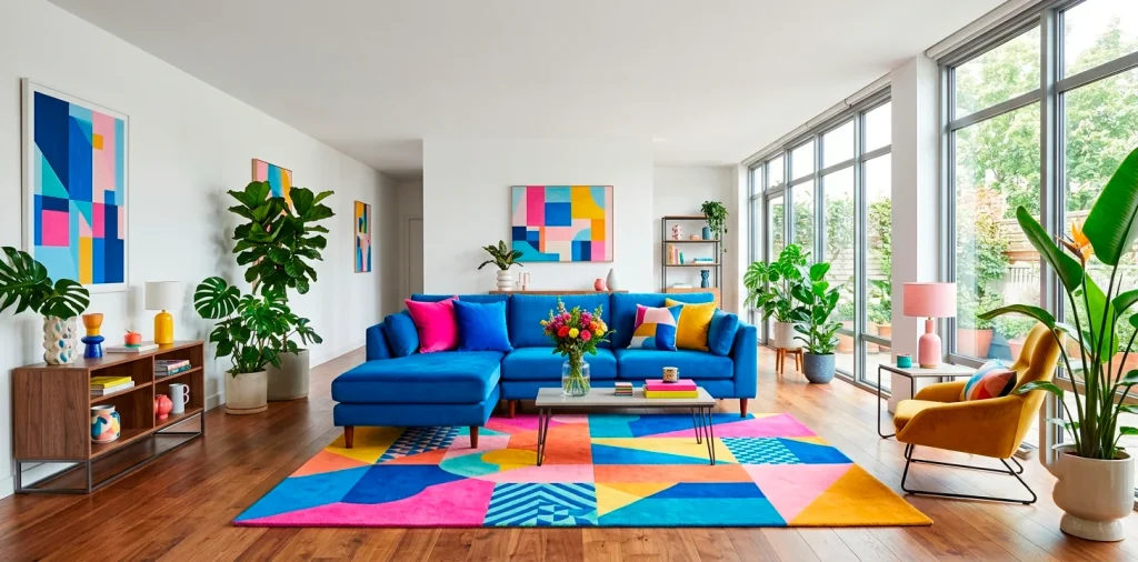

Ever wake up, stare at your living room walls, and feel absolutely nothing? Yeah, we’re fixing that today. I remember painting my first apartment agreeable gray and instantly regretting the snooze-fest I created. Building a high-energy color palette transforms your home from a doctor’s waiting room into an electric playground. Grab a coffee, and let’s inject some serious life into your space.
1. Find Your Emotional Trigger Hues
Color doesn’t just sit there; it completely rewrites your nervous system. Want to feel like you drank three espressos before 8 AM? Bright oranges and zesty yellows do exactly that. Before slapping wet paint everywhere, ask yourself what high energy actually means for your daily routine. Is it the chaotic fun of a retro arcade or the lush, vibrant feel of a tropical jungle? Identify your core mood first, and the paint chips naturally follow your lead. Trust me, defining this feeling saves you from a mismatched, chaotic mess later. 🚀

2. Pick a Dominant Anchor Color
You absolutely need a boss color to run the show.
This dominant hue sets the baseline for the entire room. I went with a saturated cobalt blue in my office last year, and it entirely changed how I work. A strong anchor stops your high-energy palette from looking like a toddler’s messy art project. It grounds the wildness.
Choose something bold but livable for your daily life. Electric teal, bright magenta, or a fiery coral make incredible anchors. Just remember, this specific color covers the most surface area, so you have to genuinely love seeing it.

3. The Modified 60-30-10 Rule
Heard of the classic 60-30-10 interior design rule? We are ripping it up and rewriting it for maximum visual impact today. Instead of letting safe neutrals dominate 60% of the space, let your bold anchor color take the immediate lead. It demands attention right away.
Make your 30% a wildly contrasting secondary color, and reserve the final 10% for a true neon or metallic shock factor. You want a home that grabs attention, right? This specific ratio delivers that perfect punch without frying your retinas. FYI, this is where the real magic happens in styling.

4. Bring in the Shock Accents
Now we reach the absolute most fun part.
Shock accents deliver tiny bursts of visual adrenaline. Think hot pink throw pillows on a deep navy sofa or a neon green lamp on a dark wood desk.
These small touches do the heavy lifting in a high-energy color palette. They quickly draw the eye around the room and keep the entire space feeling endlessly dynamic and fresh.
Need some quick inspiration for your space? Try grabbing these bold additions.
Vibrant accent elements:
- Neon acrylic side tables
- Electric yellow geometric throws
- Saturated magenta picture frames

5. Don’t Forget the Neutral Breathers
Even a high-octane room desperately needs a quiet place to rest its eyes. If absolutely everything screams for attention, nothing actually gets heard. I learned this the hard way when I tried pairing bright red walls with a screaming orange rug—pure yikes.
Crisp whites, deep charcoals, or warm woods act as ultimate visual palate cleansers. They immediately ground your wild colors and make the bright hues pop even harder. A stark white ceiling or a chunky natural wood coffee table does absolute wonders for balancing out those intense neon vibes.

6. Layer Saturated Patterns
Solid colors work great, but loud patterns crank the volume up to eleven. Mixing a bold, oversized floral print with a sharp, high-contrast geometric rug creates an incredible tension that feels completely alive. Please don’t play it safe here. Clash those prints! As long as they share at least one common color from your primary palette, the chaos looks perfectly intentional. Want to really push the boundaries? Check out these vibrant maximalist studio apartment ideas for some killer pattern-mixing inspiration.

7. Supercharge with Proper Lighting
Vibrant colors literally do not exist without fantastic lighting.
A weak, yellow lightbulb instantly turns a vibrant magenta into a muddy, sad purple. You absolutely must upgrade your bulbs if you want a high-energy home. Standard builder-grade lighting ruins good paint choices.
Aim for smart bulbs with a high CRI (Color Rendering Index) of 90 or above and a cool temperature around 4000K. This perfectly mimics crisp daylight and makes your neon tones look punchy and pure. Plus, it just makes you feel way more awake during the day!

8. Art That Amplifies the Vibe
Large blank walls act as the mortal enemy of a high-energy space. Bold art serves as your absolute best opportunity to tie your wild palette together. Look for oversized abstract pieces that prominently feature your anchor and accent colors.
I love sourcing giant canvases from local thrift stores and painting my own chaotic color blocks right over them. It costs barely anything, looks highly custom, and instantly adds a massive jolt of electricity to the room. Just make sure the frame contrasts sharply with the bold wall behind it.

9. Test Swatches Like a Scientist
Never trust a tiny paper paint chip from the store.
Those little squares completely lie to you. A color that looks perfectly energetic under fluorescent hardware store lights might look like a radioactive disaster in your own living room.
Always paint large, two-foot test squares on several different walls. Watch how the bright colors morph and change from morning sunlight to midnight lamp glow.
Does that sunny yellow turn into a sickly green at 4 PM? If yes, immediately ditch it. IMO, testing properly saves you from expensive repainting weekends.

10. Extending the Energy Outdoors
Why stop your color journey at the back door? Taking your high-energy color palette outside makes your entire property feel wonderfully alive and cohesive. Paint your worn patio furniture a blindingly bright turquoise or throw a fiery orange outdoor rug onto your deck. The sharp contrast against natural green grass looks unbelievably striking and fun. You can even add neon planters to hold your favorite succulents. For even more bold exterior inspiration, look at how these 15 bold maximalist patio designs burst with color.

11. Colorful Statement Furniture
### Transforming Old Pieces
You do not need to buy all new furniture to achieve a high-energy vibe. Grabbing a can of high-gloss spray paint breathes incredible new life into tired wooden chairs or a boring metal side table. Bright cherry red or glossy lime green totally reinvents a dull thrifted piece.
I recently took an old, scuffed console table and painted it an obnoxious, wonderful shade of electric yellow. It sits right in my entryway and absolutely smacks you with joy the second you walk through the front door.

12. Painted Ceilings Are the Fifth Wall
### Look Up for Inspiration
People completely forget about the ceiling, but we call it the fifth wall for a good reason. Painting your ceiling a vibrant shade entirely wraps the room in energy.
A pale sky blue or even a bold peach above your head draws the eye upward and makes the entire space feel taller. It surprises guests and adds an unexpected layer of architectural interest.
Just ensure your wall colors balance out the ceiling intensity. If you go bright overhead, maybe keep the main walls slightly more restrained.

13. Curating Colorful Accessories
Curating colorful accessories pulls everything together without requiring a massive commitment. Think about chunky ceramic vases in primary red, neon acrylic bookends, or wildly patterned coffee table books. These smaller items act exactly like jewelry for your room. They catch the sunlight and bounce your secondary accent colors around the space perfectly. If you ever get tired of a specific bright hue, you simply swap the accessories out for something new. It represents the easiest, lowest-risk way to play with a high-energy color palette on a daily basis without picking up a paintbrush.

14. Managing the Transition Zones
### Flowing Between Rooms
Transition zones require special attention when you use wild colors. You cannot just jump from a hot pink bedroom directly into a neon green hallway without causing extreme visual whiplash. The eye needs a second to adjust between spaces.
Use your transition areas like hallways and entryways to gently blend the bright colors. Carry one consistent accent hue, perhaps a vibrant trim or a repeating rug pattern, through the entire house to create a logical flow. This smart strategy ensures your home feels like one cohesive, fun experience rather than a chaotic, disconnected funhouse maze.

Conclusion
Building a high-energy color palette definitely takes a little bravery, but the daily payoff is a home that actually makes you excited to wake up. Start strong with your anchor hue, sprinkle in those shocking neon accents, and don’t forget to give your eyes a tiny break with crisp neutrals. Which bold color are you grabbing first? Let me know in the comments below!
Related posts
See All15 Vintage Circus Inspired Details for Playful Kids Bedroom Decor
Bring the magic of the big top home! Discover 15 playful, vintage circus-inspired decor details that will transform your kid's …
Read moreThe Complete Guide to Styling a Dining Room Credenza for Everyday Elegance
Give your dining room credenza the ultimate glow-up. Discover easy, elegant styling tips that balance everyday function with show-stopping design.
Read more15 Dried Citrus and Cinnamon Garlands for a Naturally Cozy Kitchen
Forget mass-produced decorations. Transform your kitchen into a naturally cozy, aromatic sanctuary with these 15 beautiful dried citrus and cinnamon …
Read moreThe Dog-Friendly Camper: Designing a Van Interior for Your Pets
Transform your camper van into the ultimate dog-friendly adventure mobile! Discover clever interior design hacks, durable materials, and cozy setups …
Read more