


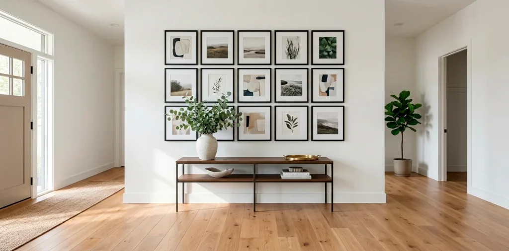

Staring at a blank entryway wall and feeling completely uninspired? I get it. You want a modern, polished look that screams “I have my life together,” but hanging random frames often ends up looking chaotic. A sleek grid gallery wall completely changes the game. It brings instant architectural interest and ridiculous amounts of style right to your front door! Let’s explore 15 stunning ways to nail this look.
Black and White Architectural Photography
Let’s kick things off with a classic that never fails. I love hanging stark, black and white architectural prints in identical ultra-thin metal frames. This aesthetic instantly elevates your space, giving it that high-end art gallery vibe without the pretentious price tag. Seriously, who needs a boring coat rack when you can display sweeping bridges and moody skyscrapers? The sharp lines in the photography perfectly echo the strict geometric shape of the grid itself. Do you want maximum impact? Space your frames exactly two inches apart for a ridiculously crisp finish.

Minimalist Line Art on White Matting
Want a softer, more approachable look? Continuous line art absolutely dominates modern interior design right now.
I highly recommend using extra-wide white matting around simple, flowing sketches. The massive white space acts as a visual palate cleanser, making your entryway feel incredibly bright and airy. FYI, this trick works wonders in narrow hallways where heavy art might feel suffocating.
You can even mix facial profiles with abstract figures. The clean grid structure brilliantly contrasts with the wild, organic loops of the line drawings!

Floating Glass Frames with Pressed Botanicals
Tired of standard paper prints? Floating glass frames sandwiching pressed botanicals bring a stunning, organic touch right to your front door. You literally see the wall color through the glass, which creates a mesmerizing 3D illusion!
I tried this in my own hallway last spring, and the way the morning sunlight catches the dried fern leaves is pure magic. You easily achieve a modern greenhouse vibe that feels fresh, not frumpy. Just make sure you align the frames perfectly; the transparent edges make crooked hanging painfully obvious!

Vintage Brass Frames with Abstract Shapes
Let’s add a little warmth to the party!
Vintage-inspired brass frames instantly soften the rigid nature of a gallery grid. When you fill them with contemporary abstract shapes in muted earth tones, the contrast completely blows my mind.
Ever notice how mixing old finishes with modern art creates the perfect transitional vibe? It simply works.
Design tip:
- Choose muted terracotta and sage green prints
- Stick to identical thin brass borders
- Hang them slightly lower to anchor a floating console shelf

Monochromatic Travel Vistas
Why not turn your entryway into a chic tribute to your favorite stamps in your passport? Curating a grid of monochromatic travel photography transforms a blank wall into a deeply personal storytelling moment. You completely avoid the cheesy souvenir look by keeping every single photo in a cohesive sepia or cool grayscale tone. I mean, a beautifully framed, moody shot of a Parisian street corner beats a generic quote sign every single time! This setup boldly declares your love for adventure the second guests walk through your front door.

The Asymmetrical “Perfect” Grid
Okay, stay with me here. What if you build a grid, but intentionally leave one spot completely blank?
This asymmetrical grid approach deliberately breaks the rules and forces visitors to do a double-take. You hang eight identical frames in a nine-frame layout, substituting the missing frame’s empty space with a tall, sculptural floor plant or an oversized sconce!
It takes guts to pull off, but the result looks incredibly avant-garde. You basically tell your guests, “Yeah, I know about symmetry, I just choose to ignore it.”

Oversized Square Frames for Small Entryways
Counterintuitive design fact: using massive decor pieces actually makes tiny spaces feel significantly larger. Hanging a tight grid of four oversized square frames completely tricks the eye into expanding the entryway!
I absolutely love utilizing massive 24×24 inch frames with deep profiles. You cover almost the entire wall, creating a dramatic, immersive focal point that swallows up awkward blank space. Just stick to light-colored art inside the frames so the sheer size doesn’t overpower your precious square footage.

Moody Charcoal Sketches
Ready to embrace the dark side?
A perfectly aligned grid featuring smudgy charcoal sketches brings incredible depth and texture to a crisp white entryway. The inherent messiness of charcoal art fights brilliantly against the mathematical precision of the grid layout.
You honestly can’t beat the dramatic tension this combination creates.
Frame these dark beauties in natural oak to keep the aesthetic grounded and earthy. The raw wood provides a crucial visual break between the intense black artwork and your bright walls!

Typography and Bold Graphic Quotes
Sometimes you just need to spell it out. A strict grid arrangement of bold typography and graphic quotes delivers a massive punch of modern personality. Forget those cursive farmhouse signs; we want heavy, sans-serif fonts sitting starkly against crisp white backgrounds. You can frame single giant letters that spell out a subtle word across the grid, or mix punchy, one-word statements. It perfectly sets a witty, contemporary tone for your entire home. Plus, guests genuinely love stopping to read the clever messages you decided to feature!

The Mirrored Grid Wall
Let’s throw a total curveball and ditch traditional artwork altogether. Creating a gallery wall out of identical square mirrors essentially doubles the visual size of your entryway!
I absolutely obsess over this tactic for dark, narrow hallways. The mirrors bounce every ounce of available light around the space, instantly faking a bright, airy atmosphere. You get the strict geometric appeal of the grid while solving a major lighting problem.
For extra drama, choose antiqued mirror glass. Check out these 15 mirrored wall ideas to see how reflective surfaces totally transform tiny spaces.

Wood Grain Frames with Neutral Textures
Bringing tactile elements into your art display completely changes the dynamic of your entry. I love filling chunky wood grain frames with actual physical textures-think heavily woven linen, raw silk, or even beautifully handmade paper.
The 3D shadow effect inside the frame adds a sophisticated, sensory layer that flat printed art simply cannot match. You ground the space naturally while keeping the color palette deliciously calm. If you love this tactile approach, you definitely need to explore this wall texture guide next!

Family Portraits in Sepia
Displaying family photos in a modern way often feels incredibly tricky.
The secret? Extreme consistency! Convert all your favorite candid family shots into a uniform sepia or grayscale tone before framing them in a rigid grid.
This strategy instantly neutralizes clashing background colors and outfits.
You turn casual vacation snapshots into a cohesive, high-end gallery installation. Suddenly, your crazy family beach trip looks like a professional editorial spread hanging elegantly in your foyer.

Bright Pop of Color on Dark Walls
If you rock a moody, dark-painted entryway, you absolutely must leverage high-contrast art. I highly recommend hanging a grid of vibrantly colorful abstract pieces against navy, charcoal, or deep forest green walls. The dark background acts exactly like a theater curtain, making neon pinks, electric blues, and sunny yellows explode off the wall! You create a jaw-dropping focal point that practically vibrates with energy. IMO, it shows off massive design confidence and guarantees your guests immediately feel that fun, welcoming vibe.

Woven and Textile Inserts
Let’s talk about adding ridiculous amounts of warmth. Ditching glass entirely and mounting woven textile squares inside open frames provides an incredibly cozy, boho-modern aesthetic.
You literally invite people to touch the walls! Mudcloth patterns, subtle macrame knots, or even vintage rug fragments work perfectly for this application.
The rigid frame grid prevents the textiles from looking too messy or dorm-room-esque. It strikes the perfect balance between free-spirited texture and modern structural discipline.

Illuminated Sconce-Flanked Grid
Our final idea focuses heavily on the presentation itself. You can elevate any simple grid layout by flanking it with sleek modern wall sconces.
Hardwiring two slim, vertical brass sconces precisely on the left and right edges of your gallery frames essentially frames the frames! The directional lighting washes down over the artwork, highlighting the textures and creating spectacular evening ambiance. You instantly mimic the dramatic lighting of an exclusive art gallery, ensuring your entryway looks incredibly expensive day or night.

Conclusion
Creating a modern grid gallery wall instantly breathes life, structure, and intense personality into your entryway. Whether you choose stark black-and-white photography, soft botanical floats, or unexpected woven textures, this disciplined layout guarantees a striking first impression. Which of these 15 grid ideas are you grabbing first? Let me know in the comments below!
Related posts
See AllEarthy Terracotta Sunroom Ideas for a Mediterranean Vibe
Transform your space into a sunny European retreat. Discover simple, earthy terracotta sunroom ideas that bring authentic Mediterranean vibes straight …
Read more15 Playful Memphis Style Attic Loft Ideas with Graphic Shapes
Transform your attic loft with playful Memphis style decor! Discover 15 bold ideas using graphic shapes, vibrant colors, and quirky …
Read more15 Custom Built-In Bed Ideas for a Luxury Kids Room
Ready to transform that chaotic playroom into a high-end sanctuary? Discover 15 jaw-dropping built-in bed ideas that blend luxury, smart …
Read moreA Step-by-Step Guide to Total Laundry Room Organization
Transform your chaotic laundry space into an organized, functional oasis with this step-by-step guide. We share smart storage hacks, sorting …
Read more