


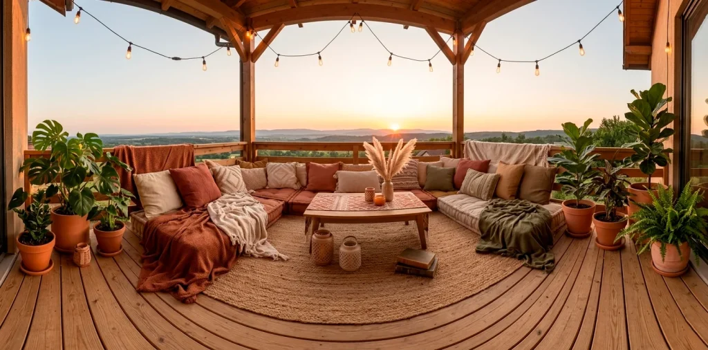

Turning a cramped balcony into a sanctuary shouldn’t feel like a chore. I spent years staring at my sad concrete floor before realizing that earthy tones are the ultimate cheat code for relaxation. These palettes ground your space and make it feel intentional rather than accidental. Ready to build your own boho retreat? Let’s fix your view.
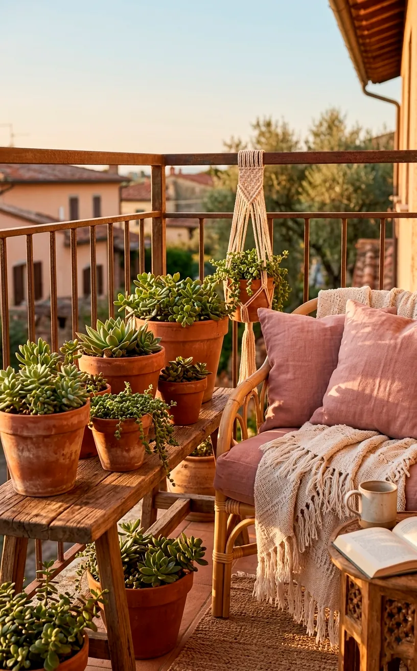
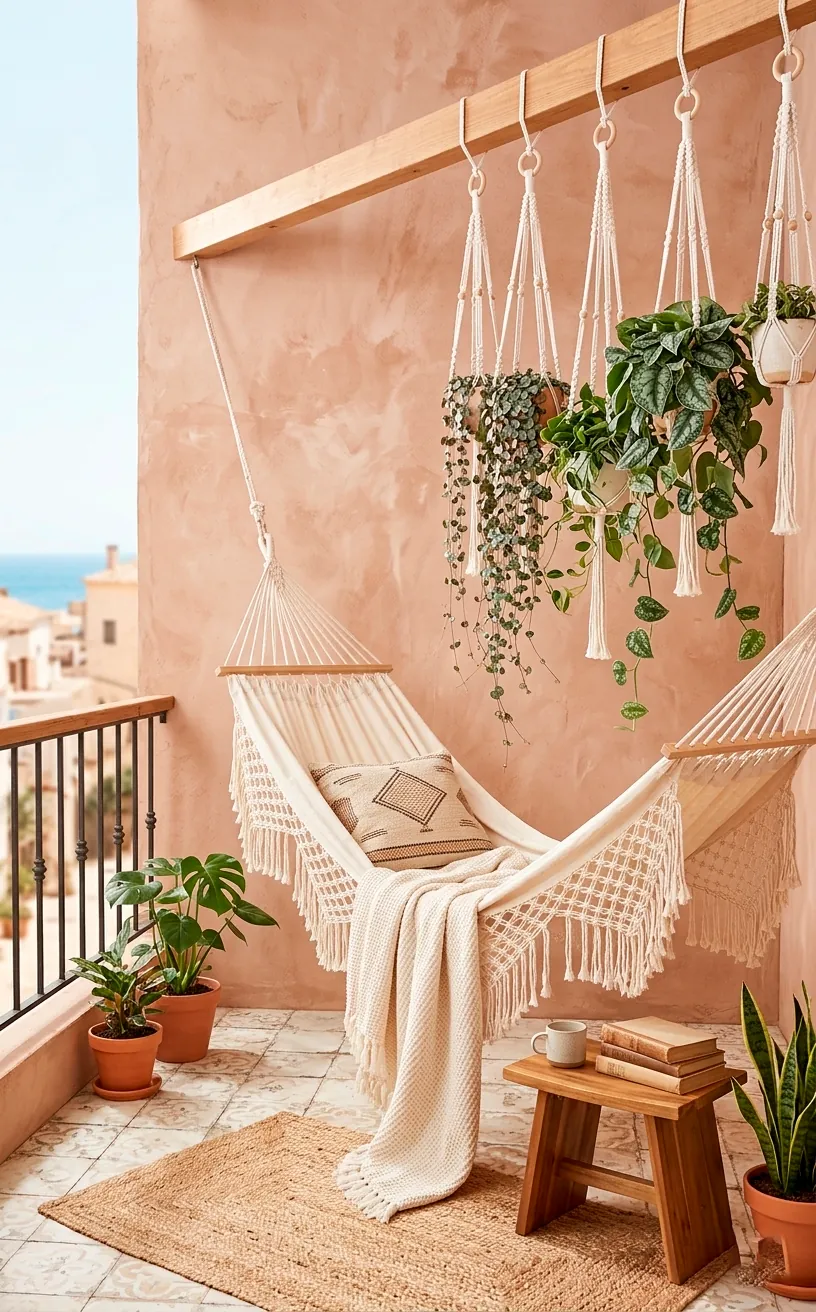
Terracotta and Dusty Rose
Terracotta is basically the mascot of the boho movement, and for good reason. It feels grounded and warm, especially when the golden hour hits your balcony. I paired my pots with dusty rose cushions last summer, and honestly, the neighborhood pigeons have never looked more envious. It’s a classic combo that avoids looking like a literal desert while still keeping those sunset tones alive.
Key design elements:
- Terracotta clay planters in varying sizes
- Velvet dusty rose throw pillows
- Woven jute rugs with subtle pink threads
Ever noticed how pink tones make skin look better? It’s basically a natural filter for your face during those outdoor brunch selfies. If you like this vintage vibe, check out these vintage balcony aesthetic accessory finds. 🌿
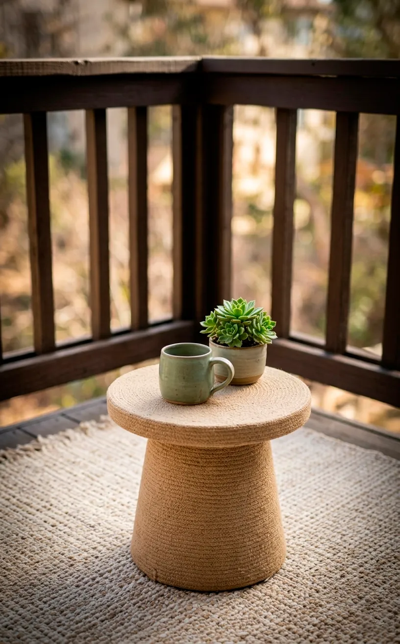
Sage Green and Warm Sand
If you want to feel like you’re living in a spa without paying for the overpriced cucumber water, this is your palette. Sage green is incredibly soothing. IMO, it’s the only color that makes plastic chairs look expensive. Combine muted green textiles with light-colored sand rugs to keep the space feeling airy. I use a few wooden lanterns to tie the look together. It’s fresh, it’s clean, and it doesn’t scream for attention like some other bright outdoor colors.
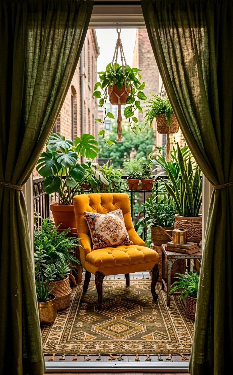
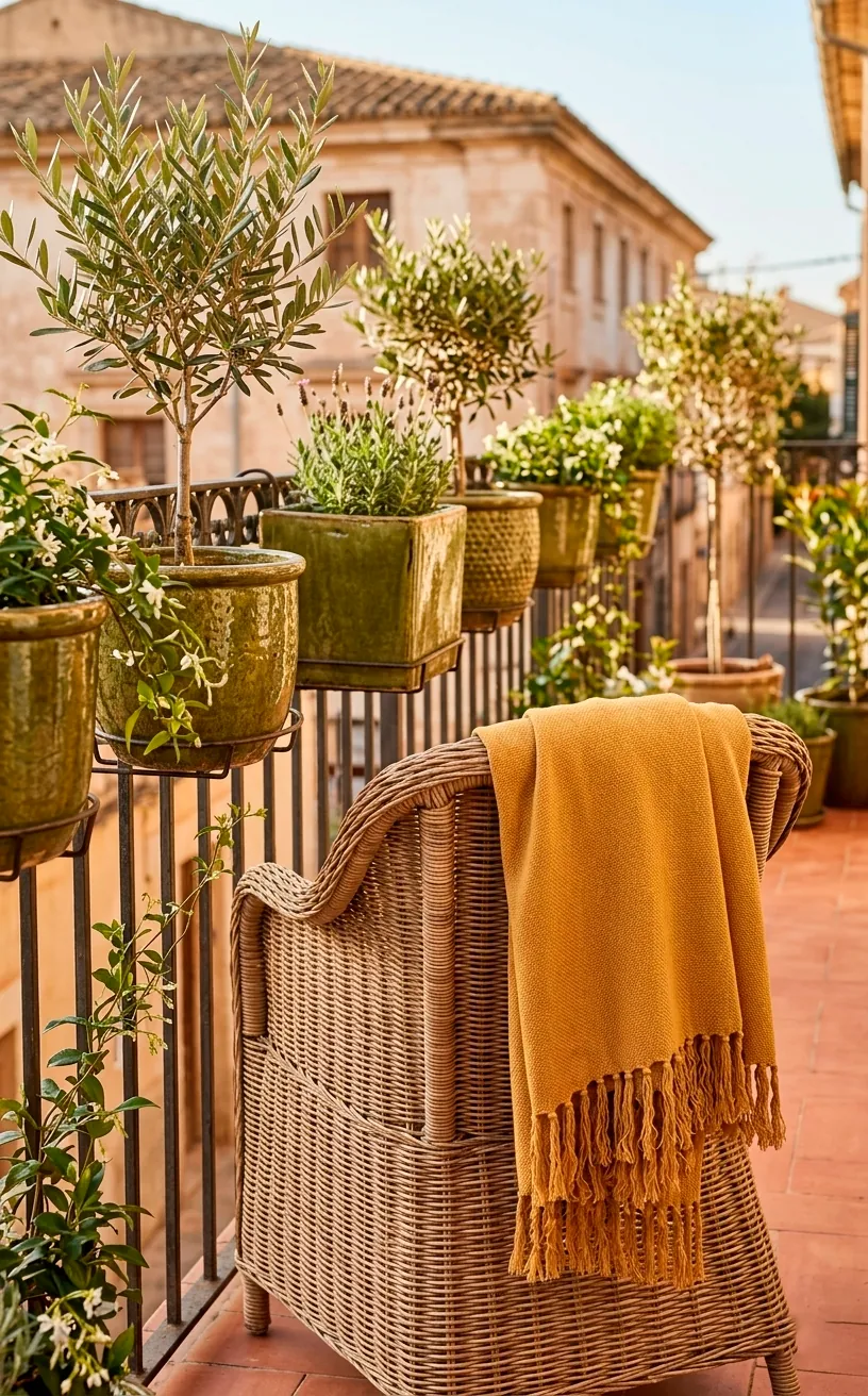
Ochre and Olive Greens
This palette screams Mediterranean escape. Ochre brings a punch of yellow energy without being as aggressive as a highlighter. Olive provides that deep, herbal anchor that keeps the vibe sophisticated rather than childish.
Essential accents:
- Textured ochre throws for chilly nights
- Olive ceramic pots for an organic feel
- Macramé wall hangings in off-white
I personally think olive green is the most underrated neutral in the design world. It hides dirt perfectly—which is a win if you’re a lazy gardener like me. Do you think your space could handle such a bold yellow energy?
This combo works best when you layer the colors. Don’t just buy one green pillow; mix different shades of olive and forest green to create depth. The ochre should act as the ‘pop’ that draws the eye to your seating area.
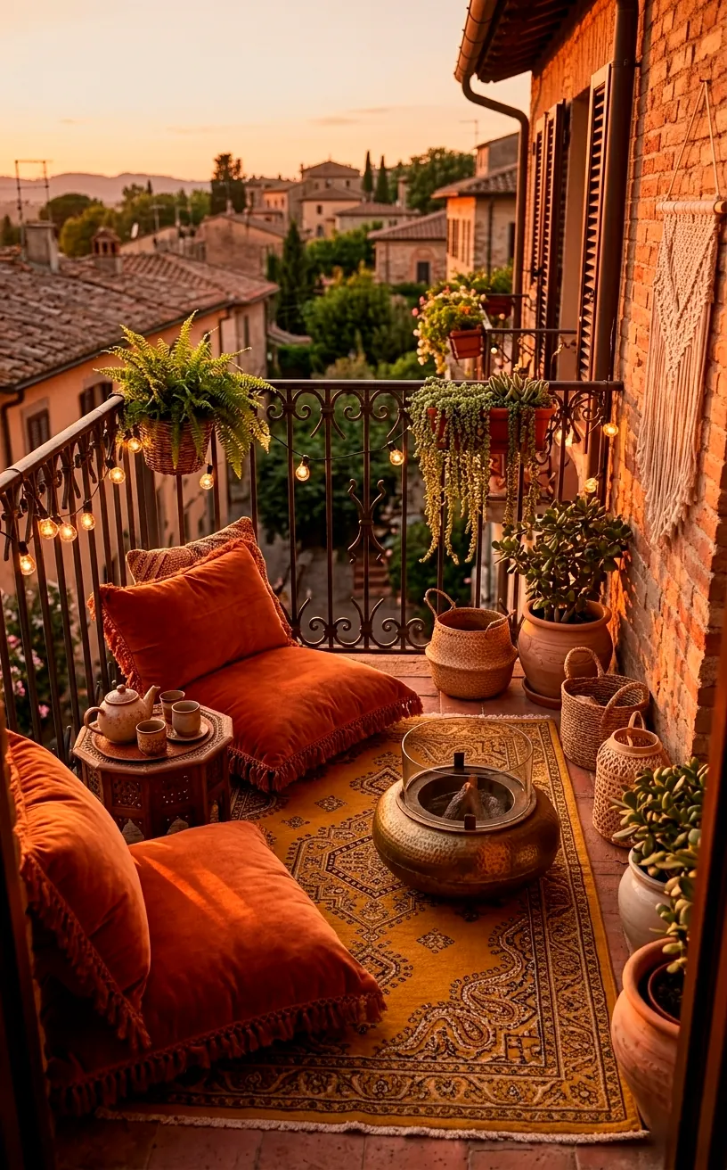
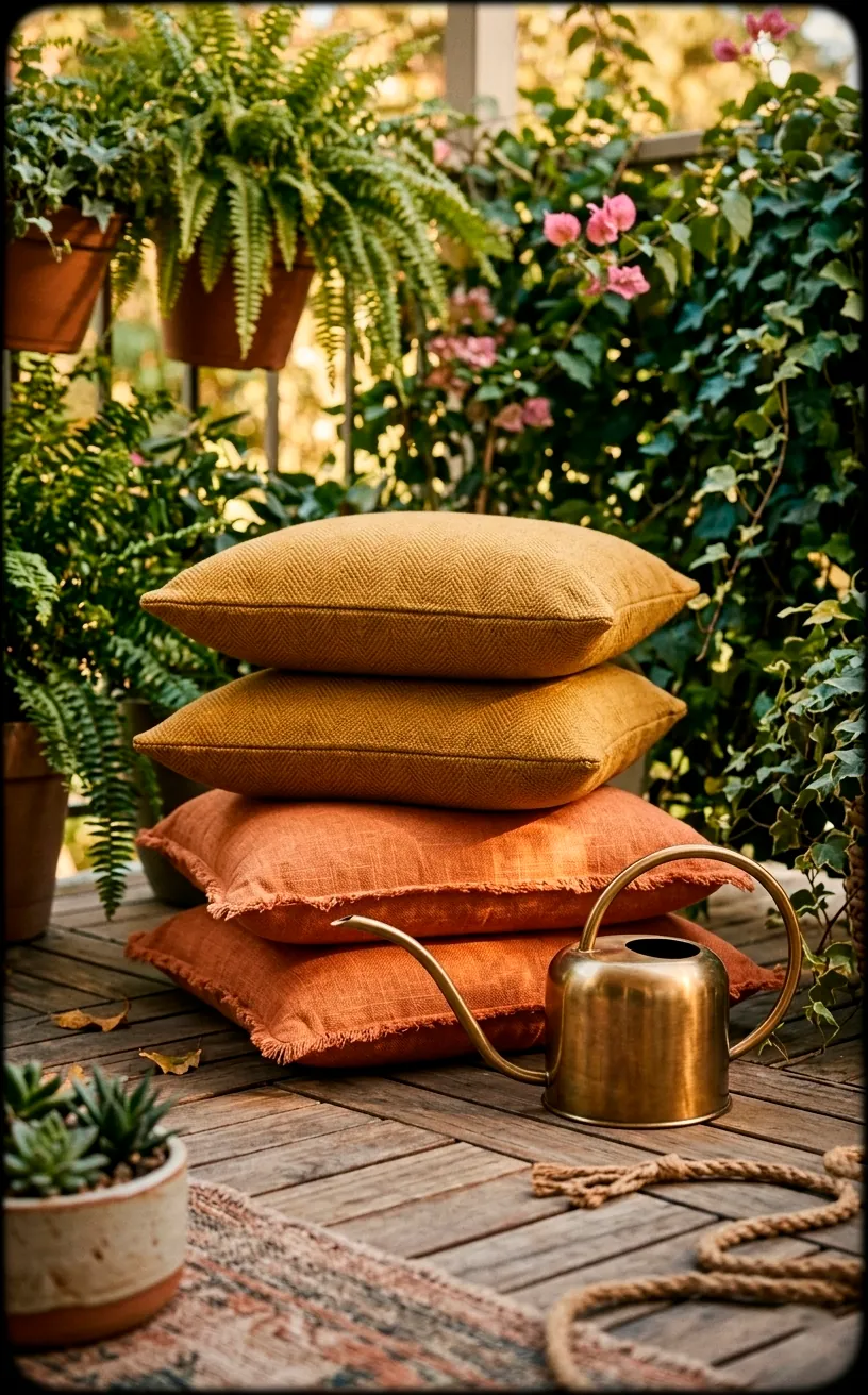
Burnt Orange and Golden Mustard
Warning: this palette might make you crave a pumpkin spice latte even in July. Burnt orange and mustard yellow are the heavy hitters of the 70s boho revival. They bring a heat that makes even a chilly evening feel cozy. I love using thick woven rugs in these tones to hide the fact that my balcony floor is actually quite ugly. Bold colors distract the eye from architectural sins.
Ever wondered why these colors feel so nostalgic? They tap into that retro sunset vibe that never really goes out of style. Just add some brass accessories to give it a little metallic edge.
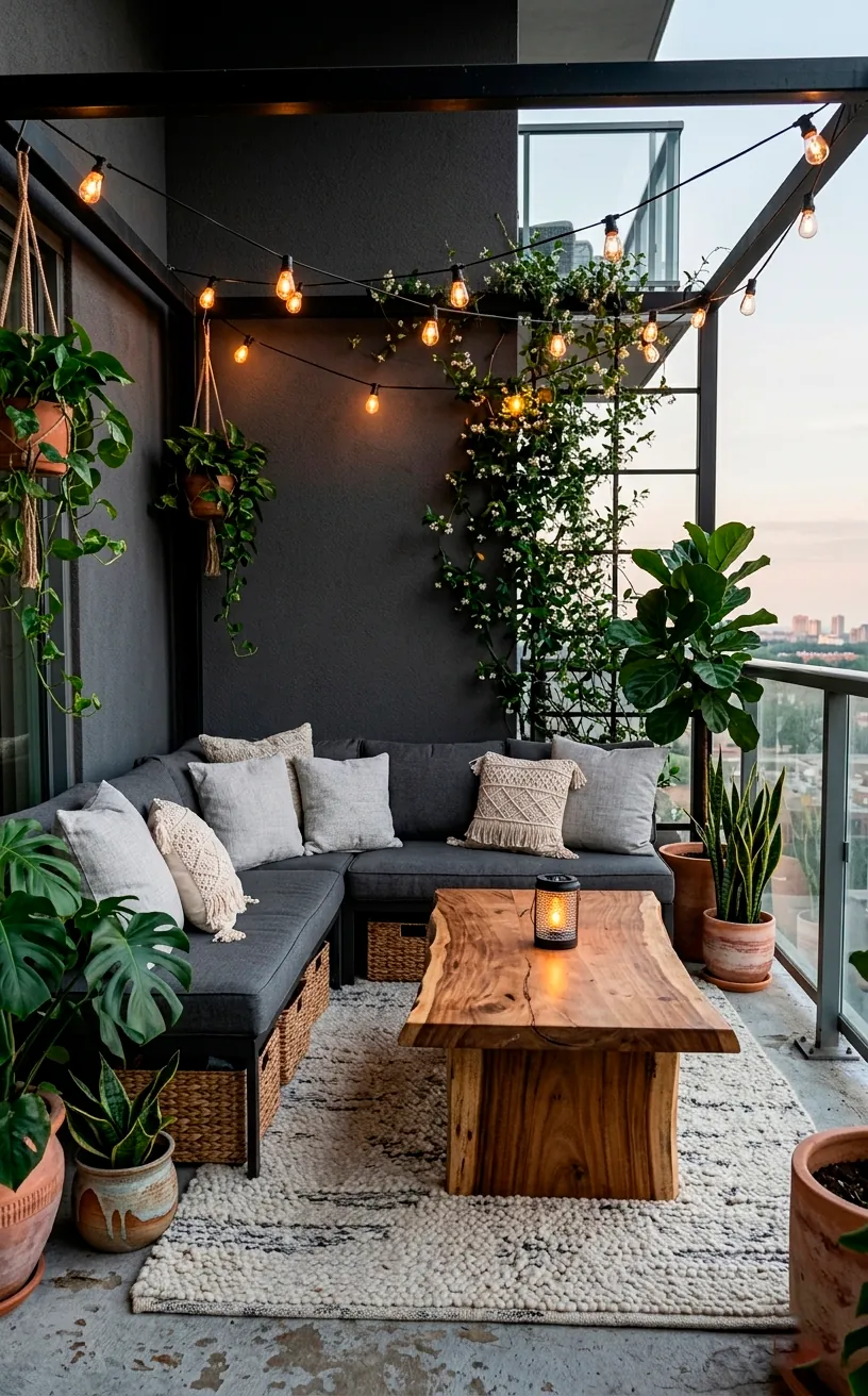
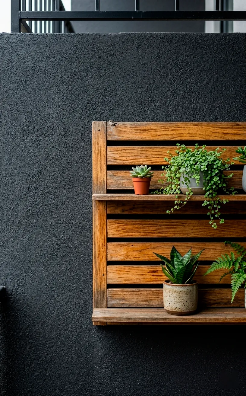
Charcoal Grey and Natural Wood
Earthy doesn’t always mean bright oranges and reds. Charcoal provides a moody, grounded base that lets natural wood grains really pop. It’s like the ‘cool older sibling’ of the boho family. FYI, charcoal is much more forgiving than jet black when it comes to showing outdoor dust.
Mandatory items:
- Dark grey outdoor sofa or bench
- Acacia wood side tables
- Black metal fairy lights
Does a darker palette make a small balcony feel smaller? Not if you use enough plants. The green leaves against the charcoal look incredible and add a sense of life to the industrial tones. For more inspiration on working with darker foundations, look at these dark and moody backyard patio ideas.
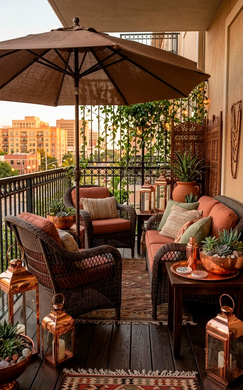
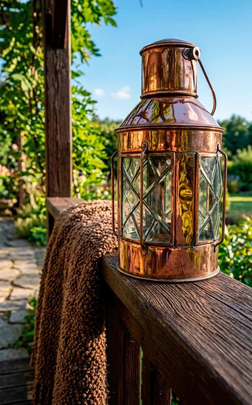
Coffee Brown and Metallic Copper
Think of this as the ‘latte’ palette. Deep browns provide a rich, chocolatey foundation, while copper accents add a bit of sparkle. It’s earthy but with a hint of ‘I actually have my life together.’ I use copper watering cans as decor pieces because they catch the light beautifully during the day. Pair them with brown linen cushions for a high-end look on a budget.
Why settle for boring plastic when you can have metals that age beautifully over time? This palette feels very organic but remains incredibly polished.
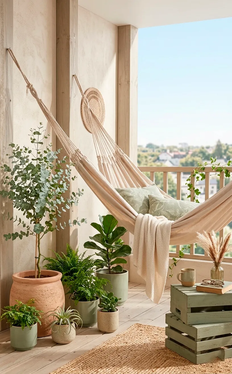
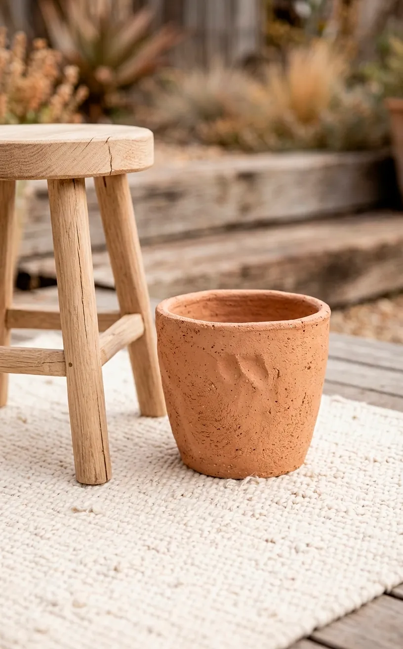
Natural Clay and Soft Cream
This is for the minimalists who still want that boho soul. Clay is a raw, unrefined pinkish-brown that looks stunning against crisp cream linens. It’s clean, bright, and very ‘Pinterest-worthy.’ Stick to undyed cotton hammocks and unpolished pottery to keep the vibe authentic. Why complicate things when nature already gave us the best colors? This palette makes even the smallest balcony feel open and airy.
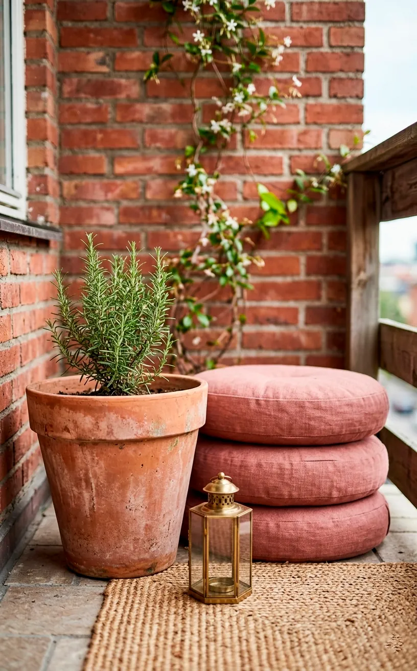
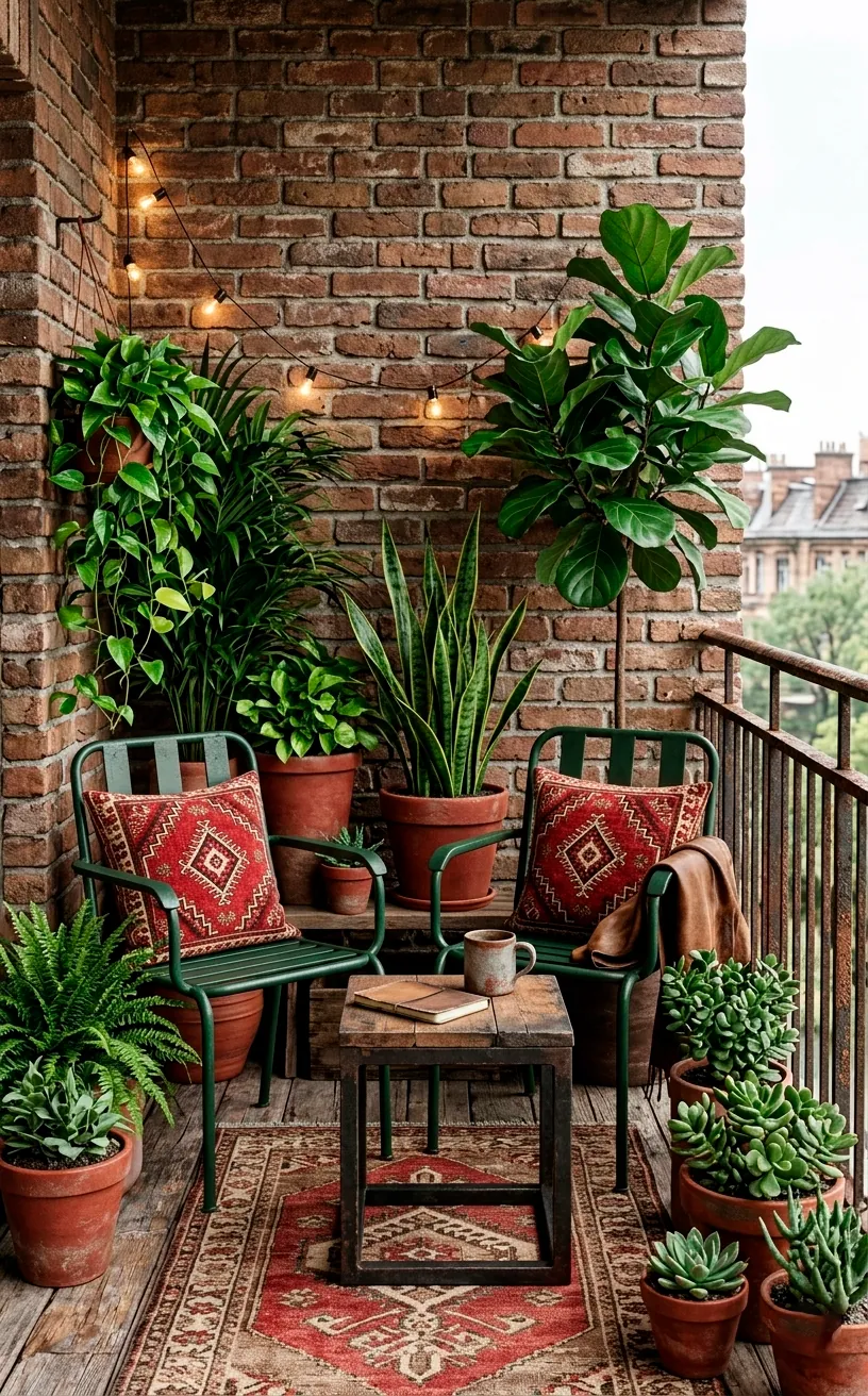
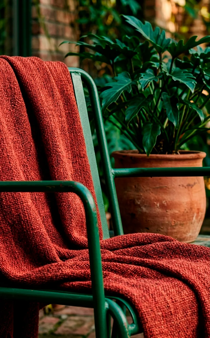
Deep Forest Green and Brick Red
If you live in an older building with brick walls, stop fighting them! Embrace the red and pair it with deep forest green. This combo feels rugged and grounded, like a mountain cabin moved into the city. I love using dark green metal furniture against a brick backdrop.
Tips for this look:
- Forest green seat pads for comfort
- Red clay saucers under every plant
- Heavy woven blankets in dark patterns
It’s a sturdy, no-nonsense palette. It doesn’t care about trends, which honestly makes it even cooler. Have you ever tried matching your plants to your furniture? It creates an incredible camouflage effect that makes the space feel larger than it is.
This look is particularly great for winter because the colors don’t look ‘dead’ when the sun goes down early.
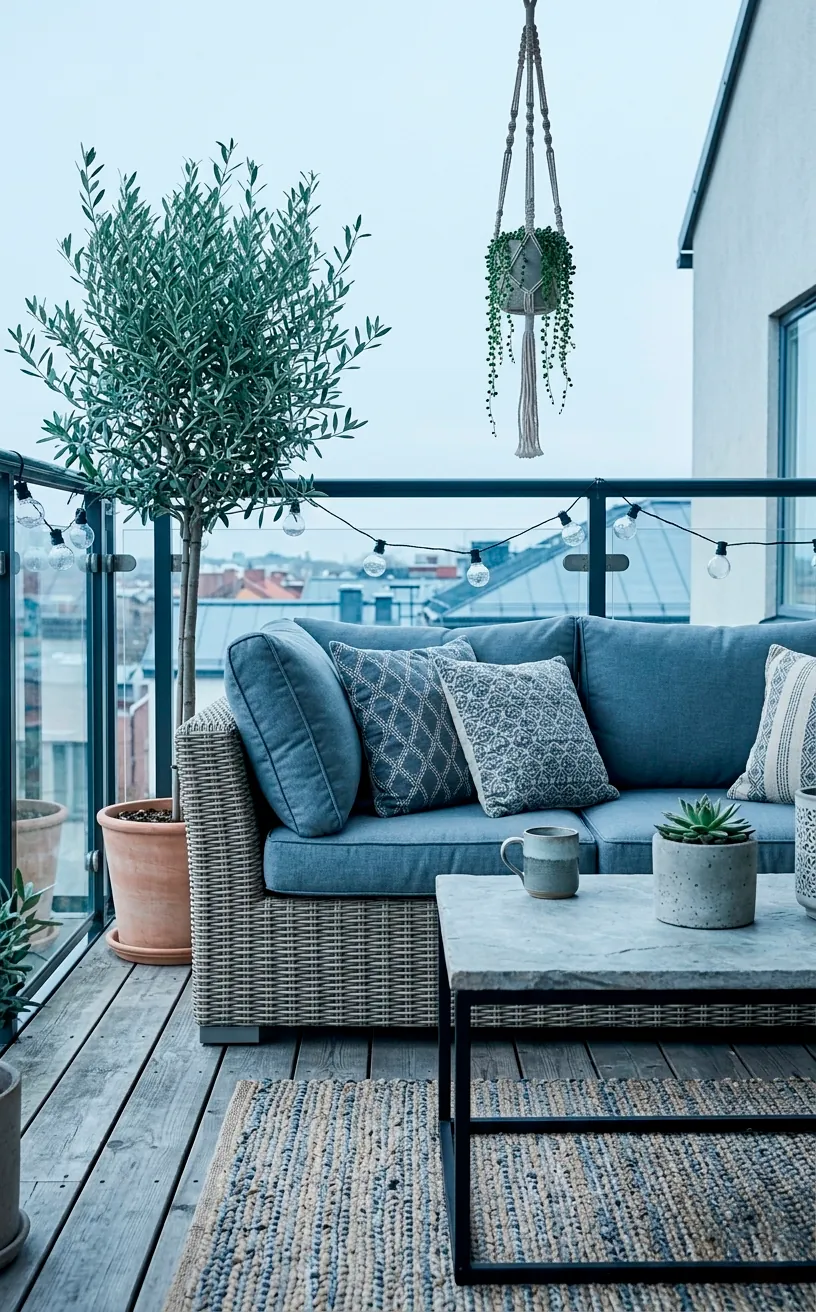
Slate Blue and Greige
For those who prefer a cooler earthy vibe, slate blue and greige (grey-beige) are the way to go. Slate blue mimics the color of river stones, while greige keeps things neutral and warm. It’s the perfect ‘ocean-meets-earth’ aesthetic for a balcony. Use weathered wood furniture to enhance the natural feel. It’s a calm, sophisticated look that feels less ‘hippie’ and more ‘high-end retreat.’
Conclusion
Transforming your balcony with earthy tones isn’t just about following a trend; it’s about creating a space where you actually want to spend time. Whether you choose the warmth of terracotta or the moodiness of charcoal, these palettes bring a much-needed sense of peace to the concrete jungle. Which one of these vibes are you grabbing first? Let me know in the comments and go start your transformation!
Related posts
See AllThe Complete Screened In Porch Planning Guide: Comfort Meets Style
Ready to transform that bug-infested patio into your favorite room? Discover how to plan a screened-in porch that perfectly balances …
Read more20 Low-Maintenance Small Balcony Design Ideas: Perfect for Busy Lifestyles
Transform your tiny outdoor space into a lush retreat without adding more chores to your weekend. Discover 20 low-maintenance small …
Read moreHow to Achieve a High-End Mediterranean Patio Look on a Budget
Want to turn your basic backyard into a dreamy European oasis without emptying your wallet? Discover budget-friendly tricks for creating …
Read more10 Sophisticated Small Pond Ideas to Elevate Your Entrance
Upgrade your home's curb appeal with these 10 sophisticated small pond ideas. From minimalist concrete bowls to zen-inspired water features, …
Read more