


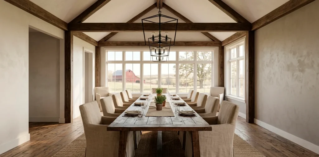

Choosing the right paint shouldn’t feel like a high-stakes poker game where the prize is a room you actually like. I’ve stared at enough beige swatches to lose my mind, so I did the hard work for you. You want a dining room that feels like a warm hug but looks like a magazine cover, right? Let’s find your perfect farmhouse neutral without the stress.
Sherwin Williams Alabaster
Ever wondered why some white rooms look like a sterile hospital wing while others feel like a cozy cloud? Alabaster is the secret sauce for that authentic farmhouse vibe. It avoids the dreaded blue undertones that make a space feel cold, opting instead for a creamy, soft finish that plays nicely with your reclaimed wood furniture.
I love how this color handles the afternoon sun without turning into a bright yellow mess. It provides a clean backdrop for your black metal accents and greenery. If you want a ‘true’ farmhouse look, Alabaster practically owns the category. It creates a space where your family actually wants to linger over coffee, rather than a room that just looks good for guests. 🏡
Benjamin Moore Revere Pewter
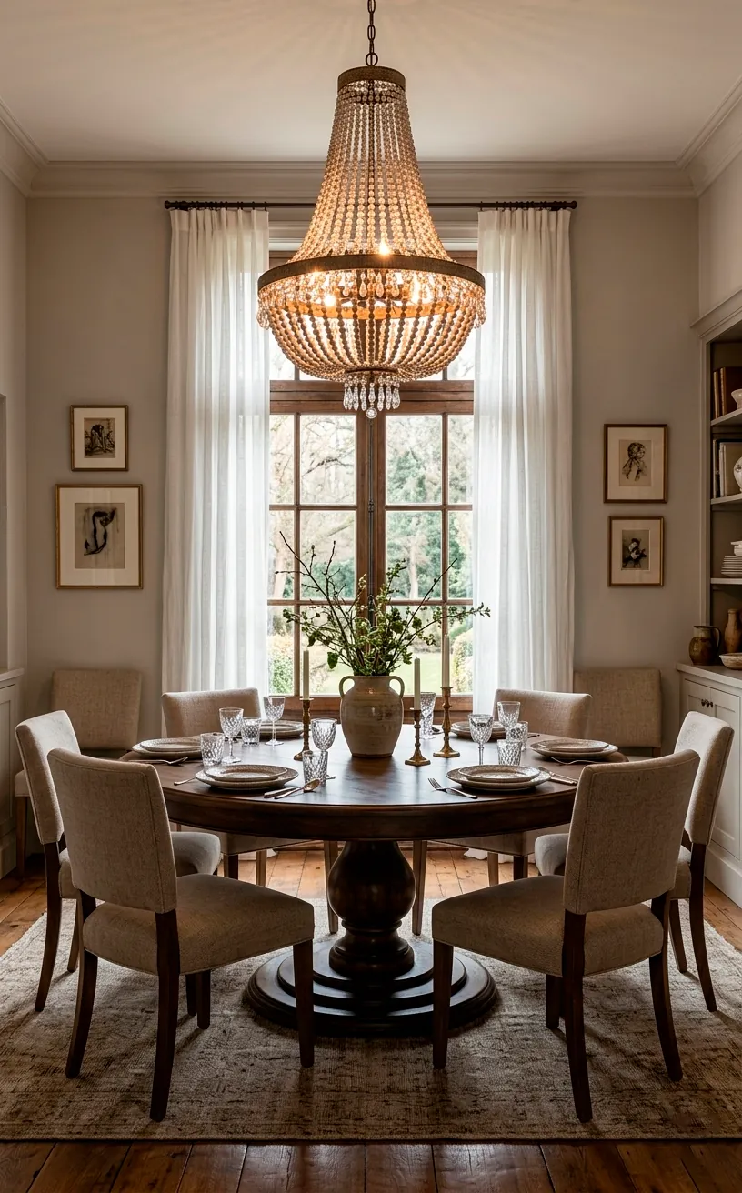
IMO, Revere Pewter is the undisputed heavyweight champion of the ‘greige’ world. It bridges the gap between gray and beige so perfectly that it fits almost any lighting situation. You get that sophisticated, slightly moody feel without the room feeling dark or cramped. I’ve seen this color transform a boring dining area into a space that feels expensive and curated. It highlights white trim beautifully and makes your natural wood floors pop. Why settle for a flat gray when you can have this depth? Check out these 15 timeless color schemes for an elegant dining room if you need more inspiration for your next project.
Sherwin Williams Repose Gray
If you want a gray that stays gray, this is your winner. Unlike some colors that sneakily turn purple or blue once they hit your walls, Repose Gray stays incredibly neutral. It’s a bit cooler than a traditional greige, making it perfect for a modern farmhouse aesthetic.
Does your dining room get a ton of natural light? Repose Gray will look crisp and airy. In darker rooms, it gains a bit more weight and feels cozy. I think it’s the perfect choice for someone who wants to avoid the ‘beige’ look entirely but still wants a versatile neutral.
You should pair this with some warm wood elements to balance the coolness. It creates a stunning, clean look that makes every piece of decor stand out like a museum exhibit. FYI, it’s also a favorite for open-concept floor plans because it flows so well into other rooms.
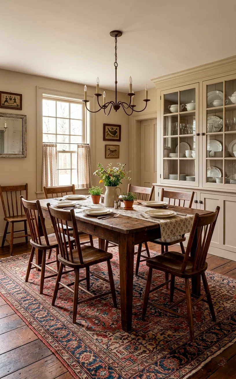
Benjamin Moore Edgecomb Gray
Think of Edgecomb Gray as the warm, sandy cousin of the greige family. It brings a certain organic, earthy feel to a dining room that standard whites just can’t touch. I usually recommend this for rooms that need a bit of ‘soul’ without feeling heavy or dated.
It works brilliantly with stone accents or brick fireplaces. You’ll notice that it changes throughout the day, looking like a soft almond in the morning and a sophisticated taupe by candlelight. It’s a safe bet if you’re worried about your room feeling too stark or cold. Ever wanted a room that feels like a beach house in the country? This is how you get it.
Sherwin Williams Agreeable Gray
People call this the ‘Gold Standard’ for a reason. It literally goes with everything. If you’re paralyzed by choice, just pick this and move on with your life. Seriously.
It leans slightly warm, so it doesn’t feel like a cold office building. It provides enough contrast against white trim to look intentional but remains light enough to keep a small dining room feeling spacious.
I’ve used this in three different houses, and it has never let me down. It’s like that one friend who gets along with everyone at the party.
Pair it with:
- Matte black hardware
- Natural oak accents
- Neutral linen textiles
- Greenery and plants
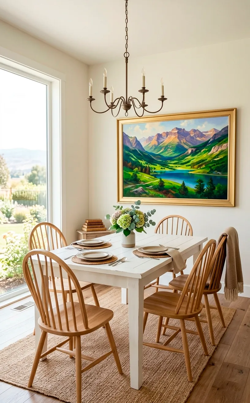
Benjamin Moore White Dove
White Dove is the ultimate soft ivory. It’s the color you pick when you want a white room that doesn’t feel like a blank sheet of paper. It has a tiny hint of gray that keeps it from glowing too yellow, which is a lifesaver in rooms with lots of warm wood.
It creates a luminous, ethereal vibe that’s perfect for a dining room where you want to host long, lazy Sunday brunches. I love how it softens the edges of a room. It’s sophisticated, timeless, and frankly, impossible to hate. 🎨
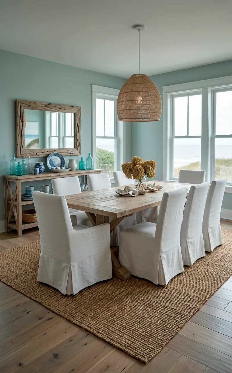
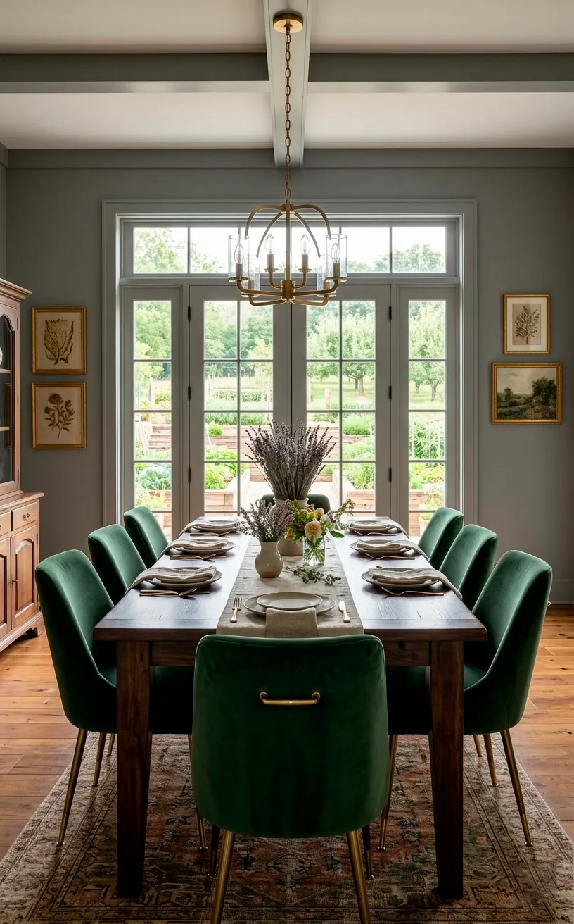
Sherwin Williams Sea Salt
Okay, this one is a bit of a wildcard, but hear me out. Sea Salt is a muted green-gray that acts like a neutral. If you’re tired of beige and gray, this brings a refreshing, coastal farmhouse energy to your dining room. It’s calm, serene, and looks incredible with light-toned woods and white furniture. It’s basically a spa day for your walls. Why stick to the basics when you can have a hint of color that still feels quiet and refined? ✨
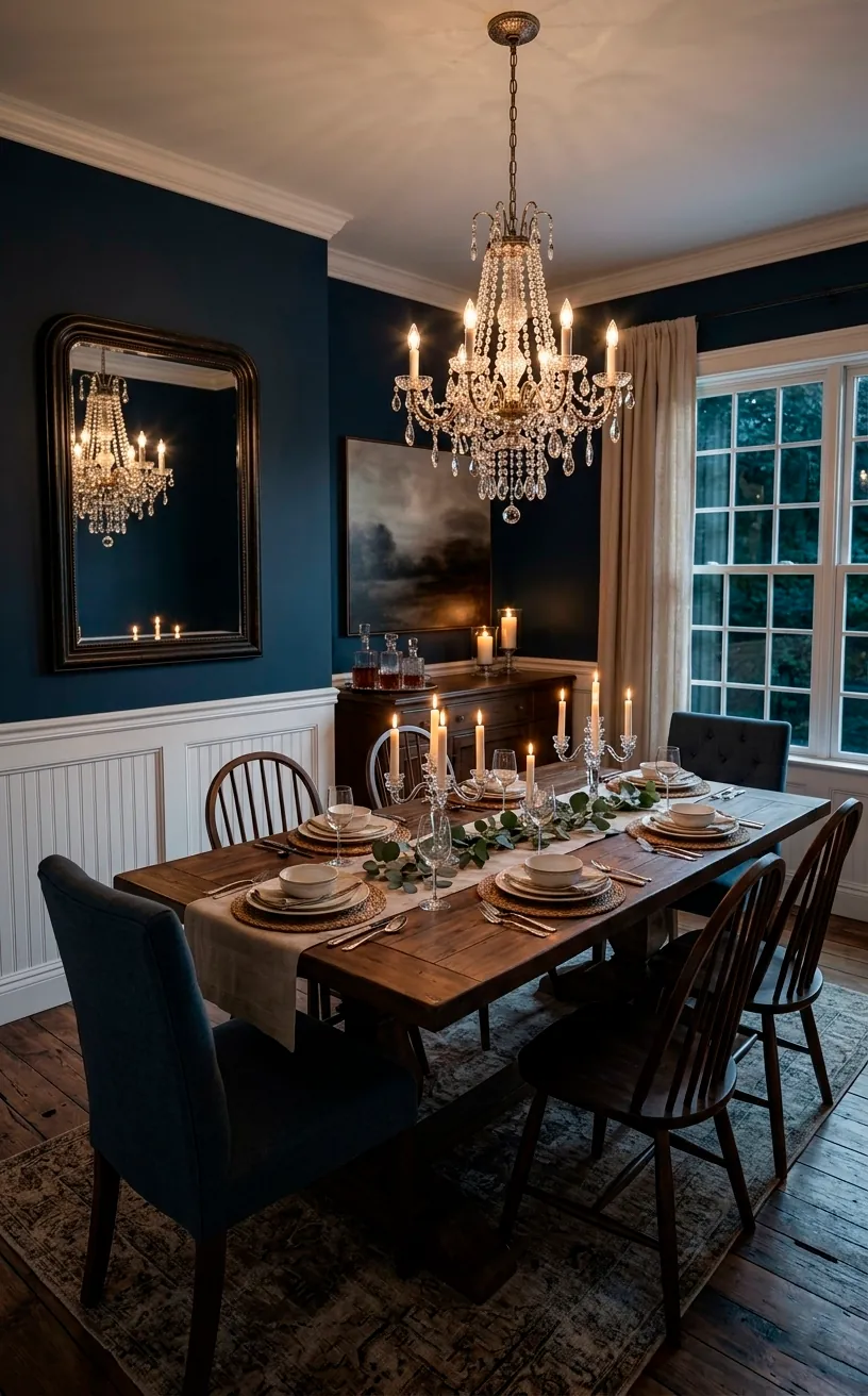
Benjamin Moore Hale Navy
Who said neutrals have to be light? In the design world, a deep navy acts as a neutral because it pairs with almost any other color or texture. Hale Navy is the king of moody farmhouse dining rooms.
It creates a dramatic, intimate atmosphere that’s perfect for dinner parties. Imagine this color behind a big wooden table with glowing candles. It’s bold, sure, but it’s also classic.
Don’t be afraid of the dark! If you have white wainscoting or large windows, this color won’t overwhelm the space. It actually makes the room feel grounded and intentional. It’s a total vibe.
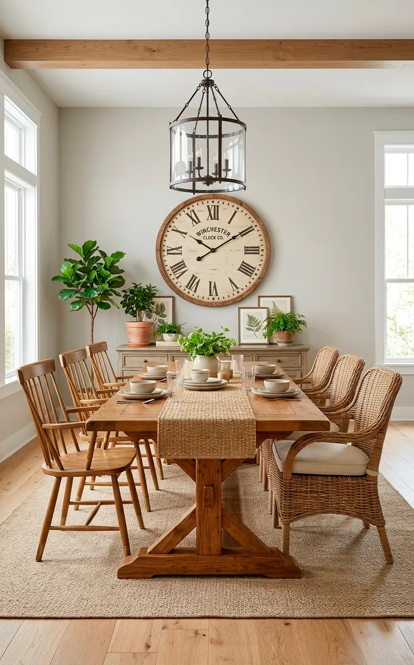
Sherwin Williams Accessible Beige
If you want a traditional farmhouse look that feels truly authentic, Accessible Beige is your go-to. It’s a warm, approachable color that avoids the ‘muddy’ look of older tans. It feels cozy in the winter and bright in the summer.
I think it looks best when paired with creamy whites rather than stark, cool whites. It provides a beautiful backdrop for heirlooms and antique finds. You can learn how to style an authentic farmhouse kitchen sink to match this warm, traditional aesthetic throughout your home. It’s a reliable choice that never feels out of style.
Farrow & Ball French Gray
French Gray is the ultimate ‘chameleon’ color. It shifts between green, gray, and blue depending on the light. It feels historic and established, like it’s been on the walls of a French countryside manor for decades.
I love using this for a more ‘elevated’ farmhouse look. It’s a bit more expensive, but the pigment depth is unmatched. It makes your dining room feel like a destination rather than just a place to eat.
Pair it with:
- Gilded gold frames
- Velvet seat cushions
- Dark walnut furniture
- Warm brass light fixtures
It’s a sophisticated choice for those who want their home to tell a story. If you’re tired of the same three colors everyone else uses, this is your secret weapon.
Final Thoughts on Choosing Your Perfect Neutral
Picking a paint color doesn’t have to be a nightmare. Whether you go for the safety of Agreeable Gray or the bold mood of Hale Navy, remember that it’s just paint—you can always change it if you hate it! But with these 10 winners, I’m betting you’ll fall in love at first brushstroke. Which one are you grabbing first? Let me know in the comments if you’ve tried any of these favorites!
Related posts
See AllEarthy Terracotta Sunroom Ideas for a Mediterranean Vibe
Transform your space into a sunny European retreat. Discover simple, earthy terracotta sunroom ideas that bring authentic Mediterranean vibes straight …
Read more15 Playful Memphis Style Attic Loft Ideas with Graphic Shapes
Transform your attic loft with playful Memphis style decor! Discover 15 bold ideas using graphic shapes, vibrant colors, and quirky …
Read more15 Custom Built-In Bed Ideas for a Luxury Kids Room
Ready to transform that chaotic playroom into a high-end sanctuary? Discover 15 jaw-dropping built-in bed ideas that blend luxury, smart …
Read moreA Step-by-Step Guide to Total Laundry Room Organization
Transform your chaotic laundry space into an organized, functional oasis with this step-by-step guide. We share smart storage hacks, sorting …
Read more