


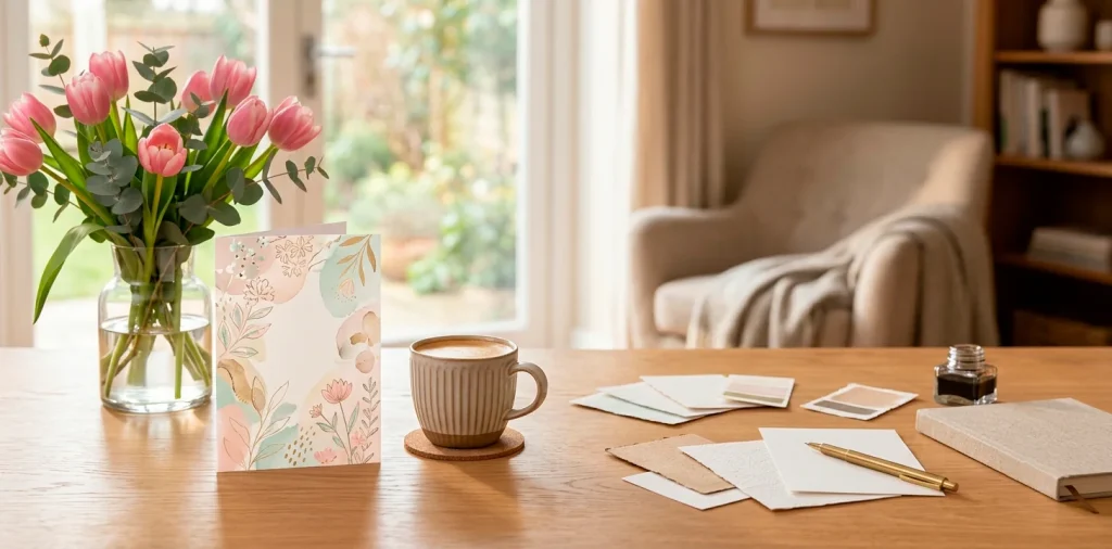

Let’s drop the generic drug-store cards this year, shall we? You know the ones-covered in glitter that gets literally everywhere. Upgrading to a custom Mother’s Day card shows you actually put some thought into it. Whether you’re a seasoned design pro or just looking for inspiration, I am breaking down the coolest graphic trends that will make Mom tear up (in a good way). Ready to make her day truly special? Let’s go! ??
1. Minimalist Line Art
Ever wonder why less is sometimes so much more? Minimalist line art is taking over the stationery world right now, and honestly, I am totally here for it. It strips away the noisy visual clutter, leaving just elegant, continuous single-line drawings of delicate flowers or abstract maternal figures.
It feels incredibly sophisticated without trying too hard. If your mom loves modern, Scandi-inspired decor, this specific design hits the absolute sweet spot. Plus, it leaves plenty of blank space inside for you to write an actual heartfelt message instead of relying on a pre-printed poem.

2. Bold Retro Typography
Nostalgia is running huge right now, and bold retro typography brings all those groovy 70s vibes straight to the mailbox. Think chunky bubble letters, warm mustard and terracotta color palettes, and playful drop shadows. It is loud, it is fun, and it completely breaks the mold of traditional pastel floral cards. I designed one last year with a funky “Super Mom” graphic, and it was a massive hit. If she has a massive, bold personality, give her a card that perfectly matches her energy!

3. Botanical Watercolor Splashes
Florals for spring? Groundbreaking. ?? But wait, hear me out!
We aren’t talking about those stuffy, old-school rose bouquets here. Modern watercolor splashes use loose, abstract brushstrokes to create organic shapes that only vaguely hint at botanical elements.
It feels fluid, dreamy, and highly artistic. The true beauty lies in the tiny imperfections-like the way the colors bleed naturally into the crisp white cotton paper.
By blending vibrant hues like magenta and lush sage green, you get a masterpiece she will probably frame. Design elements:
- Loose color blooms
- Gold fleck accents
- Soft deckled edges

4. Foil Stamping Magic
Want to instantly elevate a simple graphic design? Just add some shiny metallic goodness. Foil stamping in rose gold, copper, or classic brass instantly makes any custom card feel like a premium, high-end gift. You can use it to highlight a specific graphic or safely trace the delicate outline of a botanical illustration. The way the foil catches the sunlight on a Sunday morning breakfast tray is just purely magical. IMO, this subtle luxury trend never really goes out of style.

5. Custom Pet Portraits
Let us definitely not forget the devoted dog and cat moms out there! This trend is honestly my absolute favorite because it hits right in the feels.
Custom digital pet portraits are quickly replacing generic animal graphics. Artists use bold, modern vector illustrations to capture a pet’s unique goofy smile or asymmetrical floppy ears. It feels deeply personal and slightly hilarious.
Just pair the custom illustration with a cheeky pun, and you have a guaranteed winner. Trust me, nothing beats the reaction of a mom seeing her favorite fur baby officially recognized on fine cardstock.

6. Y2K Nostalgia Graphics
The early 2000s are calling, and they brought butterfly clips and holographic stickers. Y2K nostalgia is rapidly creeping into greeting card designs, featuring pixel art, cyber-inspired pastels, and cheeky digital motifs.
It sounds crazy for Mother’s Day, but if you are designing a card for a cool millennial mom, this aesthetic feels incredibly fun and perfectly ironic. Think bright bubblegum pinks paired seamlessly with metallic silver borders. It completely shatters the boring traditional card rules.

7. Negative Space Cutouts
Die-cut negative space creates a mesmerizing 3D effect that practically begs the recipient to touch it. By laser-cutting intricate patterns or modern typography right out of the thick front cover, you successfully reveal a heavily contrasting color or bold texture hidden on the inside layer. It transforms a standard piece of paper into an interactive, architectural experience. I love using a crisp matte white cover over a vibrant neon pink or deep navy insert for maximum visual impact.

8. Moody Dark Florals
Who says Mother’s Day cards must constantly look like a pastel explosion?
Moody dark florals offer a dramatically romantic alternative. Inspired directly by Dutch Golden Age paintings, this trend uses deep black or lush plum backgrounds to make oversized, heavily saturated blooms pop visually.
It feels exceptionally rich, luxurious, and slightly mysterious TBH.
If she appreciates high-fashion or dramatic interior design, she will totally obsess over this dark aesthetic. For a broader look at styling rich, moody vibes at home, explore our modern farmhouse mothers day entryway decor guide!

9. Abstract Geometric Shapes
If flowers simply aren’t her vibe at all, abstract geometric shapes offer a clean, ultra-modern alternative. This bold trend uses overlapping arches, perfect circles, and asymmetric blobs in warm, earthy tones like terracotta, mustard, and soft blush.
It heavily draws from mid-century modern art and classic Bauhaus principles. The carefully balanced composition creates a calming visual aesthetic that looks stunning sitting casually on a modern mantelpiece or floating oak shelf.

10. Handwritten Brush Script
Forget those terribly rigid, traditional calligraphy fonts that look exactly like a formal wedding invitation from 2010.
Modern handwritten brush scripts embrace a slightly messy, casual elegance. It perfectly mimics the look of someone rapidly painting a joyful message with a thick, wet watercolor brush.
This specific style injects a massive ton of authentic, human personality into the design. Combine a bold, sweeping script with a very stark, simple sans-serif font for the supporting text to achieve perfect typographic harmony.

11. Monochromatic Palettes
Sometimes the absolute boldest design choice is stubbornly sticking to a single color. Monochromatic palettes use various shades, subtle tints, and dark tones of one specific hue to create a highly cohesive look. Imagine a stunning card featuring soft blush pink, vibrant magenta, and deep burgundy all working together harmoniously. It forces the graphic designer to focus heavily on tactile texture and sharp typography rather than relying on basic color contrast. The final result always looks incredibly chic, intentional, and expensive.

12. Collage & Mixed Media
Want to give her something that feels truly one-of-a-kind? Mixed media collages are making a massive, unexpected comeback in the digital art space.
Designers seamlessly blend vintage family photographs, torn paper textures, scanned fabric scraps, and modern vector graphics into beautifully chaotic compositions.
It provides a very tactile, scrapbook-like feel even if the final card is printed completely flat. It effectively tells a layered visual story that perfectly captures complex family memories and hilarious inside jokes.

13. 3D Pop-Up Elements
Pop-up cards are officially no longer just for toddlers’ birthday parties. Modern 3D paper engineering creates jaw-dropping, intricate sculptural masterpieces that actually spring to life the second she opens the envelope.
We are talking about delicate paper cherry blossom trees, intricate botanical terrariums, or elegant flying birds. These complex designs successfully act as standalone pieces of art that she will proudly display on her office desk long after the holiday officially ends.

14. Eco-Friendly Kraft Paper & Ink
Sustainability is definitely not just a passing fad; it represents a permanent mindset shift in graphic design.
Designing specifically for eco-friendly kraft paper requires a completely unique approach. You must fully embrace the raw, fibrous texture of the recycled material.
Use opaque white ink or bold, earthy soy-based colors that contrast beautifully against the warm brown background.
This earthy, organic style appeals instantly to the environmentally conscious mom who loves a rustic, handmade aesthetic without sacrificing professional quality. Eco-friendly specs:
- 100% recycled fibers
- Soy-based organic inks
- Unbleached natural finish

15. Vintage Ticket & Postcard Styles
Traveling might be her ultimate passion, so why not lean fully into that theme? Designing the card to mimic a vintage boarding pass or antique postcard is an incredibly clever and charming trend. You can uniquely customize the “destination” and expertly add faded cancellation stamps, retro barcodes, and classic airmail borders. It feels nostalgic and highly adventurous, easily turning a simple greeting into a cool piece of memorabilia. Plus, it serves as the perfect delivery method if your actual gift is a surprise weekend getaway or spa trip! FYI, these look amazing when printed on textured matte paper.

16. Whimsical Cartoon Illustrations
Let’s inject some pure, unfiltered joy right into the design mix. Whimsical, flat-vector illustrations feature charming, slightly exaggerated characters that instantly bring a massive smile to anyone’s face.
Think of a cute illustrated mom attempting to juggle a hot coffee cup, an open laptop, and a screaming toddler simultaneously. It captures the beautifully chaotic, everyday reality of motherhood perfectly.
The vibrant, saturated colors and playful scenarios make these specific designs feel approachable, lighthearted, and deeply relatable to modern moms currently navigating incredibly busy lives.

17. Holographic Accents
Move over standard gold foil, because holographic accents are currently here to steal the entire spotlight. This slightly futuristic trend uses iridescent foils that shift colors wildly depending on exactly how the ambient light hits them.
It creates a mesmerizing, oil-slick rainbow effect that feels incredibly modern and slightly edgy. Use it sparingly on subtle graphic details or typography to prevent it from looking exactly like a 90s sticker book. It provides that perfect, unexpected element of surprise when she pulls it out of the envelope.

18. Interactive Puzzle Cards
Why just hand her a static card when you can creatively hand her a fun experience? Interactive puzzle cards literally require the recipient to physically assemble the pieces to read the hidden message. You design the graphic as a cohesive whole, and the professional printer die-cuts it into a mini jigsaw puzzle housed tightly in a beautiful envelope. It gently forces her to slow down, engage completely with the design directly, and enjoy a mindful moment before revealing your thoughtful, loving words.

19. Gradient Blends
Smooth, dreamy color transitions are literally everywhere in design right now.
Soft gradient blends-often widely referred to as “aurora” or “mesh” gradients-create a glowing, luminous background that feels remarkably soothing.
Graphic designers blur vibrant pastels together seamlessly on screen, totally eliminating any harsh dividing lines.
It essentially produces a calming, ethereal vibe that pairs gorgeously with stark, white minimalist typography. This specific digital technique heavily modernizes the entire concept of a traditional pastel greeting card instantly.

20. Photocentric Polaroid Grids
We easily take thousands of photos on our phones, but they rarely escape the digital world. Photocentric grid designs closely mimic the nostalgic look of scattered vintage Polaroids, allowing you to proudly showcase multiple favorite family memories in one exceptionally clean layout.
Add some hand-drawn tape graphics or subtle drop shadows, and it instantly feels like a cool mini scrapbook page. If you love bold typography too, this layout pairs perfectly with modern fonts. For more ways to integrate stunning typography into your home styling, read our modern typography memorial day decor article!

Conclusion
So there you have it-twenty completely fresh, modern ways to rethink the standard holiday greeting card. Ditching the generic pharmacy aisle options for a custom, trend-forward design heavily shows genuine effort that she will instantly recognize. Whether you lean toward moody dark florals, nostalgic Y2K graphics, or sleek minimalist line art, you really cannot go wrong if you actively match the aesthetic to her unique personality. Which of these graphic design trends are you grabbing first for your custom creation? Let me know in the comments!
Related posts
See AllHow to Fold Napkins for an Elegant Winter Dinner Party
Ready to impress your dinner guests this winter? Discover simple, elegant napkin folding techniques that transform any table into a …
Read moreThe Ultimate Guide to Fall Kitchen Decor for a Warm Gathering Space
Give your kitchen that cozy autumn glow. Discover easy, beautiful fall decor ideas that turn your cooking space into the …
Read more20 Industrial Chic Accents to Refresh Your Spring Home Decor
Spring meets factory-loft vibes! Refresh your home with these 20 industrial chic accents, from raw metal finishes to edgy lighting. …
Read moreThe Beginner’s Guide to Crafting Your Own Macramé Plant Hanger
Ready to turn that tangled ball of cotton cord into a stunning boho masterpiece? Grab your scissors and favorite pothos—let’s …
Read more